

At the start of July, I reviewed the result of the first Pendulum experiment where the loser metal Palladium could beat the supercharged Japanese Nikkei stock index. The same day at the end of the post I proposed to push the Pendulum again. This time we entered into competition the faded Nikkei index versus the matchless metal silver. Below is the graph of the bets you placed.
Chart 1. Nikkei Vs. Silver: Voting Results:
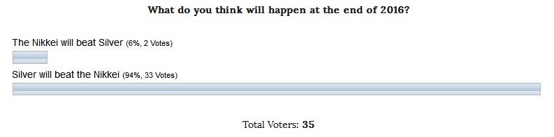
This vote clearly shows the biases of the readers as in the second experiment like in a first one the odds were in favor of the metal, at the first time it was palladium and this time it was silver. Only one person added to my voice in favor of the Nikkei as I am acting as an experimenter and chose the success of the Pendulum effect betting on the stock index to break the shutout.
Well, you will be surprised looking at the chart below as the majority’s bet is wrong so far.
Chart 2. Nikkei Vs. Silver: Maximum Divergence!
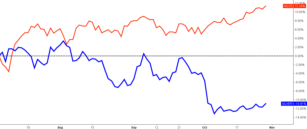
Chart courtesy of tradingview.com
It seemed to be obvious that the top gaining metal could strike higher and the disappointing stock index could go totally bust as their price actions promised such a direction. But the physical law set in the Pendulum effect started to turn the wheels of the future just in a week after the second experiment began when we can visually detect the first divergence in favor of the Nikkei. The swing moved back in August when both instruments touched each other in a “farewell kiss” as they never met again losing each other to a growing distance.
Silver has made several attempts to gain positive momentum above the zero line (black dashed horizontal line) but failed, hitting a -13% low in October. The Nikkei is well above the starting point breaking through the 10% mark this week. What a coincidence. These days when the post has been prepared, we have the maximum divergence of more than 22% in favor of the Japanese stock index. We almost reached the ¾ of the experiment’s timeline, so this result is promising. Fingers crossed, let's wait until the end of the year to make a total.
Chart 3. Silver Weekly: Large Sample
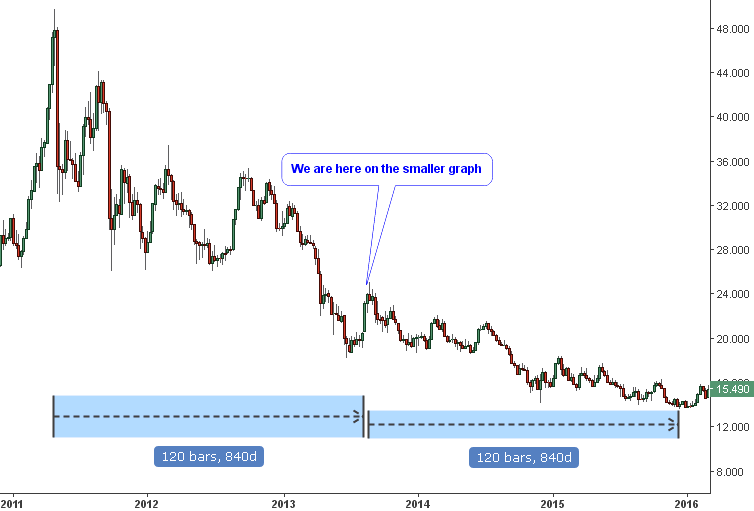
Chart courtesy of tradingview.com
Chart 4. Silver Weekly: Small Analogue
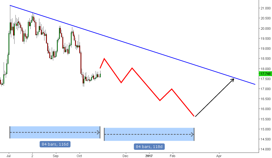
Chart courtesy of tradingview.com
This time I would like to show you the analogs that I have found for you on the chart of silver. Earlier I already made such an experiment with the silver clones and it was successful, let us see if it would score the point this time making successful experiment inside of another experiment.
The chart 3 on the left side shows the compressed weekly graph of the silver, which covers 5 year period. The right chart is the same but zoomed weekly chart of the silver, which is focused on the short period of almost one year. The current structure of the price graph has similar zigzags as the left chart. Two zigzags down, then two countertrend zigzags, after that we see the sharp zigzag down and now we are in the countertrend correction (I put blue callout on the left chart to pin the current position on the right chart analogue.
I put the blue timeline measuring arrows below both charts. On the left chart, you can see that the period of sharp fall is equal in time to the subsequent period of the soft drop. I put hypothetic red zigzags on the right chart copying the price action on the left sample with the end at the start of the next spring with the price target within the $15-$16 range. This projection doesn’t add a point to the silver’s dynamics against the Nikkei.
This experimental chart of the silver tells us about the prolonged and complex correction of the metal’s price. The break above the $20.20 mark would invalidate this scenario.
Chart 5. Nikkei Weekly: Multi-Year Resistance Broken
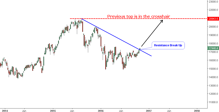
Chart courtesy of tradingview.com
I like this pure and simple chart structure of the Japanese stock index. The index finally broke out of the falling trend marked in a blue resistance line. After the price breaks such large and long-lasting structure it can hit the previous top at the ¥20943 mark, gaining more than 20% from the current level. Minor resistances are set at the previous local highs at the ¥17613 level and at the ¥20k psychologically important mark. This picture promises more gains for the Nikkei and adds more points to the success of the Pendulum experiment No.2.
Indeed, the future is hidden from us, what looks promising can easily fall to become a bust and vice versa. Only proven laws of natural phenomena can help you turn odds in your favor!
Intelligent trades!
Aibek Burabayev
INO.com Contributor, Metals
Disclosure: This contributor has no positions in any stocks mentioned in this article. This article is the opinion of the contributor themselves. The above is a matter of opinion provided for general information purposes only and is not intended as investment advice. This contributor is not receiving compensation (other than from INO.com) for their opinion.