

Copper topped the ranks at the end of last year and moved north to the middle of February without breaking any serious resistance peaking at $2.8230. Then the price drifted lower, closer to the area of the December 2016 low at $2.4480 as projected in my previous update. Copper has now bounced higher and I would like to share with you some new data, which could change my outlook for the metal.
I would like to start from Chinese data as they are the top importer of the metal in the world. China’s copper import dropped almost 20% in 1Q of 2017 according to the Chinese customs statistics and this is not supporting the pricing information. Below are two charts to show you more headwinds from China.
Chart 1. Copper Vs Chinese GDP Growth Rate (Quarterly)
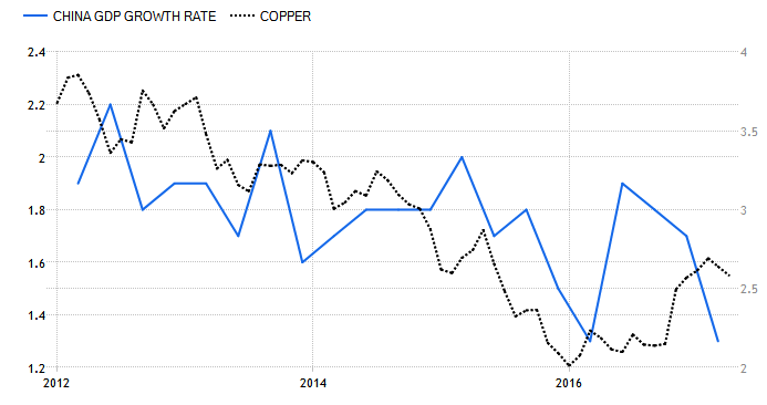
Chart courtesy of tradingeconomics.com
The Chinese economy (left scale, blue) advanced only 1.3 percent in the 1Q of 2017, following a 1.7 percent growth in the previous three months and missing market estimates of a 1.6 percent growth. It has been the weakest expansion since the 1st quarter of 2016. GDP Growth Rate in China averaged 1.84 percent from 2010 until 2017.
As we can see copper (right scale, black dotted) has the same trajectory of the price as Chinese GDP growth. The metal has a serious lag during the last year as the price was trapped in a sideways trend almost to the end of the year despite strengthening GDP data. Now it could also spend some time on the upside before following the indicator’s heavy drop.
Chart 2. Copper Vs Chinese Loan Growth (Monthly)
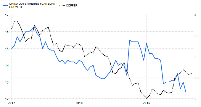
Chart courtesy of tradingeconomics.com
The value of loans in China (left scale, blue) increased 12.40 percent in March of 2017 over the same month in the previous year. It is the lowest rise since May of 2005. Loan Growth in China averaged 16.30 percent from 1998 until 2017.
The loan expansion is a very important indicator, which supports the consumption, including the copper related consumption. As we can see, this indicator is also falling sharply as the first GDP indicator above. Copper (right scale, black dotted) still didn’t react to the drop of it.
Now we are informed and ready for the possible turnaround in the metal’s price.
Another possible risk factor is the current behavior of the Australian Dollar Vs. The U.S. Dollar. I hope you find this additional finding below useful.
Chart 3. Copper Vs AUDUSD Monthly: Amazing Correlation!
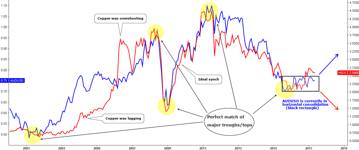
Chart courtesy of tradingview.com
Look at the chart above, it is amazing how deep the correlation of copper (right scale, red line) and Aussie (Ozzie) (traders’ nickname for AUDUSD) (left scale, blue line) is! The Australian currency usually represents the risk for commodities as up to 50% of Australian export comes from the mining industry. But what is the most surprising is that copper is not a core export commodity, which makes up only about 2% of total Australian export.
At the start of the chart in 2001 we can see that the metal was lagging behind the Aussie and could catch up with it only in 2006 and then it even overshot the currency. A smooth sync between them started after the major low in 2008. I would like to stress your attention on a perfect match of major troughs/tops of these instruments as highlighted with yellow ellipses.
Currently the Ozzie is in the horizontal consolidation within the black rectangle while copper shows a zigzag to the upside. There is a visible divergence between them and the Aussie’s breakdown of current consolidation would put pressure to the metal. But if the currency pair would go higher than it can catch up with copper at the higher level. The Ozzie should be on our watch list as not to miss any serious signals for the metal.
Chart 4. Copper Weekly: Watch $3.00

Chart courtesy of tradingview.com
Despite the negative economic background the metal still could make another strike to the upside to check the double resistance at $3.00 where the former horizontal support (blue dotted) and the trendline resistance (black) intersect. The RSI is above 50 and it is squeezed like a snake before the attack so no downside threats are yet visible on the chart. Only below $2.4480 (December 2016 low) the risk of a drop could start to grow.
The technical chart currently doesn’t confirm the fundamental headwinds described above. Let’s watch mentioned price levels for further clues.
Intelligent trades!
Aibek Burabayev
INO.com Contributor, Metals
Disclosure: This contributor has no positions in any stocks mentioned in this article. This article is the opinion of the contributor themselves. The above is a matter of opinion provided for general information purposes only and is not intended as investment advice. This contributor is not receiving compensation (other than from INO.com) for their opinion.
Mr. Burabayev clearly knows his stuff. Just would suggest that he gets someone who is a native speaker of English to edit his opinion pieces before publishing them. E.g., ". . . it is squeezed like a snake before the attack. . ." The proper word is coiled, not squeezed. The article has at least a dozen similar misuses.
Excelent. I am chilean and we are major producer of copper of the world. Thousands workers has been fired. So for me is very important this information. Thank you.
.