Crude Oil vs Platinum: You Bet Right

It is just amazing how many times you guess not only the direction but also the peaks and troughs of the prices of different instruments. This is crowd-thinking or crowd-analyzing, when the winning ideas are crystallized into the major wager.

This “market distortion” was spotted in July and it was updated this September. Almost all of you were betting that crude oil and platinum would meet on the price chart again. So, here it is in the chart below.

Crude Oil VS Platinum

Source: TradingView

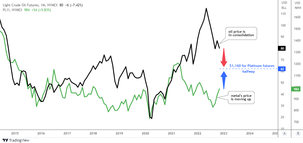
The magic of your major bet is right here in the making. As the oil price remains stuck in a sideways consolidation, the platinum price is taking quick steps towards "black gold".   

In September, crude oil futures completed their mission as the initial meeting point was set at $75 and the valley was at $76. Hence, the consolidation that followed gave the metal a chance to catch up.

The updated meeting point has been recalculated to be set at $62 for crude oil futures and at $1,160 for platinum futures. This could happen in an ideal situation. Historically, however, one of the instruments has often lagged behind.

Last time I updated the platinum futures chart for you and it played out well according to the bullish option.

Let me update the oil futures chart this time as it has changed a lot. Continue reading "Crude Oil vs Platinum: You Bet Right"

Can Central Banks See What We Don't?

The gold futures have skyrocketed on better than expected U.S. inflation data last week. The annual inflation rate in the U.S. slowed for a fourth month to 7.7% in October, the lowest reading since the start of a year, and well below forecasts of 8%.

US Annual Inflation & M2

Source: TRADING ECONOMICS

According to logic, the gold price should fall as anti-inflationary tightening measures have shown positive results in cooling price growth. The printing press, represented by the M2 money supply indicator (black dotted) in the chart above, has stopped and the reading is declining as well.

Let us check the chart below to look for an answer in the fundamental data of world gold demand.

WGC Gold Demand

Courtesy of World Gold Council

The graph above shows the quarterly data of demand statistics in the period from Q3 2021 to Q3 2022. According to the data, the most stable demand source comes from a technology side (wine-colored). The jewelry demand (dark purple) is price sensitive: it shrinks on the rising price and expands during price falls. The investment demand (dark green) is cooling down amid the tightening as per the logic I explained above. Continue reading "Can Central Banks See What We Don't?"

These Stocks Are Falling Knives

It is good to see a Head and Shoulders pattern in the making and to see it in the final stage is great luck. Fortunately, I spotted one such pattern in the chart of the Tesla (NASDAQ:TSLA)TSLA Weekly Chart

Source: TradingView

The stock price of Tesla has been trading in a big range between $180 and $414 after it managed to break above the Y2020 top of $167. Peak points were distributed unevenly as we can see the lower tops on both sides of the all-time high. This has shaped a notorious Head and Shoulders pattern on the weekly chart.

We saw this model in the Ethereum and AMD charts this year.

The model is clear; it has slightly up-sloping angle as the Right Shoulder is located higher than the Left Shoulder. A Neckline has been built through the valleys of the Head. The stock price has been hovering here for some time.

Last week, the market closed below the Neckline triggering the bearish signal.

The target of this pattern is located in the negative numbers area so I skipped it. Instead, I highlighted three potential supports that could stop the upcoming collapse.

The first support is located at the peak of August 2020 at $120. It was broken to the upside and then it was retested by a huge consolidation.

The next support comes from the top of February 2020 at $65. The price has been struggling to overcome it for a long time. The book value level of $13 is the ultimate support based on fundamental data. Continue reading "These Stocks Are Falling Knives"

Silver And Palladium Update: False Hope

The price action in the silver futures has given a false hope to bulls this month.

The largest volume support (orange) has offered a solid support for the silver futures price lately. It is located between $17.4 and $18.2. The price has tested it three times already and failed to break it down.

Silver Futures Weekly

Source: TradingView

The RSI has built a Bullish Divergence during the second touchdown at the end of the summer. The reaction was an imminent reversal to the upside. It was promising price action for the bulls as the futures price soared from $17.4 up to $21.3 by the start of this month to book the gain of almost four bucks (22% growth).

Afterwards, the same indicator has failed to break above the 50 barrier in spite of a strong impulse and so did the price rally. It stopped more than half dollar below the moving average (purple).

The price dropped back to the largest volume support after above mentioned failure but bounced then. It has managed to score more than one dollar from the latest valley of $18. This puts the silver futures between the hammer ($21.9, moving average resistance) and the anvil ($18, volume support).

The chart structure of the recent rally looks corrective. This means that the weakness of the price should resume. The next support is located at the following volume area of $15.8.

There are no other significant levels to catch the “falling knife” of silver except the “Flash-Crash” valley in $11.6. The drop to the latter could build a larger corrective structure visible on a bigger map.

The invalidation of the bearish outlook would come with the breakup of the moving average above $21.9.

Last time, your most popular answer was that silver futures would stop at $16. The next bid was bullish. None of the bets have played out as yet. Continue reading "Silver And Palladium Update: False Hope"

Gold Update: The Breakdown

It’s all about persisting inflation at the end of the day. All markets watch how the Fed tries to fight it as aftershocks of rate decisions are observed in bonds, stock market, foreign exchange, precious metals and even crypto.

US Inflation vs Fed Rate vs Real IR

Source: TradingView

The graph above visualizes that “fight of the night”. Indeed, we witness some progress of the Fed’s efforts in the falling U.S. inflation (red line) numbers from the peak of 9.1% in the summer down to the latest data of September at 8.2%, which was still above the expected 8.1%.

The 3% increase of the Fed rate (blue line) brought inflation down only by 0.9%. It is way too slow, as the inflation target of 2% is still way too far, hence the Fed could keep their aggressive tightening mode.

Surely, there is a time lag between the Fed action and the inflation reaction. However, the time is ticking away as inflation is like a fire - the earlier it's extinguished the better.

The real interest rate (black line, down pane) crossed over the August top above the -5.1%. The next resistance is at -3.7% (valley of 2011) and it is highly likely to be hit soon as it is only 1.2% away. The valley of 2017 in -2% is almost 3% away, which means a huge Fed rate hike or a big drop of inflation. We can’t rule it out anyway.

Where do you see the yearly U.S. inflation by the end of the year?

View Results

Loading ... Loading ...

Indeed, these interest rate projections above could make precious metals life tough. Let's check the gold futures chart below. Continue reading "Gold Update: The Breakdown"