
Last July I invited Gary from Biiwii.com to help us understand how to use ratio charts...properly! His first post can be found here, but I believe there were some missing examples and lessons. SO I asked Gary to come back and fill in the holes that I felt were missing, and more importantly, what our users felt was missing. Please enjoy the article, visit Gary's blog, and let the COMMENTS FLY!
====================================================================
In July of 2008 it was my pleasure to provide the INO Traders' Blog this look at ratio charts and the edge they can provide as they often tell a not readily apparent story regarding inter-market relationships.
Today, as we look at the market revival I have been calling Hope '09 and some ratios I consider of paramount importance, gold ratio charts are heavily in play.
The first chart I want to look at is the price of gold divided by units of the S&P 500.
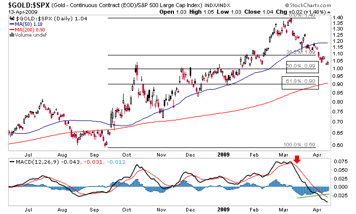
During the historic events of what I have called Armageddon '08, beginning in September of 2008, gold did what was expected and acted as a secure store of value in very troubling times. While I do not believe the worst is over by any means, technically and sentiment wise, things got over done as gold exploded in ratio to nearly all assets other than USD, the main receptacle of frightened, de-leveraging money.
Now we are in the predictable recalibration of emotion and sentiment. Gold has been expected to pull back in SPX terms to at least the 50% level, where conveniently there is a strong cluster of lateral support at around .99. If market sentiment remains buoyed for a while yet as expected, we could get a healthy 62% retrace for this ratio to around .90 before gold resumes its rightful place in out-performance mode. This ratio allows us to begin to target a reversal back to the dominant trend (gold up relative to stocks) that was in place before the correction.
Next let's look at gold in ratio to oil. This ratio had real world implications to my investment stance as it has been the primary fundamental tool I have used in building my current gold stock portfolio. Gold relative to oil exploded higher, which meant that gold miners' product exploded higher relative to one of their major cost drivers, crude oil. Can you say 'profit margin'? Of course, this ratio too has been in pullback mode and here is a look at the likely target near the SMA 200.
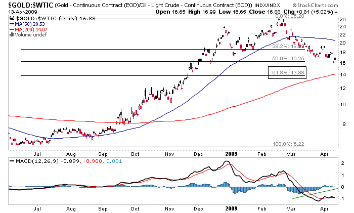
This ratio told me that while a correction was expected, gold miners' bottom lines have improved and the 62% Fib target is likely to bring a reversal back to the dominant trend along with the next leg up in gold mining profitability. Most traders are not looking at charts like these. They are watching nominal prices and they will make nominal gains (or losses) by making nominal decisions.
By listening to the underlying story told in the ratios however, you can juxtapose many macro market events against each other and make deductions that are not readily apparent otherwise. Other examples are the NDX-Dow ratio, the SOX-NDX ratio and emerging markets vs. established ones, which can tell a story about the sentiment of market participants with regard to their appetite for risk taking and hence give clues as to the overall state of market conditions.
There is literally a world full of other ratios (in bonds, currencies, etc.) that can be used as vital tools in an investor's or trader's toolbox to gain an edge.
Gary Tanashian
Market Club people: I'm asking myself the same question, can you plot ratios? I'm trying to make up my mind whether I should subscribe to your services and ratios are things I need for my trading.
Can you let me know?
Thank you!
PS., I'm a subscriber to Gary's services.
Dear Jurgen,
Right now our charting platform does not support the plotting of ratios. I wish we were able to accommodate your needs, but I'm sure you are aware how difficult it is to cater to the needs of all.
Best,
Lindsay Thompson
Director of New Business Development
INO.com & MarketClub
Very nice article. I see that Gary is using StockCharts.com to create those graphs, so I was wondering if those ratios (charts) are available within Market Club? Or a way to build them.
Thank you
Ratio Trading has been very popular among traders who use the Gold/Silver ratio for gaining in metal positions regardless of price. For example the ratio was 100 to one more than a decade ago and in 1980 was 16 to one. The opportunities to obtain free metal over time is incredible. On a more regular note, the 35/65 range is also worth trading for short term physical positions although not as lucrative on each trade.
Thanks for sharing the charts!