
 Our guest blog post today is from Jackie Ann Patterson of BackTesting Report. Jackie’s trading experience extends back to 1994 when Silicon Valley stock options piqued her interest. In recent years, she’s focused her computer skills on the markets, back testing several indicators on 7,147 stocks over 14 years of price history. Today’s Trader’s Blog post gives an overview of the MACD indicator. You can find out more by watching the free video at The Truth About MACD.
======================================================================
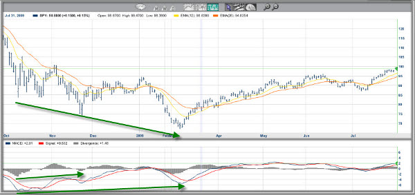
The Moving Average Convergence Divergence (MACD) started as a simple concept: measure the difference between two exponential moving averages (EMAs) to get early notice when they might cross. New applications evolved over the years. Now the MACD Lines and Histogram form a complex technical indicator that is used in a myriad of ways. This guest blog post describes the MACD signals in the order of their appearance on the chart, showing you which are the earliest signals to pick up a potential trend change and which indicate a mature trend.
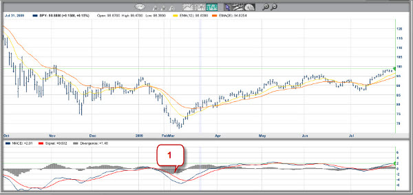
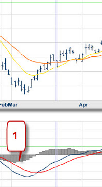
The very first indication that the price may be headed upwards is given by an uptick in the MACD Histogram from below zero. The MACD Histogram is the set of gray bars labeled “Divergence” on the MarketClub charts. See Flag #1 in Figure 1 and magnified in Figure 2. This signal is distantly derived from price. It reflects a change in the distance between the MACD line and its Signal line; a MACD histogram move towards zero indicates that the MACD is moving closer to its Signal line.

The blue MACD line itself shows the first indications of a price rise by changing slope, as shown by the #2 Flag in Figure 3 above. Flag #2 appears in two places on the chart because a MACD line slanting towards zero indicates that the two EMAs on the chart are moving closer together.
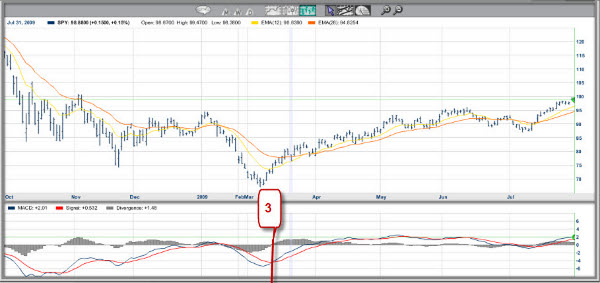
If the price indeed progresses upwards, the MACD line crosses up through its red Signal line. The Signal line is typically the 9-bar EMA of the MACD line. The MACD line crossing is reflected in the MACD Histogram as the histogram crossing zero. It is often cited as a buy signal, even though it is still rather removed from price. This is illustrated by Flag #3 in Figure 4.

The two EMAs which form the basis of the MACD are typically the 12-bar EMA (plotted in yellow on the example charts) and 26-bar EMA (plotted in orange on the examples). Different settings may also be used. When the two EMAs cross, the MACD line crosses zero, as marked by Flag #4. This is a very common buy signal, whether a trader is looking at MACD or EMAs. This relates to price because a rising price will move the faster (12-bar) EMA up more quickly than the slower (26-bar) EMA.
As the price continues to rise, the faster EMA will continue to outpace the slower EMA, and the MACD line will rise above zero. As the MACD line moves up, it will necessarily move faster than its Signal line. That pushes the MACD histogram taller and taller. At this point, the uptrend is well underway.
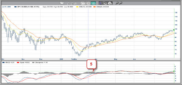
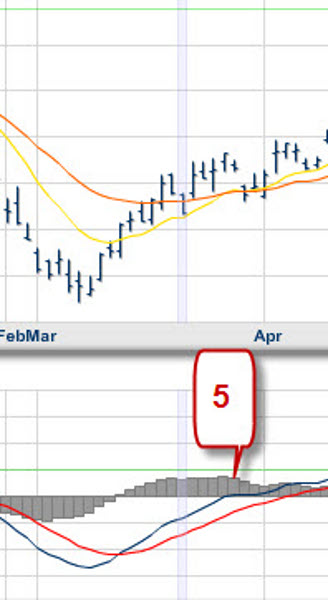
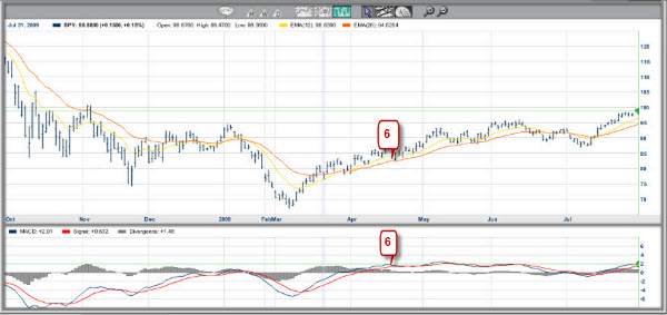
Sooner or later the momentum slows and the MACD Histogram ticks down with a shorter bar (Flag #5 in Figure 6, magnified in Figure 7). This means that the MACD line is no longer running away from its Signal line. As the downward move grows, the two EMAs start moving together and the MACD line will move down itself (Flag #6 in Figure 8 below).
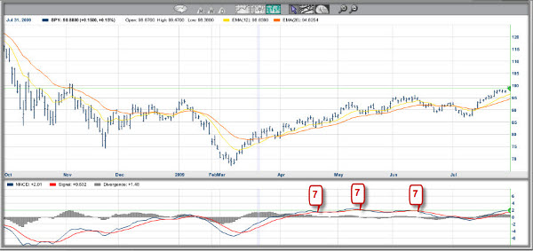
Eventually, the MACD line may drop below its Signal line, and at the same time the MACD Histogram crosses zero. Flag #7 identifies these MACD crossings in the Figure 9 below. It appears repeatedly because this example has multiple MACD crossings as the price see-saws in a trading range.
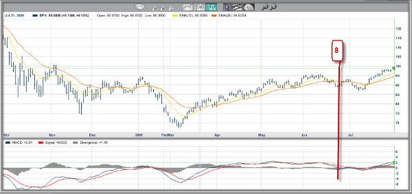
If the downward momentum builds, the MACD line drops below its zero line, signaling that the fast EMA has crossed down through the slow EMA (Flag #8 in Figure 10 below).
Looking at the whole process, we can compare the thrust of the MACD line (or the MACD histogram) with previous price moves. If the price reaches a new extreme, say a new low, but the MACD does not post a new low, that is said to be a MACD divergence. Similarly, if the MACD histogram does not confirm a new low in price, that is called a MACD Histogram divergence. These two divergences may occur together or independently. Due to the way the indicator is constructed, the MACD histogram will show more signals including divergences than the MACD lines. Positive Divergences in our example are highlighted with green arrows on the chart below.
My extensive back testing with 7,147 stocks over 14 years shows that not all MACD signals are created equal. In fact, some commonly cited MACD configurations performed no better than chance while others scored big in the right situations. To see the best of the MACD signals, visit The Truth About MACD and watch my free video.
Jackie Ann Patterson
Editor, BackTesting Report
Yo Finn--
Don't know what to tell you. I download it to desktop.
Then I close the platform. Go to "Program Files", bring up the
platform you are using........I use MT4........then click on
the platform and go to experts......then click on 'experts' and
you will see 'indicators'. Now go to desktop, and click on
the indicator you just downloaded, right click on it and hit 'copy'.
Now go to the 'indicators' on your platform and place your arrow on
the word 'indicators' and right click on 'paste'. That way you have
the indicator in your platform and you still have it on the desktop
and saved for another time........Hope this helps.
Darrell,
I wasn't very successful, I'm afraid. I got the good_macd mq4 allright and copied it to office. But it seemed impossible to drag it to the mt4 chart or to any indicator tab. Have you the least idea what I have done wrong? Best from finn
Well, I dare say, Darrell: if that works, you have made my day! Thanks a lot.
I agree with Darrell and I agree with Jackie. There must be some savvy guys who can point us to a short-cut to the traditional MACD. With the people who provide the trading platform, I imagine Jackie means for instance the broker. I asked mine and got the rather dusty answer that they didn't provided it. Perhaps when MT5 comes on line, they said; problem is that what I hear about MT5 isn't all roses.
Hey Finn--Go to http://www.metatraderlibrary.com, click on macd indicators, and it's the third one down. called Good_MACD.mq4.......paste it to desktop and then drag it to indicators on your trading platform.
later,
d
Sorry Finn--gave you the wrong info..........go here instead.(macd indicators--third one down, called good_macd.mq4
metatraderlibrary.com
I'm trying to set it up on a MT4 trading platform. Somebody must know how to do it as I see many MACD examples with the 2 lines, etc.
Thanks anyway,
dv
Darrell, you might try asking the people who supplied the MT4 trading platform. Most tools put oth lines in without any effort. Good luck!
Appreciate the MACD lesson Jackie; but not using it much, I set the parameters as you said, 12,26, & 9. On the lesson above you have a blue line and a red line. I only have the red line (signal). What am I not doing correctly to get the blue line to show on the indicator? I get the vertical lines and one moving line only.
Thanks
When I add MACD to the Market Club chart, I just select Moving Average Convergence Divergence (MACD) from the "below chart studies" and it automatically puts in the blue MACD with the red signal line.
Thanks for your comments. I'm glad the post was useful to you. Finn, indeed, it didn't occur to me to check the charts for printing. If you bring up your own charts in Market Club you can change the zoom level to print bigger.
Thanks for your comments. I'm glad you found the post interesting. Finn, indeed it didn't occur to me to check the printing of the blog post. The details may be too fine to print, but the big signals and flags illustrate the ideas.
The yellow line on the chart was basically indistinguishable from the white chart background. Better chart pictures would have made this worthwhile for archiving for reference.
Thanks for the tutorial ! I agree that any graphical representation is heplful and the concept of MACD is good, but like individual moving averages there is a great deal of arbitrariness in MACD. What is so special about 12 and 26 days. And even if "extensive back testing" reveals that 7.32 and 29.12 days produces "significantly" better results for the 7000 odd stocks, there is no law of nature that says these will apply to the next chart you look at.
Best wishes.
Agreed! Backtesting is much better at showing what didn't work than at finding the one best approach. If backtesting shows a signal didn't do any better than chance, then we know not to trade on it, because there's no reason to believe its going to suddenly start working better. But if backtesting shows a signal did well in the test set, we still need to be cautious of so-called black swans -- just because we didn't see a big loss during that run doesn't mean that the potential doesn't exist.
I'm much more interested in comparing results between different types of signals than I am in the different parameter settings. For example, knowing whether the MACD lines crossing did better than EMAs crossing gives insight into where to look on the chart.
Thanks for bringing that up!
Excellent explanation and illustration. Have read others, but this one drove home the point btw the MACD & the Histogram in a way that was most clear. Great little signal to use before entering a long term or swing trade.
Hullo, very learned and very useful. Thanks! But its such a pity that the chart (which I recognize are esigned to look at on the monitor) in most cases come out so dim as not to be of much use. This is an observation valid for most charts on the web. Maybe I should check the color intensity of my printer.