Waiting For The Next Big Move

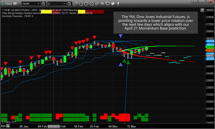
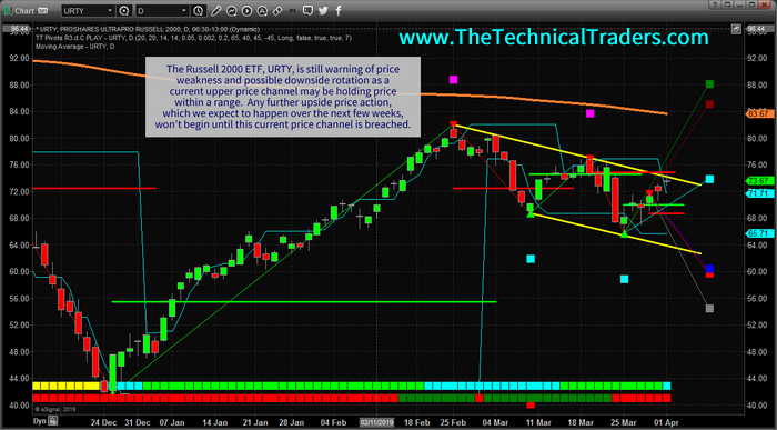
While we have recently suggested the US stock market is poised for further upside price activity with a moderately strong upside price “bias”, our researchers continue to believe the US stock market will not break out to the upside until the Russell 2000 breaks the current price channel, Bull Flag, formation. Even though the US stock markets open with a gap higher this week, skilled traders must pay attention to how the Mid-Caps and the Russell 2000 are moving throughout this move.

As we continue to advise our clients that the upside pricing cycle in the US stock market is being underestimated, see this research post: we also believe that increased volatility and price rotation will continue to drive larger rotations in price before the final breakout upside move takes place. We want to continue to warn traders that we still don’t have any confirmed upside breakout with price continuing to stay within this price channel in the Russell 2000. Eventually, when and if the price does breakout to the upside, we will have a very clear indication that continued higher prices and a larger upside move is happening. Until then, we need to stay cautious about the types and levels of rotation that continue within the markets.

The Next Big Move

Recently, volatility has started to increase as can be seen in this VIX chart. If the Russell 2000 is not able to break this trend channel with this current upside price move, then we fully expect continued price rotation in the US stock markets and another increase in the VIX as this rotation takes place. The NQ recently rotated downward by nearly 4% while historical volatility continues to narrow. When volatility diminishes in extended price trends, we’ve learned to expect aggressive price rotation can become more of a concern. We expect the VIX to spike above 16~18 on moderate volatility as we get closer to the cycle inflection date near June/July 2019. Continue reading "Waiting For The Next Big Move"

Treasury Inversion And Political Fed Cycles

With so much news hitting the wires regarding the Treasury Inversion level and the "potential pending recession", we wanted to shed a little insight into this phenomenon and what we believe the most likely outcome to be going forward. Our researchers, at Technical Traders Ltd., believe the Treasure inversion is a reactionary process to overly tight US Fed monetary policies, consumer demand factors and outside cycle forces. There is very little correlation to inverted Treasury levels and causation factors other than the US Fed and global central banks. We believe consumers and consumer sentiment also play a role in setting up the conditions that prompt yield inversion. The one aspect we believe everyone fails to consider is the uncertainty that is associated with major US election cycles.

The US Fed is obviously a driving force with regards to yields and consumer expectations. In the past, the US Fed has rotated FFR levels up and down by enormous amounts (in some cases 200 to 500%+ over very short spans of time. Consumers, you know those people, the ones that are the actual driving force of the local and state level economies, have been the the ones having to deal with wildly rotating FFR levels and the consequences of their debt rotating from 4~7% average interest rates to 8~25%+ average interest rates over the span of just a few years.

Take a look at this chart that highlights the current and previous US Federal Reserve FFR rate changes. It is quite easy to see that consumers and business, on the receiving end of these changes, often swing from one extreme to another as the US fed makes these dramatic moves. And, yes, that last 2400% number is correct. The FFR went from 0.06% to 2.4% over the past 3+ years – do the math yourself if you don't believe us. Continue reading "Treasury Inversion And Political Fed Cycles"

U.S. Equities Price Anomaly Setup Continues

This research post highlights what we believe to be a unique price anomaly setup in many of the US major markets this week. Our research suggests that April 21, or near this date, will be an important price inflection point base level for the US stock markets. We believe a unique price base will begin to form near this date and a bigger price move in May/June 2019 will unfold.

Our Advanced Dynamic Learning (ADL) price modeling system is suggesting the rotation in the US stock market may stay somewhat muted before this move on April 21 begins. The ADL predictive modeling system is one of our proprietary price modeling utilities that our research uses to identify key levels of future support and resistance as well as to watch for "price anomalies" that setup. Price anomalies are where the current price level of any symbol is greatly diverted from the ADL predictive price level. When this happens, the price will usually "revert" back to near the ADL levels at some point in the immediate future – sometimes setting up a great trading opportunity.

This Daily YM chart shows a current price anomaly in the YM of about 1000 points. This is a pretty big range for skilled traders that are capable of identifying the right trade. The ADL system is suggesting that YM will rotate lower between now and the end of April by at least 800~1000 pts.

adl price modeling system
Continue reading "U.S. Equities Price Anomaly Setup Continues"

Our May Stock Market Prediction - Part 2

If you missed PART 1 (SP500 Price Forecast) be sure to read it here.

Here is PART II let’s take a look at the NQ Weekly chart with the ADL predictive price modeling.

We are going to include predictions made by our Adaptive Dynamic Learning (ADL) price modeling system that originated from December 2017 going all the way forward through to the end of May 2019.

At this point, we are going to highlight our earlier predictions (all of 2018 and into Q1/Q2 of 2019) and show you what the market has done since these calls were made back in September 2018. Pay attention to this weekly chart and pay attention to the YELLOW ARROWS on this chart. We have highlighted key predictive price modeling points with these yellow arrows on the chart to show you what our ADL predictive modeling system suggested would happen back in December 2017.

Now, take a look at the NQ Weekly chart with the ADL predictive price modeling results displayed onto it. Pay attention to the similarities in the price patterns and the rotational modeling differences between the two charts. The ES ADL modeling predictions from “Part I” are similar to this NQ chart, but the differences really tell us about how the technology-heavy NASDAQ (NQ) will react in a different manner than the Blue-Chip heavy ES. Continue reading "Our May Stock Market Prediction - Part 2"

Our May Stock Market Prediction - Part 1

As we enter the final stage of our stock market prediction from nearly 5 months ago, we thought it would be a good time to revisit these predictions and to update all of our followers with some timely and, apparently, accurate market data. We hope that many of you remember out predictions from September 2018 where we called for a 5~8% market decline, followed by a basing market headed into the November 2018 US elections, followed by a deep “Ultimate Low” price rotation before we called for an incredible upside price rally? The reason it is so important to watch for and understand all of our research is that we are attempting to provide great value and insight to our followers as well as help them protect their open positions from unknown risks.

As a bonus to all of this, we are going to include predictions made by our Adaptive Dynamic Learning (ADL) price modeling system that originated from December 2017 going all the way forward through to the end of May 2019. Can you imagine what it would be like to have a tool that could show you what is likely to happen going forward 6 months, 12 months or even 24 months into the future? Well, that is what we have with the ADL predictive price modeling system and we are going to show you how well it has been able to pick the future of the markets for the past 15+ months. Here we go.

At this point, we are going to highlight our earlier predictions (all of 2018 and into Q1/Q2 of 2019) and show you what the market has done since these calls were made back in September 2018. Pay attention to this Weekly ES (S&P 500 chart) and pay attention to the YELLOW ARROWS on this chart. We have highlighted key predictive price modeling points with these yellow arrows on the chart to show you what our ADL predictive modeling system suggested would happen back in December 2017. Continue reading "Our May Stock Market Prediction - Part 1"