
Last week the Fed has lifted its benchmark interest rate aggressively by 0.75 percentage points and that was the biggest increase since 1994. This decision came with the yearly inflation of 8.6% in May running at its fastest pace since December 1981.
Moreover, new hikes are to come this year as the Fed’s benchmark rate is targeted at 3.4% by the end of this year, according to individual FOMC members’ expectations. This factor puts downward pressure on asset prices across the market. Bonds are definitely on that list.
I found an alarming correlation between gold and 10-year U.S. government bonds (10b) that appears these days in the chart below.
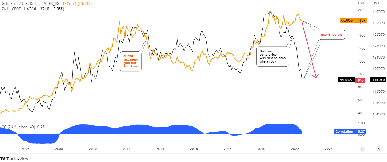
The gold price (orange) and the 10b price (futures, black) have a similar trajectory over the considered period since 2006. The blue sub-chart with the indicator of correlation confirms the strong link between these two trading instruments.
The price line of gold looks smooth compared to a volatile 10b line. The major peaks match with each other both during the previous peak in 2011 and the most recent top.
However, the area between peaks does not show the perfect correlation as the gold price continued to the downside from the earlier top while the 10b reversed to the upside in 2014. The top metal had led the drop that time.
This time, we see a strong divergence between assets. The 10b was first to drop like a rock as the inflation spiral only grows. The gap is already too big as the gold price stubbornly keeps under the all-time high. Time is ticking away for the yellow metal which should show a breakup of the major top to keep bullish, otherwise… just look where 10b is now.
The bond price has hit a low of around $114 this month, the level unseen since June 2009. At that time, the gold price had hit the low of $913. I marked the current corresponding level of gold at $910 with the red dotted line. This means that the top metal could lose half of its current price to dive below the valley of 2015 at $1,046.
Last year I had shown you the map of possible large leg 2 down to extend the correction in the wake-up call for gold. It is time to dust it off and update here.
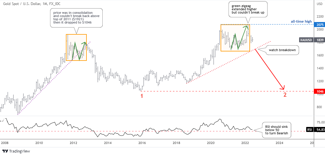
The right green zigzag inside of the right orange box extended higher than expected. However, it could not break the all-time high to repeat the pattern in the left orange box. The chance to continue to the upside is evaporating over time.
The drop below the red dotted support ($1,700) with the bearish confirmation from the RSI sinking under the 50 would open the way for the second large red leg to the downside. It could retest the 2015 low of $1,046.
In my previous gold update, I shared with you the bullish ascending triangle pattern spotted on the weekly chart.
The gold price did not progress to the upside within the pattern as it was supposed to. On the contrary, it almost fell out below the support of a triangle to challenge the validity of the pattern.
The RSI is still under the so-called “waterline” of 50. The collapse below $1,677 mark would totally invalidate the pattern.
The Fed could tighten its policy until it “breaks” the economy as there is a substantial lag between its action and the following effect on the economy. In the meantime, let us watch and see which of the gold triggers appear first – bullish or bearish.
Intelligent trades!
Aibek Burabayev
INO.com Contributor
Disclosure: This contributor has no positions in any stocks mentioned in this article. This article is the opinion of the contributor themselves. The above is a matter of opinion provided for general information purposes only and is not intended as investment advice. This contributor is not receiving compensation (other than from INO.com) for their opinion.
I think losing reserve currency status Ukraine war and the "Green Freaks" have altered the trojectory. Significant countries are boycotting the United States
Dear Mr.Downs,
Thank you for sharing your valuable thoughts.
It is not a “tomorrow” for sure, but this path is not impossible anymore.
The tightening cycle will support the dollar with a rising yield for some period of time.
Let’s live and see.
Have a good one,
Aibek
I think losing reserve currency status Ukraine war and the "Green Freaks" have altered the trojectory.
I definitely see the current correlation between gold and the 10-yr. However, here's a point worth considering. Correlations don't necessarily last forever and can even reverse entirely. e.g. gold and the dollar, despite their usual inverse correlation, can and have rallied together for significant periods.
Dear Kevin,
Thank you for sharing your valuable opinion.
I see your point and it has the confirmation in the first chart above during the period between 2016-2018 when the correlation between 10b and the gold has been fading.
Let’s live and see.
Best wishes, Aibek
Dear Frank,
I appreciate that you share your thoughts regularly on the Blog.
I agree that the Fed is having a hard time to handle the inflation.
Usually they end up undermining the economy and ruining the demand as a consequence.
Let’s hope that everything will be alright as life goes on.
Best regards,
Aibek
my personal opinion is to wonder what happens when the fed finds out that they cannot tame this inflation? The last relevant inflation in he 70s was just about oil; We just had and are having significant wage inflation with nobody around here able to get any help under $14 an hour, and with that my local starbucks and dunkin donuts are having a hard time keeping staffed and the doors open. Most of that may be priced in already but the food inflation coming will give us another round of it, and it will be worse than what we've seen so far.