Alphabet, Amazon and Apple All Have Something In Common

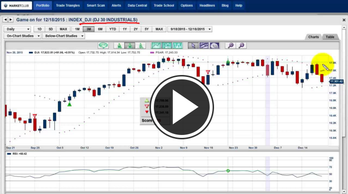
Hello MarketClub members everywhere. Well, here we are at the end of one extraordinary week for the equity markets. I don’t remember a week where we watched the major market indices rally so dramatically from a bearish position in just three days.

In today's post, I'm going to be looking at the big 3 A's, Alphabet, Amazon and Apple. What these three stocks have in common is that they are all in downtrends and they all formed a negative (bearish) engulfing line yesterday. Should any of these three stocks close lower today, they will confirm that the high on Thursday will be a formidable resistance area for these stocks to overcome in the future.

Alphabet Inc.(NASDAQ:GOOG)

Trade Triangles: Weekly red, Monthly red, overall trend is bearish, trend strength -85.

Daily Chart of Alphabet Inc.(NASDAQ:GOOG)

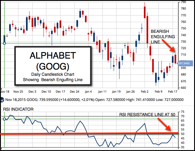
Alphabet has a negative trend at the moment even though it has been extraordinarily strong in the past several years. It's not to say that it's going to hell in a hand basket, but rather it will begin to reflect a slowing economy that is evident in both the retail and dining sector. I would view a close below $697.34 as a confirming signal that it has put in an interim top and is going to retest its recent lows. Continue reading "Alphabet, Amazon and Apple All Have Something In Common"

Yesterday Provided A Huge Clue To The Market

The market action yesterday in the major indices and many other markets has to be viewed as negative. The major indices all created what are called bearish engulfing patterns.

Bearish engulfing patterns occur when the market opens higher than the previous day's close and then closes below the low of the previous day. The main body of the candle totally engulfs the body of the previous candle. I will visually explain this phenomenon in today's video update. If you are interested in candlestick charts, I have a PDF titled, "17 Money Making Candlestick Formations." You can download the PDF here.

Should the indices closed lower than the close we saw on Thursday, it would confirm a top in the market and indicate further weakness.

I may be sounding like a broken record, but the reality is, December has turned out to be an extraordinarily volatile month. Historically, December tends to be choppy and volatile, but this year is proven to be the granddaddy of them all. Continue reading "Yesterday Provided A Huge Clue To The Market"

Candlestick Patterns – Kicking

If you follow our blog, then you are definitely familiar with trader Larry Levin, President of Trading Advantage LLC. We have gotten such a great response from some of his past posts that he has agreed to share one more of his favorite trading tips as a special treat to our viewers. Determining the direction of the market can be tricky and just plain confusing at times, but Larry’s expert opinion keeps it simple and straight-to-the-point.

If you like this article, Larry’s also agreed to give you free access to his award winning book.

I think it's time for another look at Japanese candlestick analysis. Let's take a closer look at kicking, widely considered a high reliability pattern in candlestick charts.

Kicking patterns are another reversal signal.

Kicking patterns on a candlestick chart are formed when there are two marubozu - one white and one black - with a gap between them. Bullish kicking patterns would present as a black or filled candlestick without any wicks (shadows) followed by a gap higher with a white or hollow candlestick that is also without wicks. These are marubozu. They are formed when the market has a particularly one-sided trading session that closes at the high or low leaving just that real body of the candlestick. Continue reading "Candlestick Patterns – Kicking"

Understanding Candlestick Charts

Today, we're going to be looking at classic Japanese candlestick charts. Candlestick charts were first used in Japan over two centuries ago by rice traders to chart rice prices. This system of charting has been around for a long time and can be valuable to traders everywhere. Japanese candlestick charts are now widely available on the web and in most software packages.

Candlestick charting shows, in a very visual way, a powerful picture of what's going on in the markets. Candlestick charts use individual lines that look like candles, hence the name, and are comprised of a real body and shadows. There are a number of formations that take place, both bullish and bearish, that can provide traders with valuable information.

I first discovered candlestick charting during a speaking engagement in the early 90s in Japan. Up until that time, I had used traditional Western bar charts and point and figure charts, which I also like. When I first saw a chart that had been drawn in candlesticks, I was immediately hooked, as I could see how candlestick charts show a visual image of what is going on in any market. In this tutorial on understanding candlestick charts, you will see some of the most powerful setups and learn all about the various candlestick formations and how you can use them successfully in various markets.

This short video shows you not only classic textbook examples, but also real world examples. I hope you find the video lesson interesting and of value to your own investment knowledge.

Every success using candlestick charts in the future,
Adam Hewison
President, INO.com
Co-Creator, MarketClub

Did Tesla Just Make A Classic Candlestick Bottom?

I first learned about candlestick charts when I was speaking in Tokyo on the US markets in the late 80's. I was immediately fascinated by this form of charting I had never seen before. It was similar, but so different from the way I was looking at regular Western charts.

What I like about the Japanese candlestick charts is the interesting names they have for them and the patterns that immediately tell you where the market opened and closed for the day.

At MarketClub, when you have a blue candlestick bar, it indicates the market opened lower for the day, then closed higher. When it's a red candlestick bar, it is just the reverse, indicating that the price opened higher, then closed lower for the day. This is very valuable information, information that you can use time and time again.

During my stay in Japan, I learned later that candlestick charting has been around for centuries and it was originally used to chart and track rice prices. Now, this same form of charting is used for practically every traded market in the world today.

Japanese candlestick charts differ from Western charts as they are much more visual and descriptive than Western charts. Besides the more advanced formations on candlestick charts, they also have such interesting names like "hanging man," "hammer," "dark-cloud cover" and "morning doji star." I could go on, but I think you get the picture. The names of these formations are very colorful. Continue reading "Did Tesla Just Make A Classic Candlestick Bottom?"