Updating The 3 Amigos And The Global Macro Message

This morning in pre-market the Amigos’ futures charts update the macro story…

global macro

…which goes something like this…

Copper, the cyclical Amigo (weekly chart) has furthered the intermediate trend line break we noted on October 25th. This is in line with the rally in US and global stock markets and even more so, the global macro reflation theme. It does not look so impressive yet on this weekly chart, but other components of the macro trade are starting to look impressive, especially on daily charts. So… steady as she goes. Continue reading "Updating The 3 Amigos And The Global Macro Message"

Silver & Gold To Inform Dr. Copper

They call copper the metal with the Ph.D. in Economics. But these days Doctor Copper is little more than a quack in that regard, taking a cue from the metals whose interplay will be critical to deciding the coming macro for 2020 and the run-up to the next US election. Thus, they are the 3 Metallic Amigos, riding together but providing different signals at different times (this being nftrh.com, you will have to put up with the odd shtick from time to time).

Silver Gold Copper

As we have noted repeatedly, the Silver/Gold ratio takes it place alongside other indicators (like long-term Treasury yields, yield curve, TIPs ratios, inflation breakevens, etc.) of a would-be inflationary environment. When silver (more cyclical, commodity-like characteristics) rises vs. gold (more counter-cyclical, liquidity haven characteristics) it is a hint toward an inflationary macro.

A daily chart of silver/gold shows a constructive ratio at yesterday’s close and this morning in pre-market silver is +2.77% while gold is +.77%. The implication could well be an end to the current bull flag consolidation at the moving averages and the next upturn in silver/gold, the miners and possibly the inflation/reflation trades that tend to follow. Continue reading "Silver & Gold To Inform Dr. Copper"

Copper Points At Weaker Economy?

Aibek Burabayev - INO.com Contributor - Metals


Reddish Metal Disagrees With GDP Readings

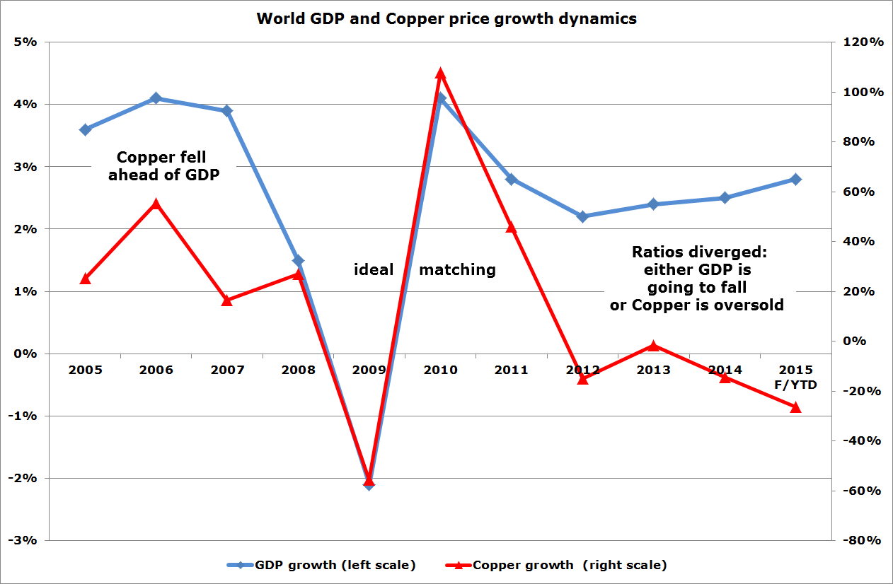
World GDP abd Copper Price Growth Dynamics
Chart: Aibek Burabayev; Data: World Bank, CME group

Copper is a core element of our everyday life and it will only grow to be even more important in our digital life as we strive for comfort. The diagram above shows it without saying a word.

The 10-year dynamics of the GDP and Copper growth had the same trajectory, at least until 2014 when the ratios diverged. In 2005-2007 the metal had fallen ahead of the GDP with a steeper curve in 2007 and then both indicators met in the collapse of 2008-2009. And then, amazingly, the ratios proceeded to keep together on the graph showing ideal matching from the bottom to the top in 2010. Continue reading "Copper Points At Weaker Economy?"