
Last week I showed you the chart where gold and silver were compared. The latter was in a worrisome lag behind the shining gold. I think most of us got tired to see if the white metal could update at least the top, that was hit last September amid gold striking one target after another reaching a 7-year maximum. Then I asked you to share your opinion as this alarming signal could be a double-edged sword. Below are your bets about it.
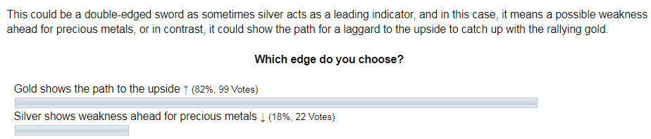
The majority picked the optimistic option of gold, leading the silver to the upside. The opposite came true last week as silver plummeted deep with a minus 14% off the week’s top dragging gold down; the latter lost almost an 8% off the weekly maximum. But before that, gold managed to reach target #4 at the start of last week!
What’s next for silver? Several scenarios could play out. I want to start with an optimistic one.
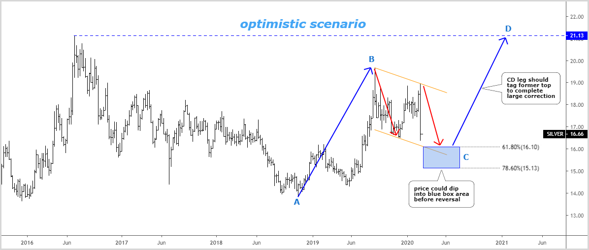
Chart courtesy of tradingview.com
This scenario goes in line with a map that I posted last October. One thing has changed since then – the structure of the consolidation (orange downtrend channel). The earlier chart was based on the simple corrective structure, that was seen in the first large leg to the upside in 2016. It means that the correction was thought to unfold entirely within the left red down arrow.
As we can see now there another leg down has appeared (right red down arrow). It is so sharp that it almost reached the downside of the orange channel in just one weekly bar. I put 61.8% and 78.6% Fibonacci retracement levels to show you the possible starting point for the next move up (blue CD segment). It was highlighted with a blue box. This area coincides with a downside of the orange channel, which shows the possible target for the second leg down.
The CD segment should tag the former top of $21.13 to complete this huge flat correction in silver. It could be a huge gain of more than 30%.
If you are skeptical about silver’s future, then the following scenarios will reaffirm it.
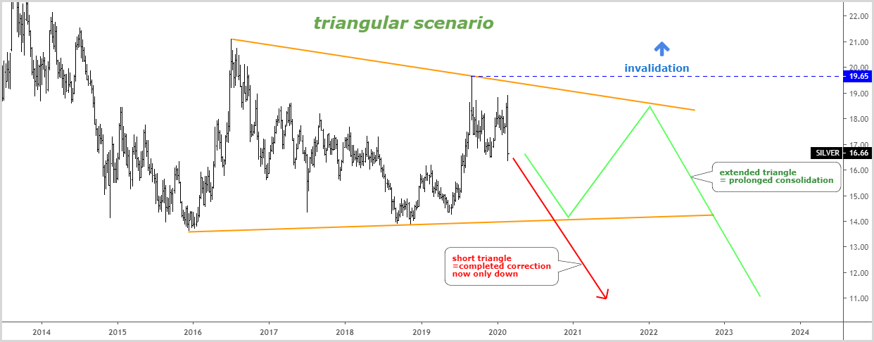
Chart courtesy of tradingview.com
This weekly chart above contains two options, which could unfold within a single geometric shape of possible triangular consolidation. It was contoured with two converging orange trend lines.
It was built through rising valleys and falling peaks to shape the contracting triangle.
The pessimistic option is highlighted with a red arrow, and it derives from the short triangle. It implies the end of the entire corrective structure with a peak established last September.
From that time, we are already in the continuation to the downside. This drop could reach an $11 area, but first of all, it should tag the recent low of $13.65 to complete the massive correction started in distant 2011.
There is also the possibility of an extended triangle, which means more time for the consolidation to unfold as it was shown with a green zigzag. A bounce-back will follow the drop into $14 area up to $18.50-19.00 before the market will continue to the downside.
The invalidation point is located above the September 2019 peak of $19.65.
Intelligent trades!
Aibek Burabayev
INO.com Contributor, Metals
Disclosure: This contributor has no positions in any stocks mentioned in this article. This article is the opinion of the contributor themselves. The above is a matter of opinion provided for general information purposes only and is not intended as investment advice. This contributor is not receiving compensation (other than from INO.com) for their opinion.