Gold, Silver, Gold/Silver Ratio & HUI

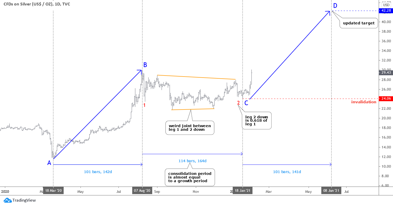
Precious metals are still locked down. With an understanding that there is always much more in play than nominal charts (the macro & sector fundamentals for example, which bounced of late but never did definitively flip positive), let’s review said nominal charts of gold, silver, and HUI along with an update of the Gold/Silver ratio for good measure.

Meanwhile, we will continue to update the full spectrum of considerations for a positive view of the precious metals complex, including gold’s standing vs. cyclical, risk-on markets/assets, the state of speculative vs. quality credit spreads, the inflationary backdrop (despite promotions to the contrary, cyclical inflation is not beneficial to the gold mining industry), the seasonal averages and the charts of the metals and miners over various time frames in NFTRH.

Gold

The daily chart shows the gold price (futures) below the moving averages but above short-term support after failing – amid much personally observed cheerleading to the contrary – to cross the bull gateway at 1920.

As a side note, the broken blue downtrend channel on this daily chart is actually the Handle to a large and bullish big picture Cup that only has one thing going against it that I can see; too much exposure by too many TAs, which of course means it may not be expressed until many of those TAs recant their stories (we have noted all along that the Handle can drop all the way to the 1500s without damaging the 2022 bullish Cup story. Indeed, if it were to happen (not predicting folks, but being prepared) it would be healthy. There is nothing healthier than a good running of the bugs before a major bull move. Continue reading "Gold, Silver, Gold/Silver Ratio & HUI"

The Rebels From Reddit Favor Silver

The internet is still one of the most revolutionary things invented. The new level of communication and coordination it gives us is just amazing. Hedge funds could not imagine a sudden coordinated attack that started as a post on Reddit could impact them so hard. The next market in their crosshairs? Silver!

The GameStop frenzy just let the dogs out. Lately, the retail investors from the famous Reddit chat Wallstreetbets started looking towards the iShares Silver Trust ETF (SLV) as they are looking forward to profiting from the same strategy of short squeeze earlier mastered on GameStop shares. They chose SLV ETF because its shares are backed with physical silver.

I prepared two silver charts to show you how the retail market force changed the structure and its outcomes.

Silver

There is an optimistic scenario depicted in the chart above. It implies the completion of the entire corrective structure. The red leg 2 down is considered to be done as it traveled only 0.618 of the red leg 1 distance. As you may remember, it is the Fibonacci ratio. The joint between legs 1 and 2 looks weird but is yet possible. Continue reading "The Rebels From Reddit Favor Silver"

Can The Silver Bugs Alter The Macro?

As to the post’s title, they sure are trying. Despite doubts that the stodgy old likes of me may have.

Silver

But for two days at least dem bugz is successfully battlin’ dem boyz on da COMEX. The result is that the Silver/Gold ratio (weekly futures chart) has been rammed to a new high for the post-crash move. If we back completely away from the #silversqueeze punchbowl, this is an indicator guiding the way for forward inflation.

silver gold ratio

So again, can the silver bugs alter the macro? Are the silver bugs altering the macro or is silver just doing what it has been technically capable of doing all along? Since well before #silversqueeze (a ‘me too!’ operation to the famous Reddit plays of late) was promoted by its originator, gold had been trending down vs. silver. Continue reading "Can The Silver Bugs Alter The Macro?"

Silver Is A Game Changer

Last month I shared with you “Three Options To Go” for silver price, namely “Optimistic”, “Pessimistic” and the sideways option called “Extended consolidation” on one chart. Below are your bets for each option.

Silver

Most of you chose the “Optimistic” option where silver should continue to the upside after completing the correction. It’s a rare case when the minority was right as the “Pessimistic” scenario played out the next week after the post. The metal’s price dropped into the abyss at $11.64, reaching the 11-year low in the price area of distant January 2009. I think this move surprised not only me, although I said that it could reach $11 area, but even those who clicked the right answer as it was so quick as price sank within a few weeks from $16.66 for 30%!!!

Silver just can’t stop surprising us as it suddenly changes from latency mode to explosion mode and back, again and again.

The interesting thing happened next Continue reading "Silver Is A Game Changer"

Are Silver & Gold Mirroring 1999 To 2011 Again?

Today, we are writing about a pattern that our research team sees in the Gold/Silver ratio which is correlated to the price movement of Gold. What does this mean and how can we profit from this setup? Let’s get started trying to explain this chart pattern/setup.

Gold/Silver Ratio Chart From A New Angle

This first chart highlights the pattern we have identified and how we believe a similar pattern is setting up again in the current market. The setup of the pattern is explained in the text below, but quickly scroll down and look at the first chart and the pink shaded areas “A” to get an idea of what we are talking about.

Prior To “A” Pattern Setup

After a moderate price decline in Gold (1996 through 2001), a bottom sets up as the price of Gold begins to base near support.

The Gold/Silver ratio (BLUE), falls throughout this pattern setup as both Gold and Silver prices decline somewhat in unison. Continue reading "Are Silver & Gold Mirroring 1999 To 2011 Again?"