
More than three years ago in my post titled, “Don't Get Trapped By Recent Dollar Weakness”, I shared with you a monthly chart of the dollar index (DX) futures with a map of large two-leg complex sideways consolidation. It was an experiment to try guessing the time target for the second blue leg to the upside based on the time it took second red leg to emerge.
Below is the updated chart with the same drawings enriched with the new highlights.
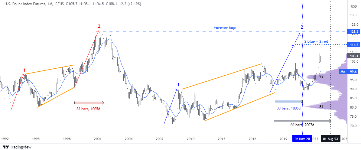
The time target was set on November 2020 when 33 bars in the second blue leg up emerge. The price had established the new top of $104 in March 2020 within those 33 bars. However, the minimum target of $114.2 on the price scale had not been reached and now 54 monthly bars appear on the chart.
If we divide 54 by 33 we will have the ratio of 1.64, which means the time period extended over the 1.618 Fibonacci ratio. This is a crucial time mark and last month the dollar index futures were really close to hitting the price target as it topped $109.1.
The next extension of doubling the time period with 66 bars to emerge falls on August 2023. It is enough time space for reaching both preset targets of $114.2 and $121.3.
I added two indicators on this updated chart. The purple one is the Volume Profile. It clearly has shown the strong barrier at the $98 level with the large volume traded there. When the price broke above that resistance, the speed of growth accelerated. It is the resistance being the strong support now. We should watch it closely in case the price drops there during correction.
The Simple Moving Average for the past year period is the blue line on the chart. It had accurately shown the reversal to the upside last year. The moving average confirms the support area of the Volume Profile indicator around $99.6 making it a double barrier for bears.
Three years ago the majority of readers misread the direction of the price as they bet on the drop of the dollar.
In the next chart, I could get a better visualization of the real interest rate comparison between countries and areas involved in the composition of the dollar index posted in June.
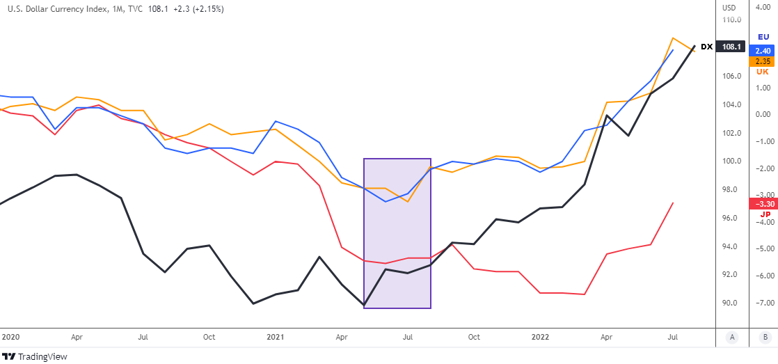
Now this chart above shows the real interest rate differential on the scale B: blue line for U.S. - Eurozone, orange line for U.S. – U.K. and the red line for U.S. – Japan.
I highlighted with the purple rectangle the area where the dollar index (black bold line) bottomed last year. It coincides with the valley of U.S. – Eurozone (the largest component of the DX) and the U.S. – U.K. (3rd largest component of DX) differentials around minus 3.3%. The following rapid growth of the dollar index was clearly supported by the rising gap of the real interest rates, which has scored over 5% change from the bottom.
Most of you were absolutely right voting for the ongoing superiority of the U.S. real interest rate over Eurozone and U.K.
The gap with Japan (2nd largest component of DX) has bottomed much later only this spring. Anyway, it has added to the narrowing from minus 6.7% to the current minus 3.3%.
We can see that the dollar index still has ammo to continue moving higher. The room over 2% is a huge buffer for the dollar’s domination.
Intelligent trades!
Aibek Burabayev
INO.com Contributor
Disclosure: This contributor has no positions in any stocks mentioned in this article. This article is the opinion of the contributor themselves. The above is a matter of opinion provided for general information purposes only and is not intended as investment advice. This contributor is not receiving compensation (other than from INO.com) for their opinion.
Hi
Hello, thanks for reading!