
The previous post “Golden Pattern For Silver, Not Gold” from December highlighted a bullish pattern called the 'Golden Cross' that appeared on the daily chart of silver futures. This occurred when the 50-day moving average crossed over the 200-day moving average.
While the majority of readers considered this signal to be reliable, they did not expect the price of the metal to rise above $30.
The following daily chart will show how the pattern has played out since then.
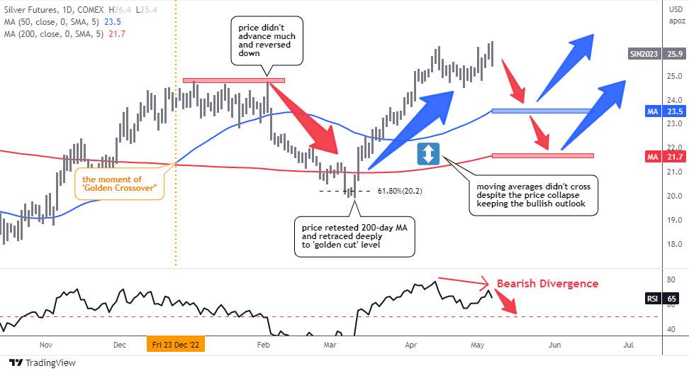
When the ‘Golden Cross’ signal was posted, the price of silver futures was at $23.9 (marked by the orange vertical line), and it went up almost $1 to reach $24.8 before stalling for over a month.
The price was unable to break above this new high and subsequently collapsed, dropping below the blue 50-day MA and testing the red line of the 200-day MA, briefly breaking through to reach the ‘golden cut’ Fibonacci retracement level of 61.8% at around $20.
Fortunately, the price rebounded strongly from this support level and crossed back over both moving averages to establish a new high of $26.4 last Friday.
If you had read the complete post, you would have been more prepared for the market movements described above. I spotted a Bearish Divergence on the RSI sub-chart and alerted about the possibility of a retest of both moving averages. As it turned out, this warning was spot on.
Ultimately, the price of silver saw a $2.5 or 10% increase from the time of the 'Golden Cross' signal to its most recent top, validating the reliability of the signal.
Nevertheless, the subsequent rise of only $0.9 (+3.8%) followed by a significant drop of $4 (-16.7%) to $19.9 could have been quite unnerving for even the most experienced traders. Therefore, I believe that this traditional signal should be viewed as a medium-term directional indicator rather than a prompt for immediate entry into the market.
The way the price moves in relation to the moving averages is particularly interesting. Specifically, when the price crosses above the blue 50-day MA, it can be considered a good tactical trigger for a bullish entry (or bearish stop), and vice versa. On the other hand, the slower red 200-day MA tends to act as a strong support or resistance level.
RSI divergence is a highly effective tool that I often use to warn readers in my posts, and it has a strong track record of accuracy. It proved successful once again in the recent price movement, as it allowed careful traders to protect 10% of their investment and avoid unnecessary stress.
Once again, a Bearish Divergence has appeared unexpectedly, indicating that the lower readings on the RSI sub-chart do not confirm the higher peak on the price chart. As a result, traders should brace themselves for a potential roller coaster ride.
It is difficult to predict how far the RSI divergence may push the price down, but the first support level is at the blue 50-day MA, which is currently around $23.5 (-9.7%). Additionally, in previous price action, the red 200-day MA was retested and is now located at $21.7 (-16.2%).
Intelligent trades!
Aibek Burabayev
INO.com Contributor
Disclosure: This contributor has no positions in any stocks mentioned in this article. This article is the opinion of the contributor themselves. The above is a matter of opinion provided for general information purposes only and is not intended as investment advice. This contributor is not receiving compensation (other than from INO.com) for their opinion.