
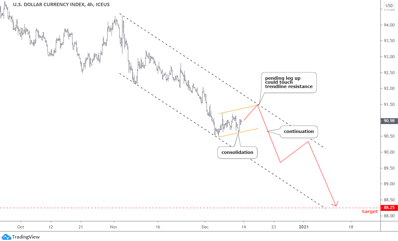
The bouncing U.S. dollar index (DXY) makes the game these days for the top metals, so I added its chart below to show you the possible path of the next move.

Most of you agreed with the map that I showed you a month ago. It indicated more downside for the DXY. On the 6th of January, the dollar established a new valley at 89.21, proving we were right. The price followed the red zigzag down and even the turning point set around 89.5.
The next move in that zigzag was shown to the upside, and the price obeyed that plan again, although it came later in the time scale. It already made the first leg to the north marked as blue A.B. segment in the zoomed 4-hour chart above. The DXY is currently building the B.C. junction as I am convinced that another leg up (blue CD) is coming.
The one minor leg down (red 1) and the counter-trend consolidation were completed out of the B.C. part. I think that another leg down to finish the whole B.C. piece should emerge next. It could tag the valley of red leg 1 at 89.92. The RSI could pull back to the "waterline" then.
After that, the blue CD segment could kick-off. The RSI should turn north as well. I set the blue box's target range between 91.4 and 91.8, where the CD part would vary between 1x and 1.272x of the A.B. segment. I extended that area to the left to show you where in the history we saw such a level before. It fell on the 30th of November, 2020. That day, gold established the former valley of $1765, and silver was around $22.
This time I added correlation sub-charts for gold and silver under the RSI. We can see there that the normal opposite correlation is back and silver is more inversely correlated with the DXY than gold these days.
Let's look at the metals charts below to find confirmations there. Gold is up next.
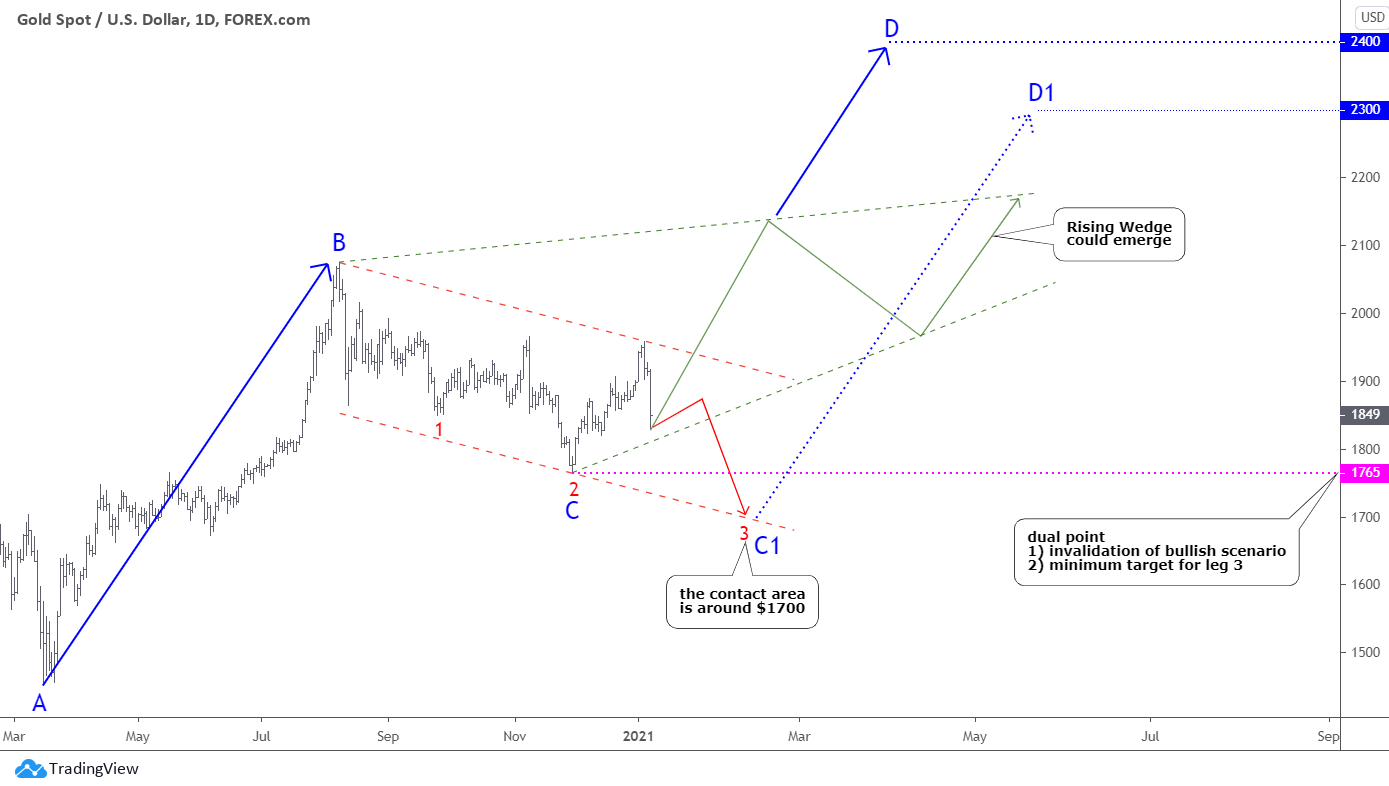
Your primary choice of the path was posted last week is surprising as you picked the mildly bullish green scenario of possible Rising Wedge pattern to emerge. It implies wide seesaw moves within the contracting to the upside pattern with the apex slightly higher than the former all-time high. It is quite difficult to trade this pattern as volatility could touch risk limits on either side.
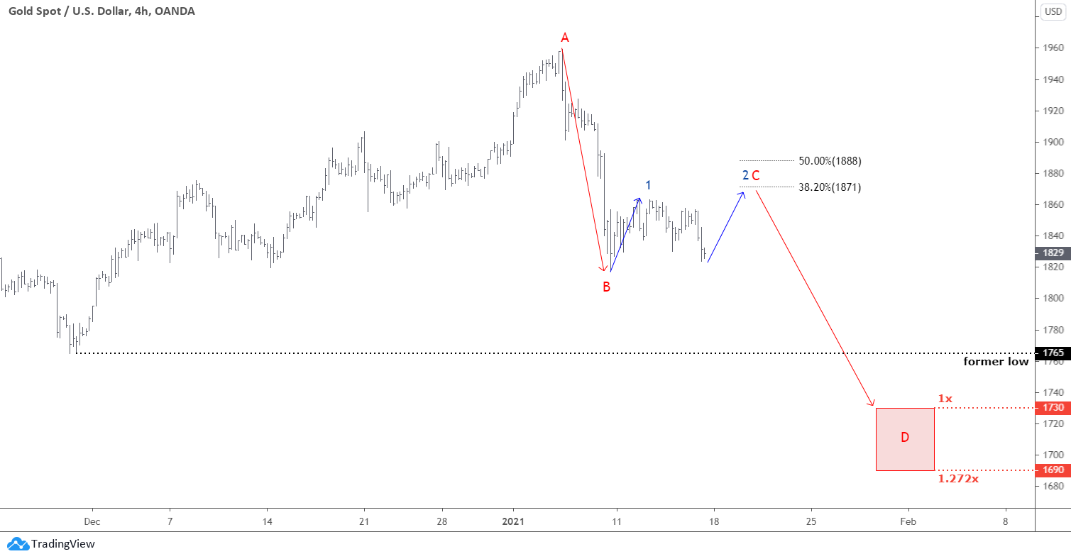
The next popular bet was the red path, which is zoomed in the 4-hour chart above. It sets the metal for another drop to tag the former valley of $1765 at least. Let me show you more details.
These Stocks Are Ready to Break Out
Over 5K stocks are trading on the U.S. and Canadian exchanges. While you may hear about the same companies over and over again, some of the biggest trading opportunities can come from "no-name" stocks.
See which stocks (some you may never have heard of) made it onto today's 50 top stocks ranked by their technical trend.
Firstly, we already have the first leg down marked as a red A.B. segment. It goes in line with the map shown in the DXY chart above but is mirrored. The same B.C. junction is currently underway, and the blue leg 1 and the following counter-trend consolidation could be over. The blue leg 2 is pending, and it could hit between 38.2% ($1871) and 50% (1888) Fibonacci retracement levels. The former is located in the area where leg 2 is equal to leg 1.
Another drop would build the red CD part. The red box shows the target area between $1730 and $1690 as CD could extend to 1.272x of the A.B. segment. It should be updated when we will get the C point established. Overall, it matches the target zone set using the other method as it sits on the downside of the red dashed channel posted before. The former valley of $1765 could offer strong support ahead.
The silver chart follows.
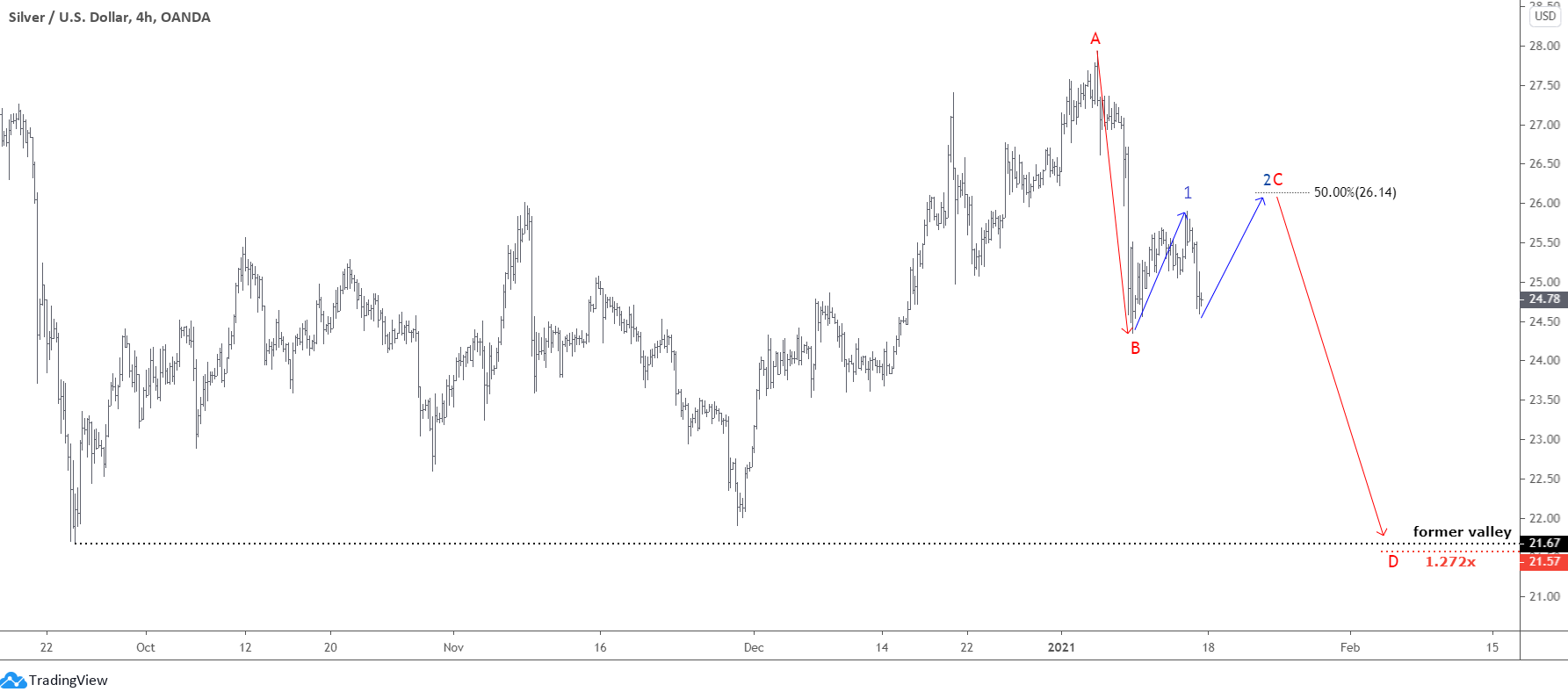
Odds split evenly between bullish and bearish views in the previous post. In the chart above, I showed how a bearish view with the target of $21.67 could play out.
The silver shows the same current structure as gold, and it mirrors the DXY graph. Although it built a more complicated consolidation phase between large two legs down, I had to squeeze the silver chart more than the gold graph to let the first large leg down with the crucial valley fit in the picture.
The blue leg 2 could reach the 50% Fibonacci retracement level around $26.14. The 38.2% is below the top of the blue leg 1, and I skipped it. The CD segment also has only one target level as the CD=AB area is above the crucial level of $21.67 of the former valley. It is located just 10₵ below at the 1.272x distance of the A.B. segment at $21.57.
Intelligent trades!
Aibek Burabayev
INO.com Contributor, Metals
Disclosure: This contributor has no positions in any stocks mentioned in this article. This article is the opinion of the contributor themselves. The above is a matter of opinion provided for general information purposes only and is not intended as investment advice. This contributor is not receiving compensation (other than from INO.com) for their opinion.