
It’s time to announce the result of the 5th Pendulum swing pushed this January. In that race, I put heating oil (ultimate futures winner in the second half of 2017) vs. wheat futures (the top loser). The Pendulum effect favored the top loser, i.e., wheat to beat heating oil in the six month period. The image below contains the poll results of your voting for that experiment.
Image 1. Poll results
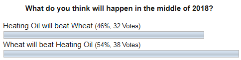
Chart courtesy of INO.com
Bingo! The majority of you guessed right choosing wheat as a winner and as you can see in the next chart that wheat has gained +17.56% as heating oil gained only +6.76. I would like to express my gratitude to those who chose the experiment success option for your trust! So after the first failure in the second half of 2017 (4th swing), the Pendulum experiment is back on a winning track! Let’s try it again and see what happens.
Chart 1. Half Year Futures Performance (First Half of 2018)
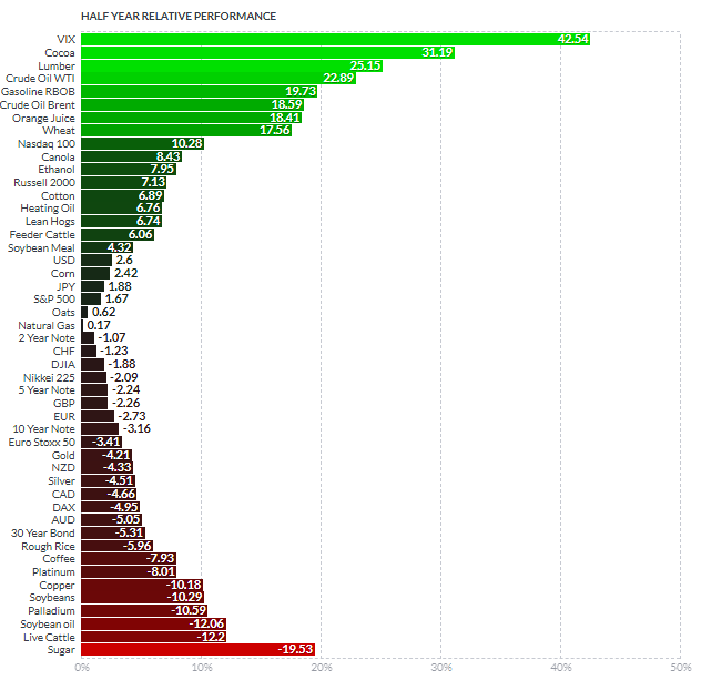
Chart courtesy of finviz.com
This time we will have an interesting race as the winner in the first half of 2018 is not a commodity, but the CBOE Volatility Index (VIX) also known as the stock market fear gauge. It gained more than 40%, leaving its rivals far behind amid the roller-coaster ride in the S&P 500.
On the other side, which is red, there is the biggest loser, sugar with an almost 20% loss in the first half of 2018. The supply glut in the sugar market undermined the price for this commodity significantly.
Let’s look into their charts before we try the Pendulum experiment once again.
Chart 2. VIX Weekly: Discovering Historical Similarities

Chart courtesy of tradingview.com
As I said earlier the CBOE Volatility Index (VIX) is different as it’s not a commodity and you can see that its chart looks more like a heart pulse diagram rather than a financial instrument’s chart. The volatility spikes are the reason for this weird type of the graph as strong market moves are followed by consolidations when the volatility calms down. You could call it a “binary code” of the stock market.
In this type of chart, I decided to lean on the historical similarities as human psychology is unchanged, although it has yet to be mastered and market phases just change each other.
Firstly, I focused on the VIX spikes to see what has happened next. After that, I highlighted the vertical line the current instrument’s position on the chart regarding time passed from the top (20 weeks have passed) in red. Then I moved to the left on the chart to the earlier big spike and added 20 weeks to the corresponding historical position highlighting it with the blue vertical line.
At the end of the chart, I copied the trajectory of the following moves in the past to the current position with the red descending zigzag. It implies the moderate growth of the CBOE Volatility Index (VIX) and then a huge drop to the 6-8 area. I added the auxiliary black downtrend channel built through the lows, and it perfectly fits with the red zigzag extension. Let’s see if this is just a mere coincidence or an additional confirmation.
The chart projects that the Pendulum could smash today’s winner.
Chart 3. Sugar Weekly: Breakout In The Making
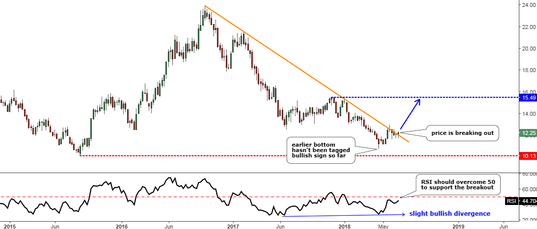
Chart courtesy of tradingview.com
The sugar was knocked down in 2016 from a $24 peak down to the $10+ area in around two years. The chart structure is just beautiful as all market stages can be seen clearly. We have a downward move at the end of 2016 and then the correction at the start of 2017, after that there was another huge drop followed by a larger consolidation at the end of 2017.
This year the last move down couldn’t tag the earlier bottom at $10.13 (2015), and it means that despite all punches there is still no knockout yet for sugar. Besides that, there is a slight bullish divergence in the RSI indicator, although it is hardly visible but still present.
At the end of the May sugar attempted to break out above the orange resistance line but failed. After a short pause, it tried again, and you can see that the candle has closed above the resistance line. This is a good sign. The final confirmation would be when the RSI breaks above 50 to support the strong move up to hit the earlier top of $15.49.
Odds from the charts favor the success of another Pendulum experiment and what do you think?
Intelligent trades!
Aibek Burabayev
INO.com Contributor, Metals
Disclosure: This contributor has no positions in any stocks mentioned in this article. This article is the opinion of the contributor themselves. The above is a matter of opinion provided for general information purposes only and is not intended as investment advice. This contributor is not receiving compensation (other than from INO.com) for their opinion.