
Life is full of surprises as we never know what could happen next, and it is the true phenomenon of our existence. Last time I shared my thoughts about the U.S. 10-year yield (10Y) in September of 2018 calling for a rise to 3.33% and more. JPMorgan Chase CEO Jamie Dimon warned that time to be prepared for a 5% 10-year yield. Let’s take a look a what you thought then.
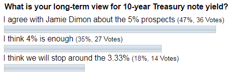
Most of you agreed with JPM’s CEO and hit the 5% option. The atmosphere then was so elevated that it was easy to believe that the rates would keep rising. Indeed, the market went higher but stopped at the 3.26% mark, and that was it. The least favored target of 3.33% appeared to be the closest call.
The precious metals’ posts schedule was busy here on the blog at the end of last year, so I posted my call at tradingview.com for 10-year yield to drop to tag the previous low of 1.34% on November 14th of 2019. Below is the chart of that post.
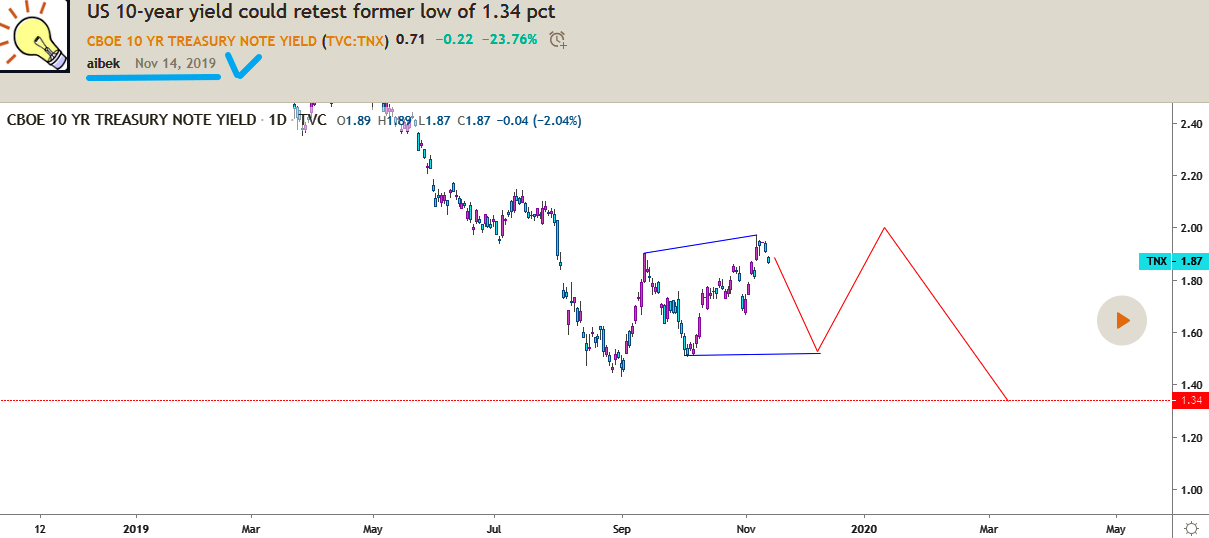
Chart courtesy of tradingview.com
The idea was based on the chart structure that implied the extended consolidation (red zigzag) for 10-year yield within a 1.50-2.00% range. The yield was at 1.87% then.
Below is the chart showing the actual path for the 10Y to compare with the call.
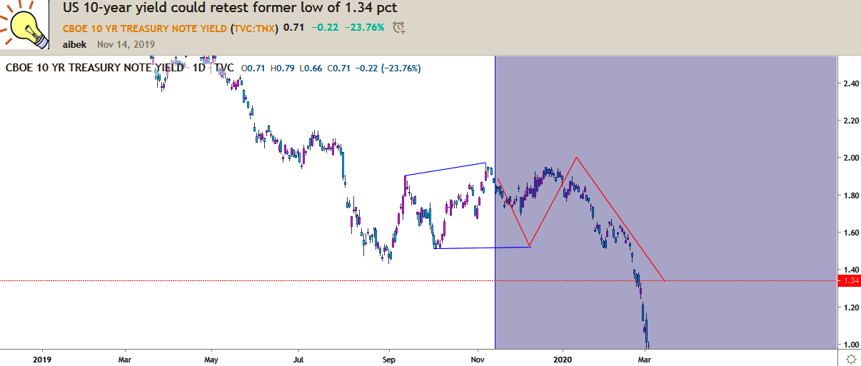
Chart courtesy of tradingview.com
As we can see from the chart above, the idea of the call highlighted with a red zigzag played out (purple side) as forecasted, although the actual range of a see-saw move was narrower. The target was reached as the yield crossed the target area of 1.34% last month.
It was unbelievable when the call was made, but the knowledge of the structure gives the vision of what could happen next based on historical patterns that we meet every time.
Let me update the long-term graph for you as the yield dropped into uncharted territory.
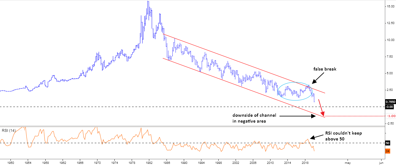
Chart source: stooq.com
This is a quarterly chart of the 10-year yield. I highlighted with the blue ellipse the area where the large consolidation had emerged. It pierced the long-term downtrend channel briefly at the end of 2018 upon completion. It was a false break as the yield has collapsed since then breaking below the former valley of 1.34% into a new record low area.
The RSI indicator moved with the price to make an inverse V-shape above the crucial 50 level first, and then it followed the trend down into the bearish territory. One could notice that in the past, this indicator showed quite accurately the overall trend as its reading kept below 50 since it dipped below it in 1985. There were many attempts to climb above that limit, but all were just corrective pullbacks as subsequent major peaks never overlapped the preceding major tops. So, watch the RSI for further clues as I update on 10Y rarely.
The downside of the red channel could act as a target around minus 1% as yield didn’t touch the bottom of the trend since 2003. It looks quite possible as the angle of the current move down is sharp enough to tag it. The Fed then could join the negative interest rate club of several European central banks and Japanese central bank to support the weakening economy wounded with trade wars and coronavirus.
The major reversal point is now too far to be triggered as it is located above 3.26%, where the previous major consolidation had topped early.
Intelligent trades!
Aibek Burabayev
INO.com Contributor, Metals
Disclosure: This contributor has no positions in any stocks mentioned in this article. This article is the opinion of the contributor themselves. The above is a matter of opinion provided for general information purposes only and is not intended as investment advice. This contributor is not receiving compensation (other than from INO.com) for their opinion.
There are three situations can be happened for any financial instrument, viz. Up, Down or Flat or side way, I think, you have analysed this matter in a single direction, Down, More Down or Even more Down, and thus, you have given just one way probabilities. However, you must, and you should even think about the other sided or optional possibilities too for this study.
According to my view,Yields are just at there "All Time Low Level" so probability of further decrease is far more less then the probability of "Turn-Around" from this lower level, so now on wards, If, and when any panic sell taken place in secondary market, ( one can assume who will may take such actions?, and why? ) Yield will be start it's upward journey.
Considering present situation of Financial Sector, Yields stood at or near to fragile zone,sharp and sudden upward reversal from this level is quite possible, and constant Fall, which has taken multi years to reach at this level may wipe out within very short duration.
And finally, I will not surprised to find Yields again in the range of 2% to 5% initially, and there after, may go up and up, even crossing it's past "All time High" and may settle above that mark too.
If you think it will drop into negative territory from here, then you don't know anything about math. As long as these bonds (which are in the secondary market) pay ANYTHING, you can't have a negative yield. The negative yield would need to come on newly auctioned Treasury issues. Which may happen. But we aren't getting there in the secondary market. It seems as though the author wants a pay on the back for tracing some lines on a computer screen. Given that he's using a well-worn wave theory, there's nothing remarkable about that. What is more remarkable is that bonds that pay less than a half percent for those who buy them at these prices in the secondary market are being seen as 'safe'. The whole point of this exercise is to demonstrate that there is no safety. At some point the government will step in and 'offer' to run all the retirement accounts, etc.
I don't think it will drop anymore you never know what rilly Going to happen. Anything could come about.