
I appreciate active readers of the Blog for leaving valuable comments on Gold and Silver posts. Recently, there have been a lot of thoughts shared not only about the metals itself but also about its relationship reflected in the dynamics of the Gold/Silver ratio. I think it’s time to talk about it in this post. Please feel free to enrich this piece with your valuable thoughts in the comments section.
Back in December 2014, I shared only the third post here on the Blog. The title was more appropriate for a science fiction novel as it promised the “journey to the Moon” for the Gold/Silver ratio as it was going to hit the 109 ounces. Below is that very chart from the distant 2014 to refresh the memory.
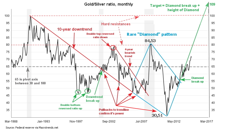
The idea was based on the “Diamond” pattern spotted on the monthly chart (blue). The target was reached more than five years later on the 16th of March this year. The total gain is equal to 109 - 72 = 37 troy ounces of silver per troy ounce of gold or 51% in five years.
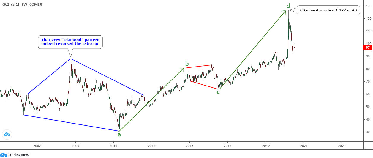
Let’s see in the weekly chart below the ratio dynamics after that post.
The price indeed never dipped below the level that was established at 59 ounces on the completion of the pattern since the idea was posted in December 2014. “Diamond” (blue) reversed the ratio to the upside, and it finally reached the long-term target of 109 ounces, and even overlapped it with a huge margin as it peaked at 127 ounces.
I spotted two segments (green ab/cd) within that move up since 2011. The expanded consolidation (red) between segments was shaped from 2014 till 2016. The cd segment almost reached the 1.272 x ab segment as the market exalted on the peak when silver suddenly broke below a multi-year minimum.
The move-up has reached the minimum target, what’s next? To address this question, I searched for the answer on the very long-term chart below, let’s have a look at it.
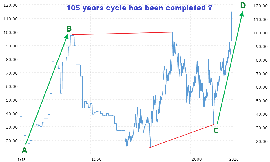
Chart courtesy of macrotrends.net
The maximum period that I found is the current chart above, showing 105 years of Gold/Silver ratio dynamics. I spotted there a very familiar chart structure with the same AB/CD segments that we got on the previous weekly chart, but this time it’s just giant. Almost every swing of it took more than 20 years to unfold.
The AB segment was built from 1919 at 18 ounces till 1940 at 97 ounces with a size of 21 years and 79 ounces. Then the vast consolidation emerged from 1940 till 2011, reaching the low of 32 ounces. It had two legs, which took long 71 years. Just imagine, it’s an average life expectancy! It was a true roller-coaster as the ratio had been moving between 100 ounces and 16 ounces back and forth. The final stage was robust and sharp as the CD segment reached the same distance as the AB segment just in 9 years. Moreover, it overlapped the former by 3 oz. (I took close-only price as no high/low data for the first historical period).
So, we reached the minimum targets both on the weekly and the long-term chart. What is next? I prepared another chart below to try to find the answer.
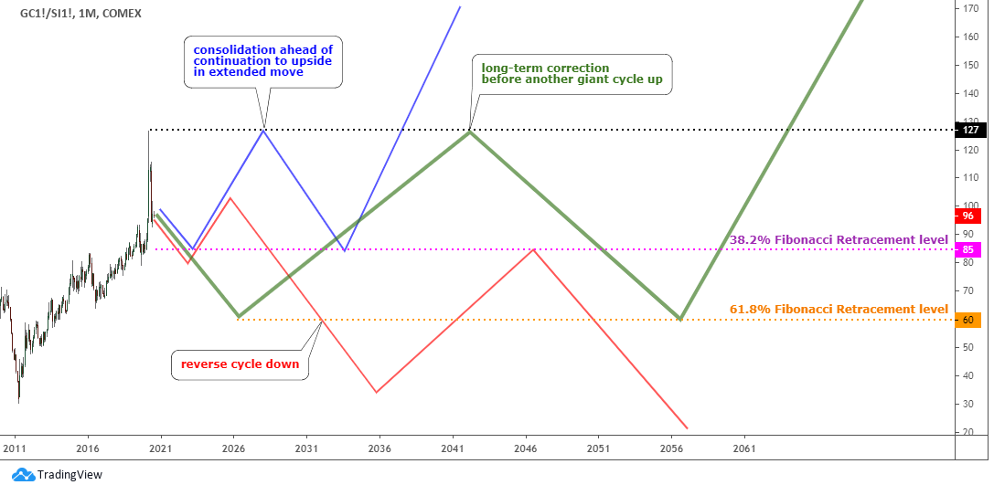
There are 3 possible ways I see for the ratio from now. It answers 3 main questions. Let’s start with the obvious one.
The first question is - did we reach the top? The top guessing and bottom picking are tricky. So, that’s why I put the blue option on the chart, which shows the path for a possible consolidation ahead of a continuation to the upside within an extended move up as the CD segment could reach 1.618 or even make a double of the AB segment. The 38.2% Fibonacci retracement level (pink) at 85 oz. should provide support for the consolidation.
The red option answers the next question positively, if we topped, then should we start the reverse cycle to the downside? In that case, we could see the mirrored move in the opposite direction.
And lastly, the technical question – we saw the AB/CD segments on the weekly and a long-term chart, what if we switch to even larger time frame? The answer could be that we have a nested move up, and the 105-year chart depicted only the breakdown of an even larger AB segment. The bold green zigzag proposes another huge consolidation before the ratio will resume to the sky. The 61.8% Fibonacci retracement level (pink) at 60 ounces might limit that big consolidation.
This is the quiz without a deadline as it could take another 105 years to get the answer, but please share your votes and comments below to leave a digital footprint for future generations.
Why is gold preferred to silver? In several posts before, I showed you that gold is a central banks’ favorite, while silver is a choice of retail investors. Who does print the money and hoards the cash? The central banks and the largest commercial/investment banks/corporations. The current geopolitical situation is tense as trade wars, and territorial disputes intensify. The COVID-19 and the subsequent money printing increased the bid for gold. The multi-polar world could be around the corner. Then gold would be the only link between currency unions as we see how emerging nations aim to drop the US dollar and put their assets into gold. The growing inequality means more gold for rich as poor people can’t buy even a fraction of silver. And lastly, let’s keep it simple, nowadays it will take 100 times less space to keep gold than silver with side costs not mentioned. It’s just more comfortable to deal with the yellow metal.
Intelligent trades!
Aibek Burabayev
INO.com Contributor, Metals
Disclosure: This contributor has no positions in any stocks mentioned in this article. This article is the opinion of the contributor themselves. The above is a matter of opinion provided for general information purposes only and is not intended as investment advice. This contributor is not receiving compensation (other than from INO.com) for their opinion.
I voted and still vote for the green scenario.
A big factor in my vote is the lack of precise data on the Macrotrends 100-year Xau/Xag chart.
I mean, look at the most recent peak (4 months ago) which we all know hit 128 approx., but on the Macrotrends chart it figures as around 115.
Then look at the peak around 1990 - on the Macrotrends chart it looks like it hit 100 precisely and then retraced but the true momentary peak must have been higher ...I only use free-of-charge charts and the best I have found are the Netdania charts which however only go back to 1995. If you have better charts then you will be able to tell us where the Xau/Xag value peaked precisely around 1990.
Then the 1940 peak:. The data is totally insufficient ! Trading was slower, much slower in those days and the recorded data even slower, I suppose. The peak on the chart does not even look like a peak, it is a plateau. So where, at what value, did it actually peak in 1940 or would it have peaked if there had been the same second-by-second trading as nowadays ?
So we must NOT see the 1940 peak as a value of 98 ! It would/could easily have peaked at 120 or even the very same 128 we saw 4 months ago !
If you see the 100-year chart in this new way, then the most recent peak at 128 corresponds to the peaks in 1940 and 1990 and thus the pattern is simply oscillation, decade-long oscillations between peaks and troughs at approx. 125 and approx. 15.
The interval between the two troughs at 15 is very roughly 60 years taking us to a new trough at 15 in ....as soon as approx. 2040 😉
I have been following Ino.Blog for many years now and you guys have taught me a lot. This is the first time I have felt compelled to comment as for the first time I think there is something you might have overlooked.
Ah, also ... the 2011 trough at approx. 30 did not occur because silver was in extremely high demand as a commodity or raw material but I understood it as happening because the masses were beginning to understand what if FIAT currencies fail, what if the banking system truly fails ? Then yes, gold will be the new "500 Euro note" or "1000 CHF note", but what about the smaller everyday transactions of the masses ? Surely silver must step into that gap. Please correct me if I am mistaken about the psychology behind the 2011 run on silver.
Similar reasonings and enotions might bring down the Xau/Xag value in the coming years. Alos: Private posession of physical gold might be made illegal by governments .... what would that do to the Xau/Xag ratio ?
I think, things are getting quite changed, therefore, in past we never thought about negative trading value of Crude Oil, but ultimately it happened, so just alike, many classical study equations like "Gold Silver Ratio" may loose their relevance, and we required to change our study point of view and methodology accordingly.
Hello Aibek, where do you think the silver price will be year end?
Dear Ray,
The silver reached the short term target recently around $19. The next move should be a retracement. Then the next move up could start. It is hard to guess the price level by the year end especially on the silver chart as it has quite sharp moves on it. Let me try it for you, Ray. If price will build both anticipated legs up by the end of the summer - start of the fall, then the price of silver will start to drop and then it could be lower than now, probably between $13 and $16. Stay tuned as I will update on both gold & silver regularly
Best regards, Aibek
I don't think the gold vs silver ratio matters any more. In the 1950's the US was still using solid silver for mass produced coins, quarters and dollars. No more. In the 1950's, industrial uses of silver was limited. Now the use of silver on high speed electronics, batteries, and solar panels, and more is far more wide spread.
Meanwhile, the US moved off the gold standard on the US Dollar in 1971. Gold is now used as storehouse of wealth by governments and gold funds like the GLD exchange traded funds; it's also popular in jewelry.
On the other hand silver is used as a storehouse of wealth mainly by doomsday preppers, not governments, and not used in large amounts in modern coinage. Silver is used in jewelry, but many avoid it because it quickly tarnishes and turns black. Solid silver tableware is a thing of the past; whereas in the 1950's most middle-class families had a set. So really, you just have the industrial use of silver driving the price.
If so much has changed with precious metals use since 1971, what good is a chart that goes back 105 years?
I contend that while there some correlation between the two, the long exalted ratio is no longer relevant.
E.O.
Dear Ed,
Thank you very much for an extended and valuable comment. It really adds to 360 degrees view.
I used 105 years view to find out what structure unfolded and as you can see it was spotted there as default monthly charts goes back only to 1970s, which would bring us to different outlook.
This ratio reflects the investors’ preference. Both metals are exchange traded and quite often act as a leading price movement indicator for each other especially in the short term as bargain hunters watch the ratio closely detecting market distortions for own benefit.
Best regards, Aibek
What good is your analysis if you can never make any predictions based on it....only options which are extremely diverse?
Excellent remark
David shows his desperation.Do not want to use his discretion.
Dear Mr.Cooper,
This post was aimed to build a new map for the ratio as it reached the target set before...as predicted and even overlapped it.
It is crucial first to build the map with possible options and then eliminate one by one as we did on both gold and silver. Please check the link for gold https://www.ino.com/blog/2020/03/gold-update-thats-it/ where I reviewed the full story of the current gold rise in my posts for several years from the reversal to the peak. At the start we got three options for gold and then eliminated all inappropriate until only one valid path remained.
Best regards, Aibek