
It is good to see a Head and Shoulders pattern in the making and to see it in the final stage is great luck. Fortunately, I spotted one such pattern in the chart of the Tesla (NASDAQ:TSLA)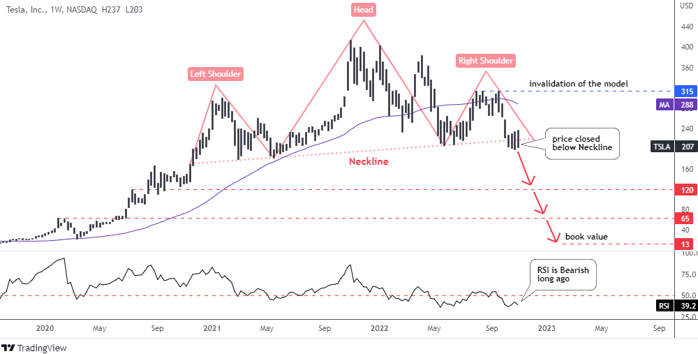
The stock price of Tesla has been trading in a big range between $180 and $414 after it managed to break above the Y2020 top of $167. Peak points were distributed unevenly as we can see the lower tops on both sides of the all-time high. This has shaped a notorious Head and Shoulders pattern on the weekly chart.
We saw this model in the Ethereum and AMD charts this year.
The model is clear; it has slightly up-sloping angle as the Right Shoulder is located higher than the Left Shoulder. A Neckline has been built through the valleys of the Head. The stock price has been hovering here for some time.
Last week, the market closed below the Neckline triggering the bearish signal.
The target of this pattern is located in the negative numbers area so I skipped it. Instead, I highlighted three potential supports that could stop the upcoming collapse.
The first support is located at the peak of August 2020 at $120. It was broken to the upside and then it was retested by a huge consolidation.
The next support comes from the top of February 2020 at $65. The price has been struggling to overcome it for a long time. The book value level of $13 is the ultimate support based on fundamental data.
The RSI has been bearish for a long time, before the pattern was triggered to the downside.
The invalidation level of this annihilation pattern for Tesla stock is located at the top of the Right Shoulder of $315.
Apple (NASDAQ:AAPL) is the next “Falling Knife”.
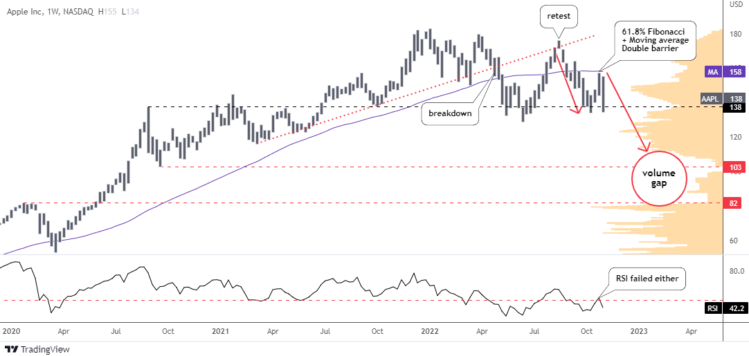
Last time I examined the Apple chart for you a year ago. It was a warning alert as I thought the stock price had been near the top. I set the bearish trigger on the red dotted vertical support.
The price action in the chart is so precise, it could be added as a sample to the textbook. Indeed, AAPL spiked to $183 and then collapsed right to that support.
It was broken later, after another smaller bounce this April. The classic throwback to the broken support followed the breakdown to retest it. Afterwards, the collapse resumed and it reached the horizontal support based on the top of 2020 at $138. That drop was highlighted with the left red down arrow.
The price bounced off the black support to nearly hit the double barrier of 61.8% Fibonacci retracement and the purple moving average around $160. The failure there hammered the price back down to the black support.
The RSI failed to overcome the crucial 50 level as it collapsed in-sync with the price.
The right red down arrow shows the path for the second leg down. The price should drill down through a large volume area first to hit the equal distance of the first drop as it is located at $117.
There are two supports highlighted in red in the chart. The nearest one is set at $103 (September 2020 valley). The price would travel 1.272x of the first leg down there. It is located in the volume gap area that starts at $110 and finishes at $80, where the next support (January 2020 top) is located. That is also a next target as 1.618x distance falls there.
Only the breakup of the double barrier beyond $160 could change this bearish outlook.
Intelligent trades!
Aibek Burabayev
INO.com Contributor
Disclosure: This contributor has no positions in any stocks mentioned in this article. This article is the opinion of the contributor themselves. The above is a matter of opinion provided for general information purposes only and is not intended as investment advice. This contributor is not receiving compensation (other than from INO.com) for their opinion.