
Some of our regular readers kindly shared their opinion about the gold market correlation with other instruments in the comments section under my previous post. I think it could be interesting for all of us to see what is going on there if we check the correlation between gold and other instruments.
I prepared the visualization of it for you below. The dollar index and the 5-year TIPS (Treasury Inflation-Protected Securities) were named in the comments, and I will add two other top instruments, so please stay tuned.
Let’s start with the Dollar Index (DXY).
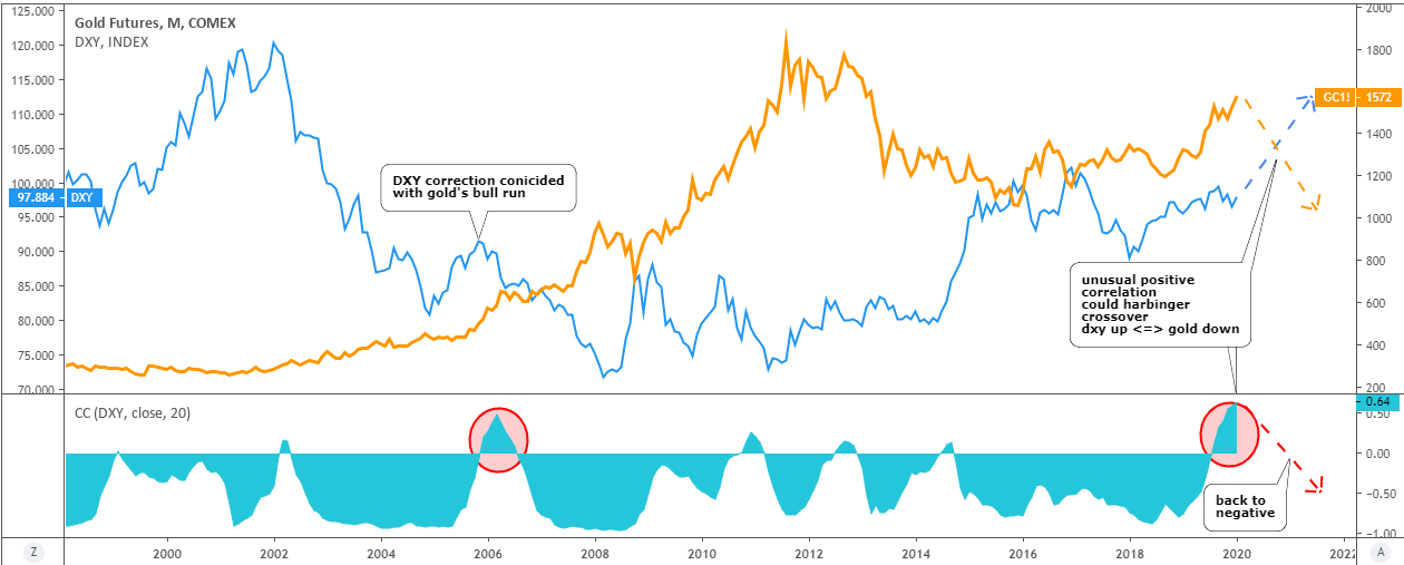
DXY: blue, left scale / Gold: orange, right scale / Correlation coefficient: turquoise, sub-chart - Chart courtesy of tradingview.com
For more than 20 years, these two instruments were mostly in a negative/mirrored correlation. It just changes from extremely negative to zero correlation with rare spikes into positive territory.
In the period between 2004 and 2006, there was a visible abnormal positive correlation (highlighted with a red ellipse), which reached the extreme 0.50 mark. If we would look at the price chart above, we can find that this has been just a coincidence of a corrective phase in DXY when it bounced higher on its way down with a Bull Run on the gold market. This outstanding positive correlation period was short-lived, and further, we can see how it turned negative again.
These days the situation is even more abnormal as the correlation coefficient beats the above mentioned extreme level to hit 0.64 closer to absolute correlation. This time it can be explained with the match of the corrective phase of the gold market with the strengthening US dollar. To return to regularity, we can see how the prices of these instruments would crossover, but this time on contrary to 2004-2006 situation, the gold could resume to the downside and the dollar would break higher to overcome 100.
If we talk about general overview, then the reader pointing at the negative correlation between gold and the dollar was right, but these days those two are moving in the same direction due to counter-trend move in gold. So be careful.
Let’s move to the 5-Y TIPS
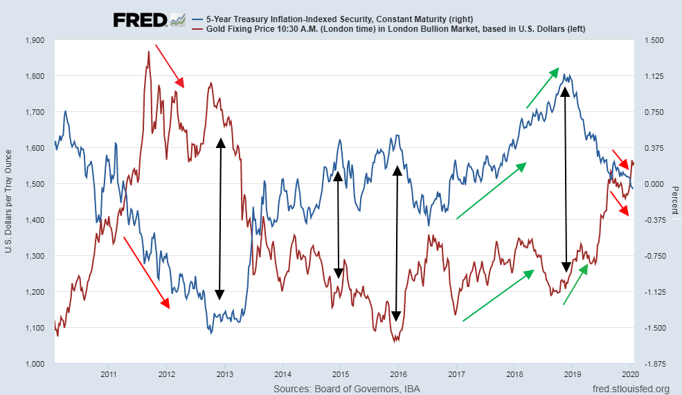
Before I highlighted specific periods with arrows, I thought these two instruments have a surprising negative correlation. Now I doubt it as we can see the prolonged periods of positive correlation on the chart above marked with the same colored arrows (2011-2012, 2017-2018, 2019). In the second half of last year, the positive was quite strong (red arrows) until it was interrupted by a Santa Claus Gold Rally, which crossed over the 5Y TIPS line.
It is safe to say about the strong correlation between these two instruments only during the periods of extreme moves as I highlighted with black double arrows. We could count at least 5 such periods on the chart above for the past 10 years.
The next is the Japanese Yen.
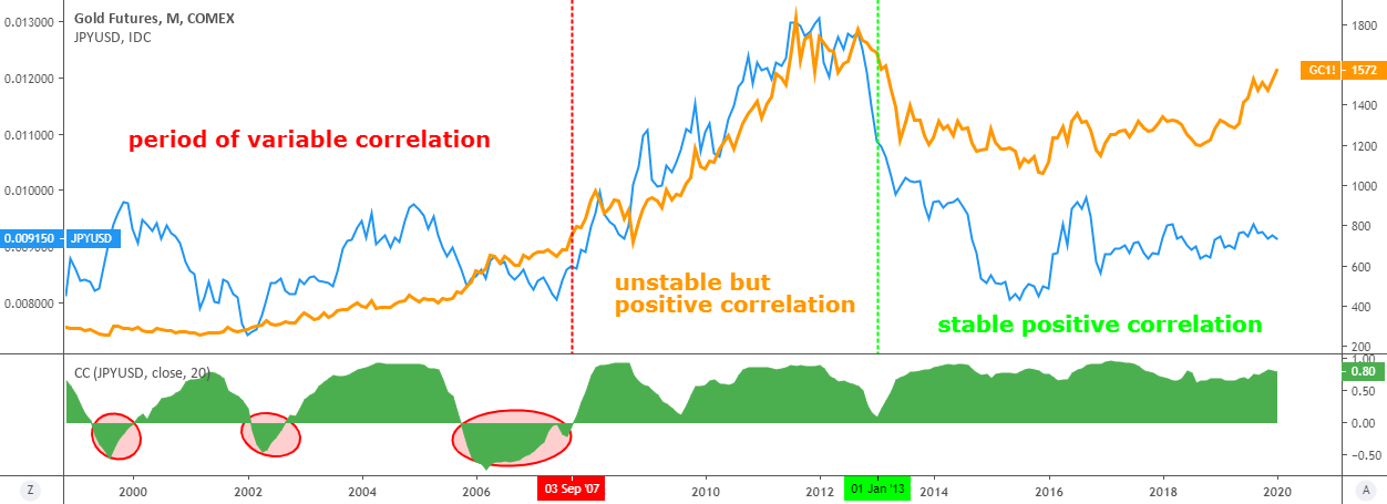
JPY/USD: blue, left scale / Gold: orange, right scale / Correlation coefficient: green, sub-chart - Chart courtesy of tradingview.com
I know some traders use the positive correlation between the gold and the Japanese yen. These instruments are considered to be safe havens during market turmoil. For the past 20 years, I highlighted 3 periods of correlations between these instruments. The red is the period of variable correlation when the gold and the yen could move in the opposite direction as a correlation coefficient looks like a roller coaster moving up and down across the zero line from 1999 to 2007.
After that, there is a period of unstable but positive correlation (orange) between 2007 and 2013. Both gold and the yen reached record highs against the dollar simultaneously, but the yen was more volatile.
Last 7 years those two instruments spent in harmony as the correlation coefficient kept almost at the absolute correlation level for a long time. This period was highlighted as a stable positive correlation (green).
The last one is the S&P 500.
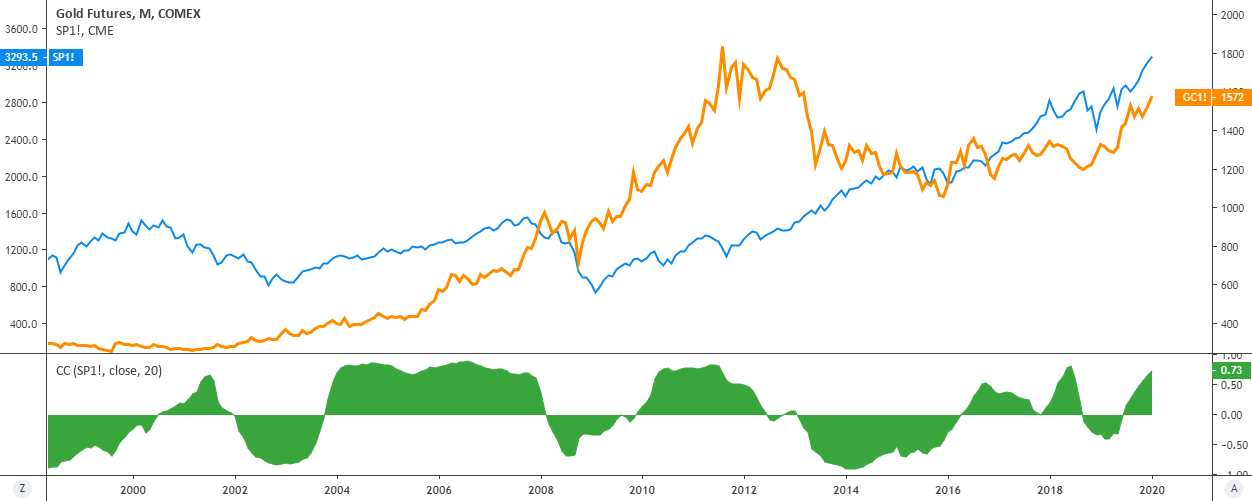
S&P 500 futures: blue, left scale / Gold: orange, right scale / Correlation coefficient: green, sub-chart - Chart courtesy of tradingview.com
I think you heard how some traders say “fly to safety” (buy gold, for example) or “fly to quality” (buy stocks for instance). Quite often, they use it to describe the situation when money flows out of the S&P 500 futures (quality) into gold (safety) and back depending on the situation. The chart above shows what has happened during the last 20 years in terms of correlation.
This is a true roller-coaster of correlation between gold and index futures - negative correlation changes to positive crossing the zero line back and forth. During the last 4 years, the positive correlation persists with a current level at 0.73 steaming to the absolute correlation. So the above mention sayings of money flying between these two instruments are not so safe these days.
Intelligent trades!
Aibek Burabayev
INO.com Contributor, Metals
Disclosure: This contributor has no positions in any stocks mentioned in this article. This article is the opinion of the contributor themselves. The above is a matter of opinion provided for general information purposes only and is not intended as investment advice. This contributor is not receiving compensation (other than from INO.com) for their opinion.