Using Ratio Charts to Gain an Edge

Today’s guest blogger comes from Gary of Biiwii.com, a site that provides top notch analysis and commentary on stocks, currencies, commodities and bonds. I'm a frequent reader of the blog and HIGHLY encourage you to check out Gary's site for more analysis.

===========================================================

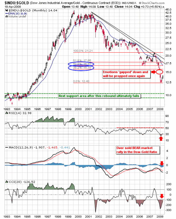
Long time readers of the Biiwii.com blog know that I rely on ratio charts to the max. In fact, I find these ratios between different markets to be absolutely vital to being on the right side of the trade where macro themes are concerned. A recent example is the Dow/Gold ratio, which allowed me to navigate the oncoming - and entirely predictable - rally in stocks (both in nominal terms and in 'real' terms as measured in gold) that began in the fear filled days of March. Our April Letter from the main website, Reset/Recalibrate explained the process by which market sentiment needed to be reset. Here is the monthly ratio chart that was used in the letter:

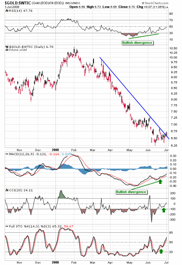
Of interest now is the Gold/Oil Ratio, which appears to be in the bottoming process amid bullish divergence by RSI & MACD. This is an absolutely vital ratio to gold stock traders as oil is a major cost input to mining operations and with the likelihood of the ratio bottoming, gold miners' bottom lines stand to benefit as their product (gold) begins to outperform one of their major cost drivers (oil). Here is a current daily chart showing the status of the ratio. Gold, while having been pummeled in oil terms recently (along with nearly everything else), may well turn up from here in terms of crude:

I also routinely use the Gold/Silver Ratio to gauge general market confidence or lack thereof, along with more traditional sentiment indicators like the VIX and Put/Call Ratios. Other ratios which have appeared on the blog have included the S&P500/Nikkei Ratio, NDX/Dow and even SOX/NDX. All provide hints as to sentiment and/or macro-fundamentals and hence future market direction.

To summarize, you can trade any market but it is very important to be aware of the major trends and turning points between different markets and assets classes so that you may be aware of whether or not you are on the right side of the trade in the bigger picture. As traders and investors, we need every edge we can get.

===========================================================

Read more Biiwii.com TA & Commentary by Gary at Biiwii.com

The Symmetry In The Market Is Incredible

Today's guest blogger comes from the popular MYSMP.com site and it's creator Kunal Vakil. Kunal is a man who is plugged into the market literally!! I asked him to give his unique perspective on the market...and it's symmetry.

===========================================================

First off, I want to thank Adam and Trader's Blog for allowing me to post my materials on Trader's blog.

Today, I want to share my thoughts on the S&P 500 and where I see it heading before this bear market is over. And, yes, we are in a bear market. Not only has the Dow Jones already fallen 20% off its highs of last year with the S&P 500 nearly there as well, but the price action in the broad markets has been that of a bear market. It is typical to see sharp sell-offs and ferocious bear market rallies which make even the bears capitulate, all before the market begins a move lower again. Big volume down, and low volume up. This is precisely what we have seen since the top at 1576.09 on the S&P back in October of 2007.

Now, let's talk about the culprit a little. We know that the banking index has been decimated with the exacerbating write-downs and credit quality issues due to the unscrupulous practices of many bankers and loan brokers. Many banks have lost over 50% of their value, and the beating continues. As we review the daily charts of the major banks, one can easily see a pattern that is definitive of a bear market, lower highs and lower lows. From looking at these charts, it is my firm opinion that the worst is not over yet. We are probably half way through the write-down cycle. Now what does this mean for us as traders?

Well, here is what I am watching very carefully. I want to see some of the major banks (ie. C, LEH, MER, MS, GS, FNM, FRE) start to show signs of strength relative to the entire market. I want to start seeing them make higher lows and higher highs. I want to see a base building process develop within these stocks. I want to see volume lighten up to the downside and increase to the upside. When these developments start to take place, we can start to look for long entries in these stocks. Is the US banking sector going to fall to 0? NO!, but don't try and catch a falling knife, stay patient. Remember, Cheap can always get cheaper...and it has.

Moving back to the S&P 500, I want to now walk you through a few charts that will illustrate where I think this market is headed by the Sept./October timeframe. This period historically provides some dynamite buying opportunities and it looks like this year wont disappoint.

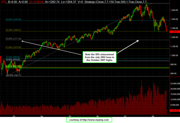
On longer term charts, especially index charts, Fibonacci retracements and extensions offer good points of support and resistance. Here you can see that the S&P has a major support area at the 1171 area. I will show you why this is a very important level.

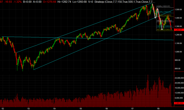
Our next chart is another weekly chart of the S&P, however, this time notice the Fibonacci extension. Notice the initial move off the top and the subsequent rally off that reaction low created an extension target between 1353 to 1248. Notice how the 1.382 and 1.618 levels held the two lows set in January and March and the market showed its weakness by extending down to the lower end of that zone.

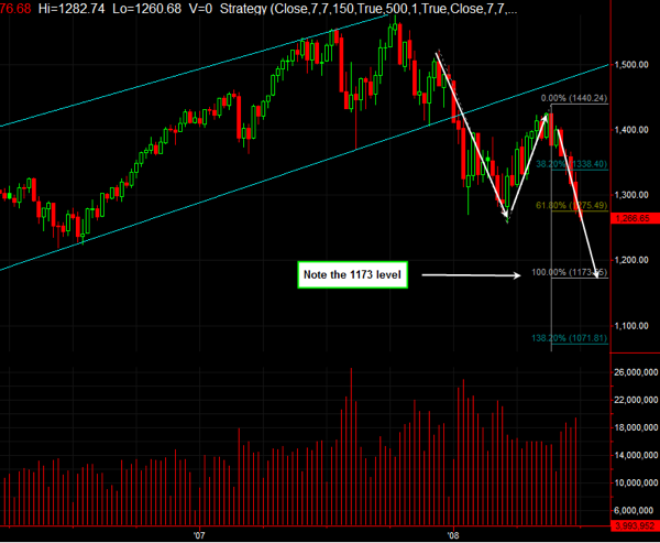
The next chart shows you the current extension that we are watching now. It starts with the December 2007 highs going down to the March lows and the retracement up is at the May highs around 1440. Now, notice the extension targets. The 100% extension takes us down to 1173.65, very close to the 50% Fibonacci retracement level in our first chart.

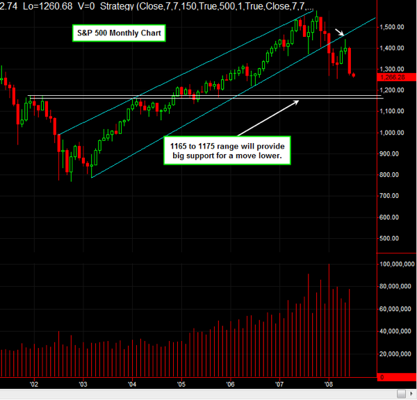
One final point in terms of symmetry that I want to make here. Back in 2003 when we were looking for a breakout in this market, the 1165 to 1175 range was a key pivotal area we watched. It represented the neckline of a massive W bottom, which some would call an inverted head and shoulders. This area is going to provide massive support on the way down.

All things considered, I am looking for another 100 point drop in this index before I can see a true bottom being put in. Remember, you want to watch the leaders on the way up and the way down. The banks have been providing that leadership and are showing no signs of letting up. Therefore, we are not bottom picking here. The speculative soul in me believes that the shoe is going to drop with one of the big banks out there. Time will tell but until then, be safe and protect your downside risk.

All the best,

Kunal Vakil

MYSMP.com

Initial Public Offerings (IPOs) – Removing the Mystery

Today we have the special honor of learning about IPOs from Zachary D. Scheidt who runs a fund that focuses on IPOs and their effect on the markets. His analysis is sought after daily with new IPOs and historic IPOs. Please take the time to read his article prepared just for Trader's Blog readers. Have a great Sunday.

-----------------------------------------------------------------------------------

When I tell people that I run a fund that primarily trades IPOs, I often get a blank stare. It’s a bit of a shame that some of the more profitable opportunities on the street are often unrecognized and passed over by many individual investors.

Ironically, one of the reasons many people are not aware of a newly issued stock is because of restrictions placed on research firms who may know the very most about the new company. The regulations are actually in place with the intent of protecting investors from conflicts of interest, but even the best set of rules sometimes have unintended consequences. To understand how the process works, let’s start at the beginning and explain the complete IPO process.

Imagine you started a new company based on a new invention you created. You put your life savings into getting the patent, creating a prototype, and you have begun to sell this invention to a few retail shops around your hometown. The company is successful, but in order to truly realize its full potential, you need to build a factory for mass production, hire a bigger sales-force to market the product nationally, and you would like a way to get your capital back when you are ready to retire. Well you are probably a prime candidate to sell a portion of your company in an IPO.

Now an IPO is simply an Initial Public Offering – or the first time a stock has been offered to investors and traded on a public market. Typically, the business owner will offer only a portion of the company (for example lets use 30%) and keep the rest of the company as his own position. So we might assume that there are 300,000 shares being offered to the public and an additional 700,000 held by the business owner.

Typically, a business owner will go to an underwriter (you would recognize some of these firms such as Morgan Stanley, Goldman Sachs, Merrill Lynch or Lehman Brothers. An analyst at one of the underwriting firms would take a look at your business model, asses what he thinks it might be worth, draw up the legal papers (called a prospectus) and then begin to search for buyers who are interested in owning a piece of your company.

The underwriter may face challenges in finding buyers for your firm. After all, there is no history of this company trading, and investors would be taking a bit more risk on this relatively unproven company. Usually the underwriter tries to set a relatively attractive price on the issue so that he can find enough willing buyers and so that those buyers actually are likely to realize a gain once the stock starts trading. So lets assume that the underwriter believes the company is worth a bit more than $10,000,000 and we have already assumed there will be 300,000 shares offered and another 700,000 shares held by the entrepreneur.

After speaking with many clients about the offering, and possibly introducing management to some of these key clients, the issue is placed on the calendar and expected to begin trading on a certain date. Now its time for investors to put their money where their mouth is. The underwriter takes Indications of Interest (IOIs) from clients which means that the client actually tells the underwriter how many shares he would like to buy. If the deal has a lot of demand, it is considered to be “oversubscribed” and most clients will only get a portion of the stock they indicated for. However, if there is a smaller amount of demand, clients will likely get “allocated” the entire amount that they asked for.

Sometimes the price has to be adjusted as well to fit with the demand (if there is not enough demand, they may price the IPO stock below expectations in order to find enough buyers for the 300,000 shares being offered. If an IPO prices below the expected range, that is usually a pretty good indication that demand is light, and investors should be cautious as the potential for further weakness is much higher. Conversely, if underwriters sense strong demand for an IPO, they may actually price the deal above the range published in the preliminary documents. This is definitely a positive for the business owner who is receiving more for the 30% of the company he is selling. Ironically, investors who pay higher prices for the IPO have a better chance of making strong profits because the higher price points to extreme demand in the marketplace.

Once all the shares have been allocated and the wrinkles are ironed out, the stock starts trading in the open market and investors can buy and sell shares. At this point there is nothing different between buying this stock or any other public company. Often, there is great opportunity for trading gains as the company is less well known than existing stocks that have been trading for a period of years. This means that someone who is willing to roll up his sleeves and research the true value of the company may be able to uncover issues that are not yet fully discounted in the stock price.

The reason the market may not have all the fundamental facts priced in is because analysts associated with the underwriting firm are technically barred from issuing an opinion for a period of time after the deal is brought to the public. The rule is in place because there would be a conflict of interest between the underwriting firm and the business owner as the stock is being issued. It would be tempting for an underwriting firm to agree to publish an overly optimistic report in order to drive demand for the deal.

To counter this conflict, the SEC has required a “quiet period” during which an underwriting firm (who ironically knows more about the newly issued company than anyone) may not publish a recommendation. In the mean time, it is possible for individual investors to do their own homework and possibly buy into a company before the official analyst issues a report later. If the analyst is positive on the company it will likely drive the share price higher as the underwriting firm’s clients begin to buy the stock in earnest.

So for individual investors, the challenge is where to find IPO information in order to make an educated decision on whether to invest or not. I have found that a small website called morningnotes.com does a very good job of giving an overview of upcoming IPOs and how they will potentially trade in the open market. Secondly, Investors Business Daily keeps a running table of soon to be priced companies as well as recent IPOs. Finally, the SEC has all the formal documents that are issued by companies in the IPO process. While some of these reports will put you to sleep, there is good information as to the nature of each business, the balance sheet and income statement, and interestingly, who owns the bulk of the remaining shares.

Investing in IPOs should not be a mysterious process. There is ample opportunity to uncover hidden growth companies, and the information is available and is often free of charge. It just takes a bit of homework to determine the best companies.

Zachary Scheidt is the Managing General Partner of Stearman Capital, LP. The fund focuses on recently issued securities and companies issuing IPOs. Mr. Scheidt received his MBA from Georgia State University and has earned the Chartered Financial Analyst (CFA) designation. He authors a blog at www.zachstocks.com highlighting stock ideas for individual investors to pursue.
Forex Trading with the MACD

After receiving many requests, I've contacted the team from DayTradeology to help explain how to use MACD AND Forex. Please let me know what you think of the Guest Blog spot.

=================================================================

The MACD (Moving Average Convergence Divergence) is a trend-following momentum indicator that shows the relationship between two moving averages of prices. The MACD is calculated by subtracting the 26-day exponential moving average (EMA) from the 12-day EMA. A nine-day EMA of the MACD, called the "signal line", is then plotted on top of the MACD, functioning as a trigger for buy and sell signals when trading the forex market.

First Some History

Developed by Gerald Appel, Moving Average Convergence/Divergence (MACD) is one of the simplest and most reliable indicators available.

MACD uses moving averages, which are lagging indicators, to include some trend-following characteristics.

These lagging indicators are turned into a momentum oscillator by subtracting the longer moving average from the shorter moving average. The resulting plot forms a line that oscillates above and below zero, without any upper or lower limits.

Benefits of the MACD

One of the primary benefits of MACD is that it incorporates aspects of both momentum and trend in one indicator. As a trend-following indicator, it will not be wrong for very long.

The use of moving averages ensures that the indicator will eventually follow the movements of the underlying security. By using exponential moving averages, as opposed to simple moving averages, some of the lag has been taken out.

MACD Setup

The default settings for the MACD which we will use are:

Slow moving average - 26 days
Fast moving average - 12 days
Signal line - 9 day moving average of the difference between fast and slow.
All moving averages are exponential.

Although there are three moving averages mentioned you will only see two lines. The simplest method of use is when the two lines cross. If the faster signal line crosses above the MACD line ( The MACD line is calculated by the difference between the 26-day exponential moving average and the 12-day exponential moving average) then a buy signal is generated and vice versa.

The higher above the zero both lines are the more overbought it becomes and the lower below the zero line both lines are the more oversold it becomes.

It may also lead to a stronger signal if the signal line crosses down when it is overbought and crosses up when it is oversold.

The last common use of MACD is that of divergence.

If the MACD has made a new low and starts to head up but price continues dow making new lows that is one form of divergence (BULLISH Divergence).

Also, if the MACD has made a high and starts to head down making new lows but price continues up making new highs that is another type of divergence (BEARISH Divergence). This is also referred to as Negative Divergence and is probably the most reliable of the two and can warn of an impending peak.

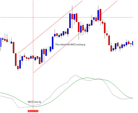
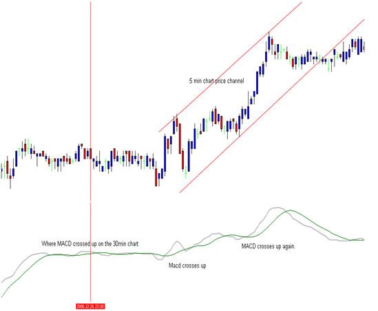
There are many ways to trade the MACD but one of our favorites are too use two different time frames. All we do is establish a trend in a higher time period than the one we intend to trade. For our higher time frame we like to use the 30 min chart and then drop down to the 5 min chart when conditions have been met on the 30 min chart.

On the 30 min forex trading chart below there was a typical buy signal. The chart below (red arrow) shows the fast 9-day signal EMA (gray line) crossing over the MACD line EMA (green line).

After confirming the signal on the 30 min chart we then dropped to the 5min chart and bought the rallies wherever the MACD crossed up, confident to stay long (to buy) as long as our higher time period MACD trend in the 30 min stayed intact. If the 30 min MACD signal line were to cross down we would have closed all long positions.

Conclusion

The MACD is not particularly good for identifying overbought and oversold levels even though it is possible to identify levels that historically represent overbought and oversold levels. The MACD does not have any upper or lower limits to bind its movement and can continue to overextend beyond historical extremes.

Also the MACD calculates the absolute difference between two moving averages and not the percentage difference. The MACD is calculated by subtracting one moving average from the other. As a security increases in price, the difference (both positive and negative) between the two moving averages is destined to grow. This makes its difficult to compare MACD levels over a long period of time, especially for stocks that have grown exponentially.

With some charts you can set the MACD as a histogram. The histogram represents the difference between MACD and its 9-day EMA. The histogram is positive when MACD is above its 9-day EMA and negative when MACD is below its 9-day EMA.

That having said, the MACD still is and will always be one of the few indicators that all traders love and use daily and in many ways it is an old familiar friend you know you can rely on.

Thank you for joining us in this forex trading lesson.
http://www.daytradeology.com/

Traders, Are Commodity ETFs Fueling the Energy Spike?

In today's Guest Blog spot, I decided to contact Chuck E. Cash from Forex-Trading-School.com. I wanted to get his thoughts and insight on what he thought about the current commodity markets, with Crude and Gasoline as the specific targets. Take a look below and enjoy!

=====================================================================

It's hard not to notice the rally cries coming out of the political parties lately. Each side has their "solution" for the energy problem. The left wants windfall profit taxes and investigations. The right wants a tax holiday and more drilling.

Lately I've been wondering, are the spat of energy ETFs partly to blame?

Conceptually, the energy ETFs should create a more liquid (and thus more perfect) market. But I am starting to have my doubts.

For those unfamiliar with these commodity ETFs, let me explain who they are and how they work.

The first US traded energy ETF, USO, was introduced just 2 years in April 2006. This was the first in a series of unique ETFs whose assets were held in futures and options contracts. Specifically, they seek to track the spot price of West Texas Intermediate (WTI) light, sweet crude oil. These funds also invest in futures contracts for other types of crude oil, heating oil, gasoline, natural gas and other petroleum based-fuels.

This is in sharp contrast to previous commodity ETFs such as GLD, which is backed by some 600+ tonnes of the gold.

Since USO was introduced, other petroleum tracking ETFs have followed.
The aptly named OIL opened August 15 2006.
UCR opened November 29, 2006.
In January 2007 Deutsche Bank introduced DBO and DBE.
And the newest member, UGA which just started trading Feb 26 2008, tracks gasoline futures.

So what's wrong with all these ETFs? Why would they drive up energy prices?

IMO, the commodity ETFs have contributed in 2 key ways.
1. They have allowed casual investors to participate

Futures trading is frequently described as both risky and sophisticated. No doubt, this is because futures are traded on margin, which creates huge profit and loss swings in a short period of time.

By packaging the futures into an ETF though, many participants now see it as a type of stock and behave accordingly. They are willing to buy and hold. They are able to sit through a $14 down turn believing their asset will rebound.

2. They create a new entity, a tracker.

For close to 2 centuries futures markets worked with three types of participants - producers, users, and speculators. These new ETFs have added a 4th entity, a tracker whose sole role is to mimic price movements. Now the traditional players must compete with this new tracker for shares of the same asset. Demand for the contracts has grown while the supply of contracts has not. As we all know, when demand outpaces supply, prices go up.

Don't get me wrong, I'm a capitalist pig no doubt. And I don't think closing these ETFs is a panacea. But I do believe they are exacerbating the spike.

So traders I ask, what do you think?
Are these ETFs helping to create a perfect market that reflects a fear of peak oil?
Or, are they creating a new type of speculation that is contributing to the spike in energy prices?

Chuck E. Cash from Forex-Trading-School.com