Is The Housing Bubble The Next To Burst?

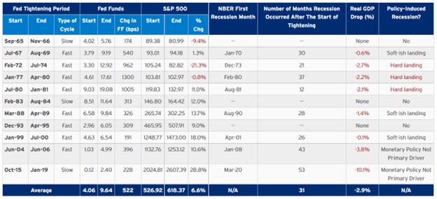
With stock prices cratering and bond yields soaring, it’s a fair question to ask if the housing bubble is about to burst, too. After all, home prices have skyrocketed in recent years thanks to artificially low-interest rates engineered by the Federal Reserve, which has kept mortgage rates well below historic levels ever since the 2008 global financial crisis, even well under 4% for most of the past three years. But with the average rate on a 30-year fixed-rate mortgage now at more than 5% and climbing, is the home price boom still sustainable?

According to the National Association of Realtors, the median price of a single-family home has jumped by over $100,000, or more than 39%, to $382,000 in March from $274,000 in 2019. The median principal and interest payment has increased by nearly 50%, to $1,502 from $1,054 three years ago, while the percentage of monthly income the typical mortgage payment eats up has risen to more than 20% from less than 16% in 2019. Likewise, the group’s affordability index, which measures whether a typical family earns enough to qualify for a mortgage, has dropped to 124.0 from nearly 160. While the NAR says the median family income has increased more than 10% to $89,321 from $80,808 during that time, the amount of income needed to qualify for a mortgage to buy a median-priced home has jumped by more than 40%, to more than $72,000.

Now, these NAR figures are as of March, when the average rate on a 30-year mortgage was 4.24%. Since then, that figure has risen by more than 100 basis points, to more than 5.25%.
So, is this a bubble ripe for the popping? Continue reading "Is The Housing Bubble The Next To Burst?"

Signs Of Peaking Inflation?

Inflation – The Stock Market Achilles Heel

The stock market is a forecasting instrument that anticipates and prices-in future economic conditions. The confluence of rising interest rates, inflation, China Covid lockdowns, and the war in Ukraine has resulted in months of selling. The relentless, indiscriminate selling has pushed the Dow Jones and S&P 500 deep into correction territory while pushing the Nasdaq deep into a bear market. As such, the market appears to be factoring in a worst-case scenario that may result in a Federal Reserve induced recession as a function of over-tightening of monetary policy and/or its inability to combat inflation responsibly for an economic “soft landing.”

The markets are anticipating sequential rate hikes through 2023; however, if inflation has peaked and the tightening cycle turns dovish, then the markets will likely turn the tide on this relentless selling. If inflation has peaked and yields stabilize, these oversold conditions could easily reverse course. For April, market conditions have not been this bad for the Nasdaq and S&P 500 since the Financial Crisis and the Covid 2020 lows, respectively. With signs of inflation peaking, the markets may have fully priced in a worst-case scenario for an inflection point from these oversold conditions. During Federal Reserve tightening cycles, markets typically generate positive returns with an average of a 6.6% return over the tightening period (Figure 1).

Inflation
Figure 1 – Market performance during periods of Federal Reserve tightening cycles

Signs Of Peaking Inflation

There are many areas of the economy where inflation is receding or has peaked. Although energy prices remain elevated due to the Russia-Ukraine conflict, other commodities and inputs into the CPI composite that contribute to inflation are falling. There have been pullbacks in used car sales, easing supply chains (China’s Covid lockdowns are prolonging the supply chain recovery), copper, steel, grain, soy, freight, lumber, and aluminum prices. Continue reading "Signs Of Peaking Inflation?"

New ETFs You May Want To Own

New ETFs are popping up all the time. This is partially due to the ease of the process of opening a new product but largely because investors are looking for new ways to play different emerging trends and new technologies. Of course, it's unlikely all the new ETF options will last the test of time; just look at how many ETFs close each year, but that doesn’t stop fund managers from opening new ones like it's going out of style. I guess the thinking is, ‘throw as many things at the board and see what sticks.’

But from an investor's point of view, it's not costing you anything unless you invest in something that fails, and it gives us a lot more options to choose from. So with that in mind, let's take a look at a few of the newer ETFs to hit the market; perhaps you may find one interesting enough to invest in or at least follow.

The first one that I would like to highlight is the iShares Emergent Food and AgTech Multisector ETF (IVEG). The fund will invest in companies that focus on agriculture technology, alternative proteins, nutritional innovation and safety, and sustainable food production and packaging. For the fund to hold a company, it must derive revenues from one of those themes; they also must expect to see profits from one of the themes increase by at least 5% during the coming 5-year period. The fund will have an expense ratio of 0.47%.

From 2010 to 2050, food demand is expected to increase by 56% worldwide. Furthermore, it is believed that Continue reading "New ETFs You May Want To Own"

Crypto Apocalypse?

Ethereum (ETHUSDBIT) has an annihilation pattern in its chart and I would like to share it with you below as the price of the second largest crypto is approaching the trigger point.

Crypto - Ethereum Chart

You know this famous pattern very well as this model frequently appears in different instruments. I know it looks a little bit weird as the shoulders are not symmetric. However, all parts are in place, and the Head is the highest peak.

The failure to proceed to the upside after breakout beyond this February’s peak of $3,280 dried the demand for the second largest cryptocurrency; it has been building the small Right Shoulder of the pattern. The Neckline has been drawn through the valleys of the Head. Continue reading "Crypto Apocalypse?"

The Truth Behind The Tech Selloff

There’s no doubt about it: Tech stocks have taken it on the chin lately. In fact, the tech sector (NASDAQ) is down 22% since the beginning of the year. That’s a terrible start to the year, no matter how you slice it.

And inside tech, there’s nowhere to hide. Even the biggest and brightest are getting hammered. See for yourself:

Tech

Source

This chart shows the year-to-date performance of the stars of tech, the so-called FAANG stocks. The acronym stands for the five prominent players in tech, including Meta (FB), Amazon (AMZN), Apple (AAPL), Netflix (NFLX), and Alphabet (GOOG). Included in the chart is also the performance of the NASDAQ. (Apple was originally excluded from the FAANG club but was added in 2017).

The details are gruesome. Since the beginning of the year, Meta is down 39%, Amazon is down 29%, Apple is down 15%, Netflix is down 67%, and Alphabet is down 20%. All told, those are bone-crushingly bad numbers. Continue reading "The Truth Behind The Tech Selloff"