
Last time I updated the gold chart at the beginning of the year I focused on the long-term consolidation, which has started at the end of 2015 and has a tricky structure as all corrective stages do. I shared with you the three most feasible options of structure development.
The first one implies the straight move up beyond the former top of $1375 (blue labels), it took only 22% of your likes. The second option, which you liked the most (48%), offers triangular consolidation (green labels). The third alternative (red labels) gained 30% of your support, and it could bring gold back down to retest $1122 area before it goes up.
I am proud to have such smart readers of my posts as most of the time you accurately predict the market behavior as last time you did it with a Santa Claus rally of precious metals. These days I spotted one notorious pattern, which could terminate the first option, which collected the least support from your voting, that amazes me again and again.
Gold Daily Chart: Possible Head And Shoulders Pattern
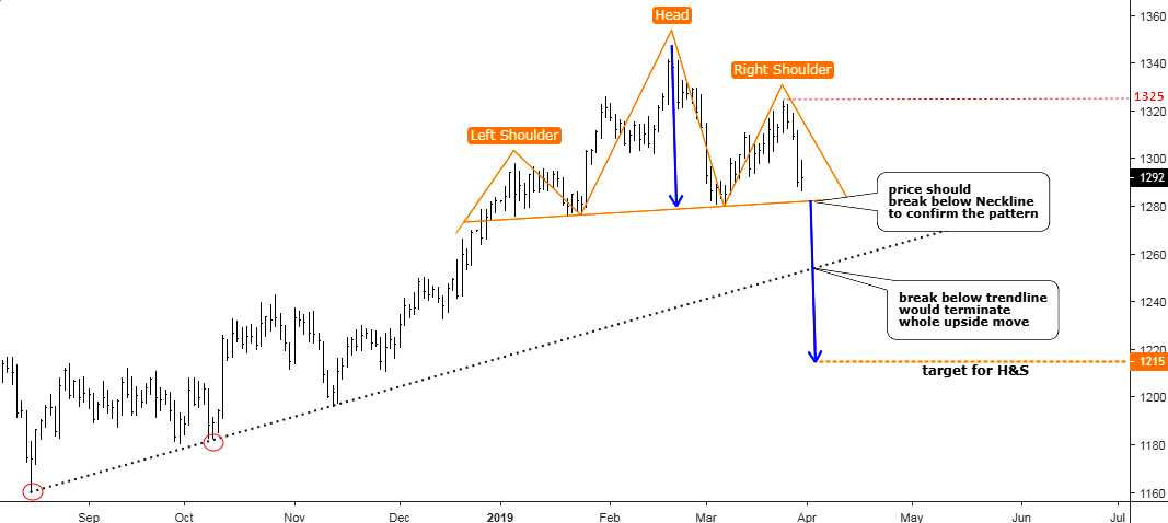
Chart courtesy of tradingview.com
Continue reading "Gold Update: Reversal Pattern Emerges"
 I was going to look around to see if I could find a media article out there (complete with a TA trying to sound really important) that would be appropriate to be made fun of in our little Men Who Stare at Charts series. But then I decided to create my own chart, stare at it a little, post it and talk about it (hopefully not too self-importantly).