

Last week, both metals triggered the signal support lines described in my previous post, therefore we are now in another consolidation phase. Let’s be patient and let the market take a pause to see what shall be further. I will update the metals charts in coming posts.
Meantime, let’s refresh the gold/silver ratio chart to see what’s going on there. I prepared three charts for you, which highlight the current snapshot of the metals, the ratio’s updated outlook and the “Risk Appetite” chart for “dessert”. Bon Appetite!
Chart 1. Gold vs Silver 4-Hour: The Strength Of The Chain Is In The Weakest Link
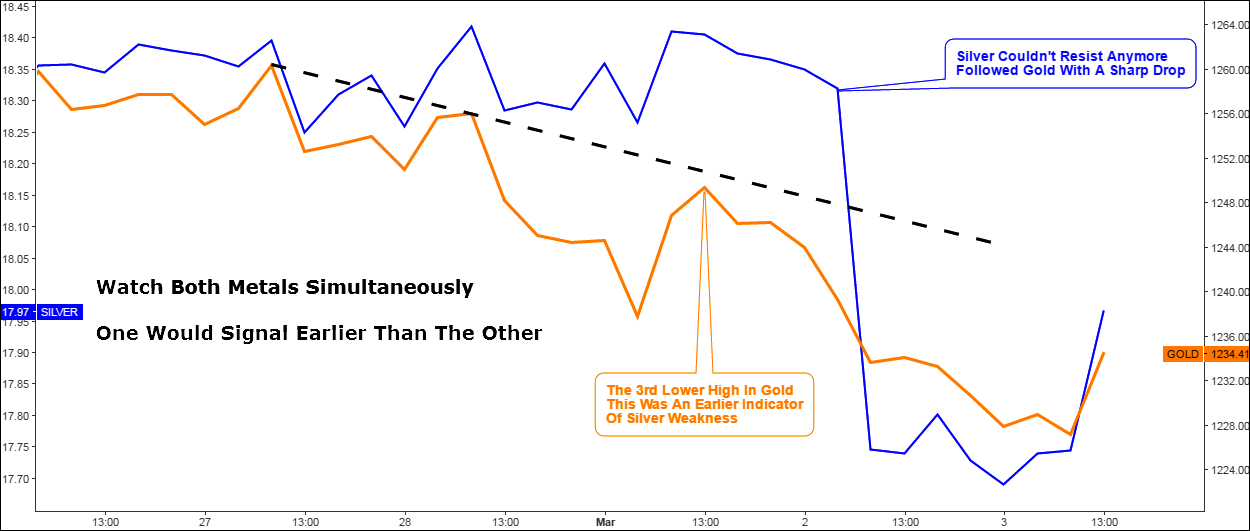
Chart courtesy of tradingview.com
This 4H chart above shows the “moment of crash” of the metals. Gold topped on the 27th of February and then started to shape lower highs with the trajectory of those highs highlighted in black dashed falling trendline. But that wasn’t a case for mighty silver, which has made another two higher closes on the chart ahead of severe drop on Thursday. It couldn’t resist the bearish pressure anymore as gold broke below the 1st of March low on the second day of March.
This is not a ratio chart, I put it in this post to show you how we can benefit or avoid excessive risk or save profits watching both metals simultaneously as one of this pair would signal earlier than the other. In this chain last week gold was the weakest link giving the silver traders time to jump out of longs before the crash happened.
Chart 2. Gold/Silver Ratio: Extended Target
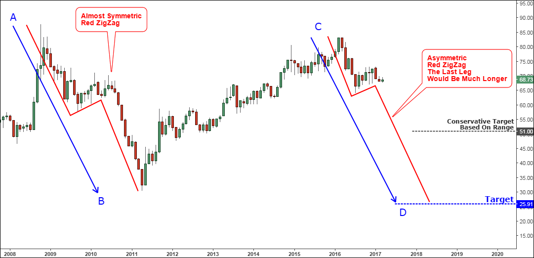
Chart courtesy of tradingview.com
This time I’ve provided a different chart perspective, stepping aside from the range concept described in my initial post a year ago. I applied the AB/CD concept as we have a similar trend structure during 2008-2011 labeled as AB segment.
I put the red zigzag inside of the AB segment to highlight the trend structure for you. It is almost symmetric as the lower leg is only 1.3 times longer than the upper leg. The current downtrend started exactly one year ago had the lower top with C label. It means that the downside target of CD segment should hit a lower level where the CD=AB. The target is located at the 25.9 oz level. It is much lower than the conservative range target set at the 51 oz level and hence means more profit as the risk/reward ratio even at the current level is at the very high 1:7 level.
The red zigzag within the CD segment has an asymmetric structure as the upper leg was shorter. The lower leg would be more than two times longer. Currently, we are still in the same consolidation phase as was the ratio during September 2009 – June 2010. It took ratio nine months to finish it. We are now in the 8th month, it could be repeated this time and ratio could spend another two months (8-9) at these levels before another drop starts. 76.3 oz level (previous top, June 2016) on the upside and 64.2 oz level (previous low, July 2016) should contain the consolidation.
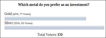
Below is a snapshot of the distribution of votes you gave to gold and silver last November. The most of you preferred the silver that time.
The next chart is that very same “dessert” prepared for you.
Chart 3. Gold/Silver Ratio Vs S&P 500: Risk On?
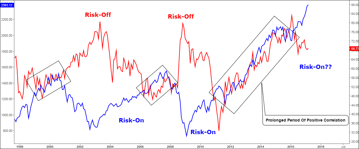
Chart courtesy of tradingview.com
When I post about the gold/silver ratio people keep asking the same question – is there a difference between gold’s and silver’s movements? I understand the natural logic of this question, these top metals are precious and are in focus for the most of the time and looking at the dollar based price charts we can judge that they move simultaneously. The difference is seen only in comparison graphs like in the first chart above.
Gold is the synonym for the safe-haven on the market when investors seek for the risk aversion shelter (Risk-Off). Stocks are considered to be a risky investment (Risk-On). So, to illustrate the approach that the strength of gold over more industrial silver means the risk-off I added S&P 500 index (blue line) to the comparison chart above.
This century there were two periods of well-functioning risk-on/risk off mechanism. The first period during the post-dotcom crash was just an ideal example of risk-off negative correlation when the gold/silver ratio (red line) hit the 80 oz level amid the drop in the S&P 500 to $800 area. Their extreme points are almost perfectly mirrored both in time and in depth. The second period of risk-off was after the start of the financial crisis and again perfect opposite correlation, instruments diverged to the peaks almost at the same time. Both risk-off periods were followed by risk-on seasons.
After the spring of 2011 something has interrupted the perfect mechanism. The stock index started to fall amid the rise of the gold/silver ratio, but then in September of the same year the S&P 500 reversed to the upside denying the risk-off logic. We can see the prolonged period of abnormal positive correlation of the instruments highlighted in the 3rd black rectangle during 2011-2016. If you would look at the left part of the chart you could find another two black rectangles highlighting the periods of positive correlation (instruments move together into one direction) but as you may notice these are the very small compared to the last one.
What could be the reason for such a weird situation when the risky background reflected in the growth of the ratio didn’t stop investors from buying risky stock index? That period associates with the several abbreviations namely QE (Quantitative Easing), ZIRP (Zero Interest Rate Policy), NIRP (Negative Interest Rate Policy). Those are the symbols of unconventional monetary policy during the “New Normal” time and they are still taking place in some major countries. And that was the main reason for the Bull Run or risk-taking in the stock market, although the risks were still there as ratio showed.
A year ago the ratio had topped above the 80 oz level and started to fall crossing below the S&P 500 line. Looks like the normal behavior returned to the market. Even the consolidation in both instruments started in synch last July. The stock index broke out of consolidation last October surpassing the July 2016 top while the gold/silver ratio is still above the low established at 64.2 oz level, although it should be already at the 65 oz mark (currently 68.7).
If we assume that the ratio would hit the 25.9 oz target level then the gain from the top (83.3 oz) would be 69%. Then if we think that the negative correlation is back to the market, we can add 69% to the corresponding low of S&P 500 at $1810 level, the target would be $3059. Looks fantastic? Let’s calculate the possible time target to put the time limit. According to the chart 2 we have around 12 months to copy the previous drop of the ratio, and then we should check if the S&P 500 would hit the $3059 mark on the 1st of April, 2018 after 12 months elapse. The market is imperfect, but let us take it as a clean experiment for the sake of science and leave all inputs as they are.
What do you think?
I encourage you to leave your comments on this post with your opinion, which would become invaluable in one year after we will see where the market goes.
Intelligent trades!
Aibek Burabayev
INO.com Contributor, Metals
Disclosure: This contributor has no positions in any stocks mentioned in this article. This article is the opinion of the contributor themselves. The above is a matter of opinion provided for general information purposes only and is not intended as investment advice. This contributor is not receiving compensation (other than from INO.com) for their opinion.
As your very own chart indicates, the gold-silver ratio has not given a valid signal for the stock market since 2011 - this is now 5 years of the ratio being utterly meaningless to the stock market - even though the correlation you discuss normally exists (or used to exist once...) and can be logically explained.
Now let's briefly look at the idea that the gold-silver ratio will decline, i.e., silver will outperform gold in coming years. You base this on a chart, which is fair enough, but from a fundamental perspective the likelihood of this happening is currently between slim to none. Admittedly that is an assessment that may change at some point, but currently virtually every data point indicates that the gold-silver ratio should either continue to rise or at best go sideways over the medium to long term.
So I wouldn't be too hasty to construct S&P 500 targets based on this idea. That's adding yet another huge leap of faith to what is already a highly questionable premise.
The PM slam has been relentless since once again the fed mouth pieces opened their collective pie holes last week about a minuscule rate increase, utilizing all the key words that get the algos all excited on the sell side triggering multiple levels of stops, works every time, rinse and repeat, even after in February they said there will be no rate increases in the near term. Historically gold has done quite well in a rising or high rate environment, this is nothing but fraud in an effort to slam gold back down as low as they can for political (Dollar confidence) purposes. $1260 gold was major resistance that gold blew right through...can't have that now can we.
I wish you will add conclusion comment as that according to Charts what is expected from the price of Gold and Silver in a Time Frame like S&P. Thanks.
Target will be hit as long as Fed and Treasury and other CB's continue to work together
I believe it will reach the goal of $3000 mark just based on the fact that the stock market has gone up in the months of Jan. and Feb. and 100% of the time the market has gone up over a years time.
Im looking to taking a class. Im always in the market for if someone takes from me I want something of equal value. If you can enforce that.