Dear INO.com Readers,
Recently, I have heard a lot of arguments about the correlation between major financial instruments and I decided to make special report for you to give some idea about their actual relationships.
For today’s analysis, I chose Gold, WTI Crude Oil ("black gold") and the Prime Currency’s DXY Index (King). I would guess all of you track these instruments from time to time to check the precision of your financial "compass." Most important here is to find out how sensitive Gold price is to fluctuations in Oil and Dollar value. To check that, let’s get down to our comparative historical dynamics charts depicted in different time periods.
Quarter Century Comparative Dynamics
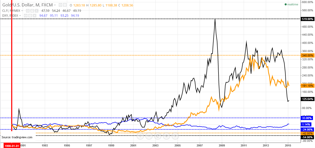
The 90’s look flat compared to the wild present day, only Oil managed to make a huge 80% spike in 1990, rising from the $20 level up to the $40 area. During those years, Gold and the Dollar index showed good and quite constant negative correlation, making opposite curves and charting ellipses. It worked nicely up until the crisis 2008 year, both instruments, by turns, had been changing sides and keeping an accurate inverse relationship. Oil is less predictable, first it was between Gold and the Dollar index correlation, but still positive with Gold and negative with the Dollar index, then in 1996 and in 1999-2001, it was in direct relationship with the Dollar index, but the rest of the time Oil reverted back to its normal inverse relationship. Bipolar might be the right definition for Oil.
The overall picture only looks stable for the Dollar index, which can be portrayed with the following expression, "Never shall those born to crawl, learn to fly." If we mention the instrument’s dynamics, which stayed in the range between -24/+33%, showing mirror reflections. 25-year dynamics indicate that the Dollar is quite stable with only above 1% gain, meaning that major currencies in total kept about their parity to the Dollar.
It’s quite an interesting discovery because as we see on the chart both hard "tangible" assets (I stress the word "tangible") gained weight significantly from 2 fold for Oil to 3 fold for Gold against the USD, with even more impressive peaks on the way. Another interesting note is that Gold and Oil have higher upside margins: 519% for Oil and 340% for Gold and comparatively small downside negative extremes: -54% for Oil and -42% for Gold, which means that asset inflation or actual revaluation tendency dominates. Fiat money lost its value to hard assets in triple digit percent numbers. That’s it with the sad but true part.
Post Crisis Comparative Dynamics
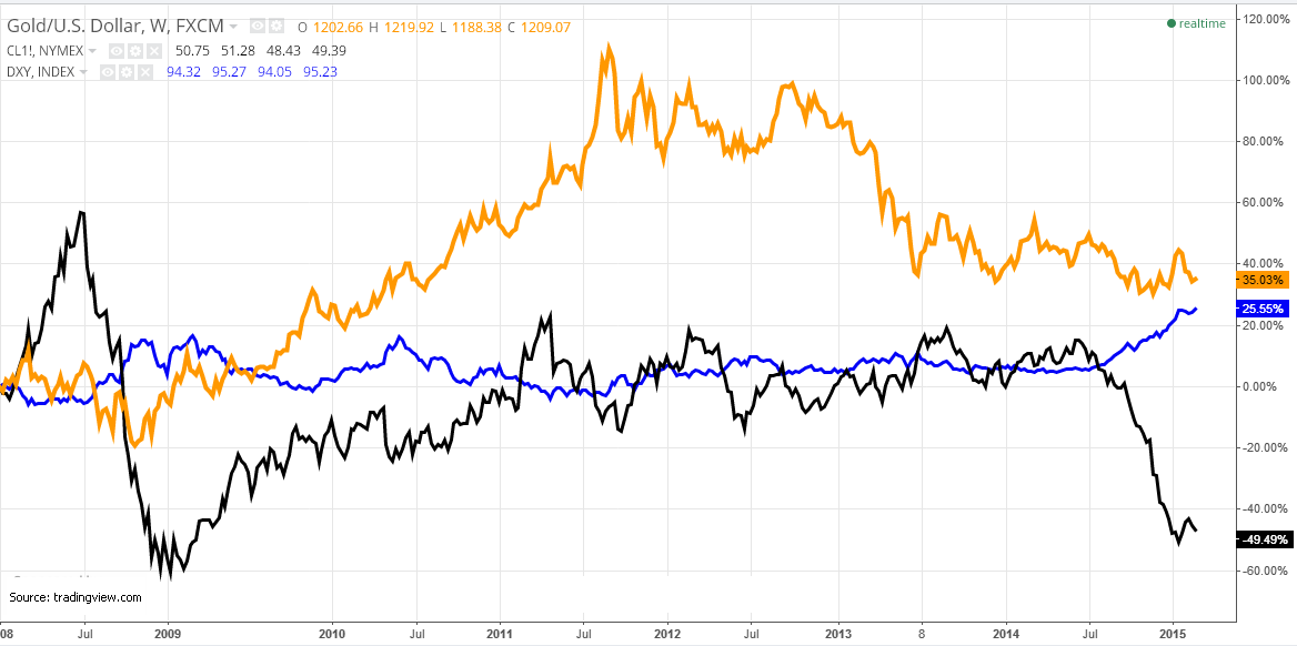
As seen on the weekly chart above, Oil is a very tricky instrument. In 2008, just in one year it hit both margins: upside at +60% and then downside at -60% when the crisis emerged, moving an unthinkable 120% in between. From 2009 up to the middle of 2011, the Fed’s Quantitative Easing started a robust uptrend and positive correlation between Gold and Oil. In the meantime, the Dollar index had been behaving in its normal inverse relation, but only in 2009. In 2010, due to European debt crisis, half a year it had been moving in an uptrend with abnormal positive correlation with Gold and Oil. After that, the Dollar index returned to its usual role, being opposite to commodities.
I want to you to focus on the period between spring and autumn of 2011, when Gold’s bubble hit a historic record above $1900/oz, but Oil on the contrary, plummeted from a $114 high to a $77 low on weak economic data and deepening European crisis. It’s interesting to watch how the same fundamental reasons caused two different reactions. Feared investors put their money into Gold and at the same time they ran off the Oil. For me, it means that Gold’s safe haven function is mostly in a "sleeping mode" when both Gold and Oil just track the opposite direction from the Dollar index, although with different velocity. But when the world needs a hedge, Gold starts to be in high demand, seeking price’s ceiling and then all other tangible assets just dim.
Present Day Comparative Dynamics
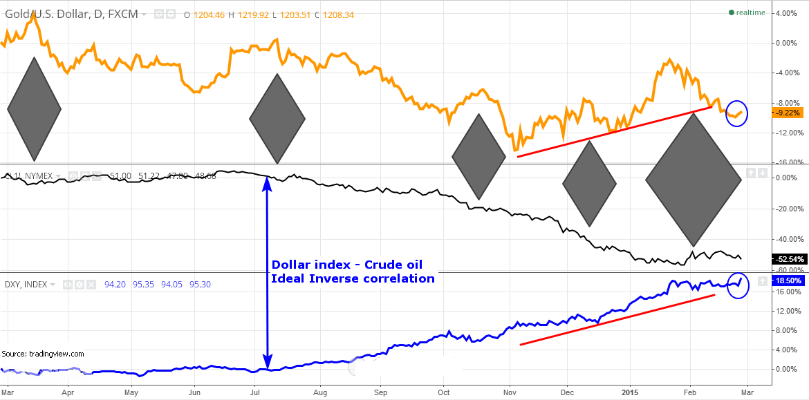
The above daily chart is last and represents the current situation in relationships between the three instruments. Briefly saying, Oil and the Dollar index have an almost ideal inverse relationship between each other compared to the sudden abruptions appearing with Gold. Abnormal correlations between Gold and Oil are highlighted in dark grey rhombuses, for one year one can count five distinct periods where these soil treasures move opposite directions.
As for the Gold and Dollar index correlation, we can see a good inverse relationship with several disconnections. Only in last November (highlighted in red ascending lines), Gold started to be in direct relationship with the Dollar index, with some deviations in Gold behavior when both instruments have been gaining value. Recent days' moves in Gold and the Dollar index are even more similar, highlighted in blue ellipses.
Bottom Line
Most of the time, Gold moves together with Crude oil, but opposite to the Dollar index. Still, history shows that we can’t rule out sudden abruptions in relationships where most often Gold and less often the Dollar index are the world’s safe haven assets, nowadays, due to currency wars.
Oil is the most Dollar index sensitive asset here and is utmost vulnerable amid fear, weak fundamentals and growing supply.
After all, you should be flexible with your approach as nowadays the world is changing so fast.
Lucky and Intelligent Trades!
Aibek Burabayev
INO.com Contributor, Metals
Disclosure: This contributor has no positions in any stocks mentioned in this article. This article is the opinion of the contributor themselves. The above is a matter of opinion provided for general information purposes only and is not intended as investment advice. This contributor is not receiving compensation (other than from INO.com) for their opinion.