Don't Get Trapped By Recent Dollar Weakness

Last week I promised to the reader who commented on the dollar index’s strength under my silver post, that I would write a separate piece about the king currency.

Here we are, and I will start from the very long term chart, and you will see why I answered in my comment that it all depends on which time frame we are looking at as these days as the dollar index is falling. Should we worry about it?

Chart 1. Dollar Index Futures Quarterly: Correction

Dollar
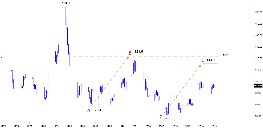
Chart courtesy of STOOQ.com

This is a long-term view of the dollar as almost 50 years passed since 1971. For the whole period, the maximum price was established in 1985 when the dollar index hit 164.7. After that, it dropped like a rock down to the 78.4 in 1992. And then we can see a huge correction that had reached exactly a 50% Fibonacci retracement level at 121.5 in 2001. That strength of the dollar turned out to be short-lived as another drop followed. This time it had fallen much faster as it quickly reached the former trough and after a small consolidation, the index slid further down to a new four-decade low of 71.1 in 2008 amid the financial crisis. Continue reading "Don't Get Trapped By Recent Dollar Weakness"

Bearish Pattern Warns Of Dollar Weakness

A unique setup has occurred in the Invesco DB US Dollar Index (UUP) that resembles an Engulfing Bearish type of pattern (even though it is not technically an Engulfing Bearish pattern). Technically, an Engulfing Bearish pattern should consist of a green candle followed by a larger red candle whereas the red candle’s body (the open to close range) completely engulfs the previous candle’s body. In the instance, we are highlighting in this article, a unique variation of what we’ll call a “Completely Filled Engulfing Bearish” pattern is setting up.

This is when two red candles set up in an Engulfing Bearish type of formation – omitting the requirement that the first candle is green. Japanese Candlesticks help us to identify the psychology of the market price in relation to our other specialized tools. We believe this formation is important because both of the red candlesticks that make up this pattern opened much higher than the previous bar’s close and dramatically sold off into the close of each session. We believe this type of rotation clearly illustrated that price is reaching resistance near $25.50 and pushing lower because of this strong resistance. We also believe this resistance/pattern will set up a downside price move in the US Dollar very soon.

bearish pattern

Below, we have highlighted the traditional formation of an Engulfing Bearish Candlestick pattern. The example chart, to the right of this definition, shows another variation of the Engulfing Bearish pattern setting up after three minor sideways candles. The interpretation of this Bearish Reversal pattern is subjective in terms of understanding the psychological representation of the Engulfing Bearish pattern. This pattern represents a total reversal of power within the price bar where the buyers were in control at the open (resulting in a higher opening price) and lost control through the trading session to allow the sellers to drive the price much lower into the close of the trading session. Thus, the Engulfing Bearish pattern represents a “key pivot point” in price that may prompt a larger downside move in the near future. Continue reading "Bearish Pattern Warns Of Dollar Weakness"

Gold Update: Triangular Consolidation

Aibek Burabayev - INO.com Contributor - Metals


In the previous Gold & Silver update I warned you about the possible correction ahead. Indeed, both top metals showed weakness, but I didn’t think it would be that severe as we quickly reached seemingly distant supports both in gold and silver. Later I shared with you my concerns about golds outlook as the Fed starts cutting its massive balance sheet this month. This could be a real game changer as market wizards call for another perfect storm for the financial markets. In the charts below I try to model this change for you.

I would like to start with the U.S. 10-year Treasury notes (UST) chart as this instrument has a strong relationship with gold, which I already showed you in August.

Chart 1. U.S. 10-year Treasury Notes Daily: Bear Flag Works Out

U.S. 10-year Treasury Notes Daily
Chart courtesy of tradingview.com

Above is an updated and zoomed in chart from my last post. I chose a daily time frame to focus on the tactical move to see how the chart structure of the instrument develops over the time. Continue reading "Gold Update: Triangular Consolidation"

Fed Takes On Gold Unintentionally

Aibek Burabayev - INO.com Contributor - Metals


In my previous Gold & Silver post published earlier this month, I promised to update a long-term chart of Gold as I observed some interesting price behavior in a related instrument. But before I do that, let me speak about the Fed’s decision last Wednesday and that “related to gold” instrument first.

The positive dynamics of the US economy underpinned the Fed’s decision to finally start to trim its huge balance sheet next month, besides that there is a big chance of another rate hike this December. It wasn’t a shock to the market, and some big players already started their game weeks before the Fed moved from rhetoric to action.

The Fed’s decision could have a double impact on US interest rates as falling US Treasury notes increase the yields, and the impending rate hike could secure that situation. I was writing about the high possibility of this almost a month ago and last Wednesday we received a first-hand confirmation from the Fed. Continue reading "Fed Takes On Gold Unintentionally"

Gold And The Era Of Rising Interest Rates

Aibek Burabayev - INO.com Contributor - Metals


The U.S. dollar is the primary benchmark for the expense of the time value of the money around the world. It affects all asset classes, and I want to analyze it to see if the speculation about the coming cycle of the rise in interest rates is valid or not.

The wise trader once said; “if you want to know the market trend just squeeze the chart to see the perspective.” I used that advice to focus on the long-term perspective, and in this post, I would like to share the result of my research in the three graphs below.

Chart 1. The Yield Of 10-Year U.S. Treasury Notes Quarterly: Downtrend Could Be Over Soon

Quarterly Chart of 10 Year U.S. Treasury Notes
Chart courtesy of stooq.com

The chart above shows the history of the yield on the 10-Year U.S. Treasury notes (UST) from 1980 to present day. I chose that period to highlight the whole move down of the yield from the top in 1981 at the 15.84%. I chose this instrument as it is a benchmark showing investors’ sentiment about the future interest rates for the U.S. dollar. Continue reading "Gold And The Era Of Rising Interest Rates"