S&P 500 Bullish Divergence

Last September, I called the S&P 500 index to lose 30% according to the projection based on a comparative analysis.

The index price was at $4,459 that time. The deepest valley since then was established at $3,637 last month. 18% of the index value evaporated since the idea had been posted and 25% from the top of this January ($4,819).

The majority of you voted for 10%-20% retracement and this was the closest call so far as we cannot be sure whether it is over or not.

To remind you, I had put together two ETFs and the S&P 500 index (black). I chose Vanguard Value Index Fund ETF (VTV) (red) and Vanguard Growth Index Fund ETF (VUG) (blue). Let us check the updated comparison chart below.

SP500 VTV VUG Comparison Chart

Source: TradingView

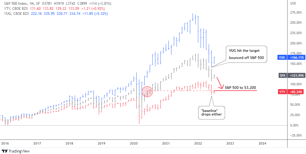
The bearish alert appeared to me when the value stocks (VTV, red) stopped contributing to the rise of the broad index. Moreover, the gap between the latter and the growth stocks (VUG, blue) has widened tremendously.

The retracement targets for VUG and the S&P 500 were based on the corresponding level of underlying / less performing instrument: for VUG it was the S&P 500 and for the S&P 500 – VTV.

It is amazing how accurately the VUG target at $217 was hit last month as the ETF dropped even lower in the valley of $213. The concept played out precisely as the VUG bounced off the broad index, blue bars approached but did not overlap black bars.

The S&P 500 index almost closed the gap with the VTV last month, however the VTV itself also dropped and hence wasn’t caught up. The retracement target has been set at $3,200 last September and the lowest level has been seen since then was $3,637 last month.

Let us look at the S&P 500 chart below to see what could happen next.

SP500 Weekly Chart

Source: TradingView

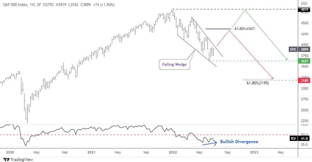
The price has shaped a familiar model of the Falling Wedge (purple) within the current retracement. The amplitude of fluctuations decreases as the price approached the apex of the pattern.

The RSI indicator has already built the invisible Bullish Divergence as it can be seen only through its readings: 30.2 vs. 30.5, which means higher valley versus the lower bottom in the price chart.

This combination of narrowing trendlines and bullish diverging indicator could result in the possible breakup anytime soon. Would it be a reversal or a dead cat bounce?

I added two paths on the chart. The red zigzag shows how the Falling Wedge would play out in the first place. The target (purple flat line) is located at the widest part of the pattern added to the breakup point. It coincides with the 61.8% Fibonacci retracement level at $4,367. It could be a double resistance.

The following drop should complete the complex correction down to $3,185. This target was calculated by subtracting the size of the Falling Wedge from the target of that pattern. And again, this area corresponds amazingly with the 61.8% Fibonacci retracement level and the first chart target based on a comparison with VTV.

The green path implies the sideways consolidation that should keep within the existing range of $3,637-$4,819.

Which way do you think the S&P 500 will go?

View Results

Loading ... Loading ...

Intelligent trades!

Aibek Burabayev
INO.com Contributor

Disclosure: This contributor has no positions in any stocks mentioned in this article. This article is the opinion of the contributor themselves. The above is a matter of opinion provided for general information purposes only and is not intended as investment advice. This contributor is not receiving compensation (other than from INO.com) for their opinion.

Market Distortion: Crude Oil vs Platinum

Market distortions appear from time to time in different instruments and sometimes it offers opportunities. I spotted one of a kind for you in the chart below.

Oil vs Platinum Chart

Source: TradingView

There is a quarter of a century of amazing correlation between crude oil futures (gray, scale A) and platinum futures (green, scale B) in the chart above. The rally and the simultaneous climax in 2008 with the following tremendous collapse into the same valley the same year are the bright spots of that strong sync.

These two instruments have been swapping the leading role as sometimes oil has been showing the path to the platinum and vice versa. The strong rebound in the past financial crisis in 2009, as well as the robust recovery in 2020 has been led by platinum futures.

The long-lasting depreciation period from 2011 till 2020 has several mis-correlation spots and overshoots in the oil price. In 2020, the two instruments have synced again as the platinum price appreciated strongly to levels unseen since 2014 and crude oil was catching up.

Last year something went wrong as the price of the metal could not progress higher after hitting the 6-year top of $1,348 in February 2021. In spite of this, the link remained strong for some time longer.

The oil price has paused its rally making the sharp zigzag in the area of the platinum price peak as if it was “inviting” the metal to continue hand in hand sky high, but in vain. This is when the divergence has started to grow and reached the ultimate gap this year.

What’s next? Possibilities that come to my mind would be a huge drop in oil price down to the $50 area to match with the current platinum level, the strong recovery of the metal’s price to around $1,600 to catch up with the oil price, or the third path would be a compromise, both instruments close the gap equally to meet in between around $75 for crude oil futures and $1,200 for platinum futures.

Every news feed tells us why oil is rising daily. What about the platinum depreciation? Let's check its fundamentals.

Platinum Supply and Demand

Source: Metals Focus, World Platinum Investment Council

In the first quarter of this year, the platinum market is in the oversupply of 167 thousand oz. Both parts of equilibrium are down, but demand dropped harder.

Platinum Demand

Source: Metals Focus, World Platinum Investment Council

Three of four main components of platinum demand have decreased, especially industrial and investment components. The automotive demand remains flat. Total demand declined 26% (-541 thousand oz.) year-on-year, which is huge and it doesn’t support the metal’s rally.

Let us check the price chart of platinum futures.

Platinum Futures Monthly

Source: TradingView

The price of platinum futures moves downwards in the second red leg within a large pullback to retest the broken resistance.

The retracement was already deep enough as it dropped below the 61.8% Fibonacci retracement level. The next support level is located at $730 (78.6% Fib). The touch point of retest is located even lower around $670. Though, the market price has more room for a further weakness.

The price shouldn’t fall below the invalidation level of $562 where the current growth point is located. The first upside barrier is too far now at $1,348 (2021 peak).

This April I called the oil price to skyrocket to $176. These days, it is not a bold projection anymore as “Global oil prices could reach a “stratospheric” $380 a barrel if US and European penalties prompt Russia to inflict retaliatory crude-output cuts”, JPMorgan Chase & Co. analysts warned.

The updated oil futures chart is below.

Oil Futures Chart

Source: TradingView

The oil price has advanced almost $30 since April, however the previous top of $130 was not touched. There is a retest of the blue uptrend channel support now and the situation could change anytime soon.

The bounce back in the uptrend could fuel the price to retest the all-time high of $147 at least. On the other hand, the breakdown could send the price into a deep pullback to the broken orange resistance around $50.

The latter is the price area where crude oil would close the gap to catch up with platinum according to the first chart above. It is an amazing coincidence of different charts.

How do you think the current divergence between crude oil and platinum will play out?

View Results

Loading ... Loading ...

High energy prices are the main driver of the current persistent inflation. Platinum is an industrial precious metal and its depreciation reflects the falling demand affected by gloomy projections of the economy and the tightening Fed. This combination could result in the stagflation (stagnation + inflation) of the economy.

Intelligent trades!

Aibek Burabayev
INO.com Contributor

Disclosure: This contributor has no positions in any stocks mentioned in this article. This article is the opinion of the contributor themselves. The above is a matter of opinion provided for general information purposes only and is not intended as investment advice. This contributor is not receiving compensation (other than from INO.com) for their opinion.

Copper Fears Recession

The copper futures hit an all-time high this spring. This is not a surprise to many readers who suspected it would - see the poll from late August.

The price has topped at $5.04, missing the preset target area between $5.36-$5.41. After that, copper futures collapsed below the valley of the last summer ($3.96) in the area of $3.60.

See the latest stats for the copper market in the table below.

World Refined Copper Usage and Supply Trends

Source: The International Copper Study Group (ICSG)

According to the table above, the world refined copper production has increased to 8.44 million metric tons in the first four months this year, compared to 8.16 million metric tons for the same period last year.

At the same time, the world usage or demand has grown up either to 8.35 million metric tons in January-April this year from 8.17 million metric tons last year.

As a result, this year the copper balance turned into a surplus of 95 thousand metric tons compared to a deficit of 3 thousand metric tons last year. Moreover, if we take the last line of the table that shows the refined balance of the market adjusted for the Chinese bonded stock change is in even bigger oversupply of 213 thousand metric tons.

As we can see, the market fundamentals could have undermined the uptrend in the copper price in the first place. The following speed up of the futures collapse was fueled by the hawkish Fed, Chinese lockdowns and a new scaring mantra that has been circulating recently in the media about upcoming recession.

One could call it a self-fulfilling prophecy as last Friday the Atlanta Fed posted a second quarterly decline of a real GDP in a row on its GDPNow tracker. The second quarter reading is minus 2.1%, the first quarter reading was minus 1.6%. Technically speaking, this could mean that the forecasted recession is already here.

The auxiliary economic data from the graphs below also confirms the economic headwinds for the copper market.

US PMI vs Copper

Source: tradingeconomics.com

United States ISM Purchasing Managers Index (PMI) (blue) fell to 53 in June of 2022 from 56.1 in May, demonstrating the slowest growth in factory activity since June of 2020, and below market forecasts of 54.9.

The robust uptrend of copper futures (black) in 2020 was in an accord with U.S. PMI until the start of 2021 where the factory activity has peaked and then started to collapse. The copper price firstly continued further up on the market inertia and then dropped huge to finally catch up with the current fundamentals.

China Industrial Production vs Copper

Source: tradingeconomics.com

The similar situation has been seen in the chart above of Chinese industrial production (blue). The “World’s factory” performance has also peaked last year, ahead of the top in copper futures (black).

We could see here that the metal has more room to the downside into the $3 area to reach the corresponding level of Chinese data. It is worth to note that the industrial production in China has grown up by 0.7% recently after a relaxation in COVID-19 curbs in some major Chinese cities.

US Consumer Sentiment vs Copper

Source: tradingeconomics.com

To complete the picture, we should look at the chart above that shows the U.S. consumer confidence (blue) as a main indicator of the initial demand.

The situation is even more depressed here as we can see no progress since the pandemic outbreak. The indicator just made a small rebound within the consolidation in 2020 and then continued to the downside to hit the record low of 50.0 in June 2022.

Let’s look at the updated chart of copper futures below.

Copper Futures Monthly

Source: TradingView

The copper futures price goes well with the plan posted almost a year ago. It didn’t advance too much to the upside to fit with the extended consolidation pattern. We entered the red leg 2 down.

The latter could unfold either like the first straight leg down with a panic selling amid financial crisis of 2008 or it could build a zigzag with a corrective phase in the middle of the drop. More often than not, two legs are not alike.

Two possible downward targets could be set. The closest one is computed using the distance of the first red leg down subtracted from the new all-time high; it is aimed at $2.02. This area coincides with the valley of 2016 and 2020.

The next target is an old one as it Is located at the minimum of the first red leg down at $1.25.

The RSI sank below the so-called “waterline” beneath the crucial 50 level. If it closes this month there than the bearish trend is confirmed.

How deep could the copper futures collapse?

View Results

Loading ... Loading ...

Intelligent trades!

Aibek Burabayev
INO.com Contributor

Disclosure: This contributor has no positions in any stocks mentioned in this article. This article is the opinion of the contributor themselves. The above is a matter of opinion provided for general information purposes only and is not intended as investment advice. This contributor is not receiving compensation (other than from INO.com) for their opinion.

Dollar Index: The Last Shall Be First

Since my last update, the dollar advanced further to the upside establishing the new multi-year top of $105 in the middle of May. Later, the market started the correction as the dollar index (DX) drifted into the area of $101.

Last time, you bet the most on the further rise of the dollar to $121 (Neckline of Giant Double Bottom pattern). The second choice was the Bearish scenario for the main currency. It is early to judge the results as the price dynamics are somewhat mixed.

Let me show you one comparison graph that shows the underlying fundamentals of the dollar index. But, before that, to refresh the memory, firstly, I put below the chart showing the composition of the dollar index.

Dollar

The euro takes the largest piece of cake with 57.6%; the Japanese yen with 13.6% is the second largest component, although the gap with the euro is huge. The third is the British pound, as its part weighs 11.9%. Continue reading "Dollar Index: The Last Shall Be First"

Strong Jobs Report Supports Continued Monetary Tightening

A Bloomberg survey of economists indicated that the medium estimate for jobs added in May would show that approximately 318,000 new jobs were added. Additionally, the survey also predicted that the unemployment rate would fall to 3.5%. A Wall Street Journal survey of economists forecasted that employers would add 328,000 jobs in May. The survey also anticipated that the unemployment rate would fall to 3.5%. Both surveys underestimated both the number of jobs added in May 2022 and the unemployment rate.

The U.S. Bureau of Labor Statistics released the latest jobs report, which said, “Total nonfarm payroll employment rose by 390,000 in May, and the unemployment rate remained at 3.6 percent, the U.S. Bureau of Labor Statistics reported today. Notable job gains occurred in leisure and hospitality, in professional and business services, and in transportation and warehousing. Employment in retail trade declined.” Continue reading "Strong Jobs Report Supports Continued Monetary Tightening"