Bitcoin and Ethereum: No Safety Net

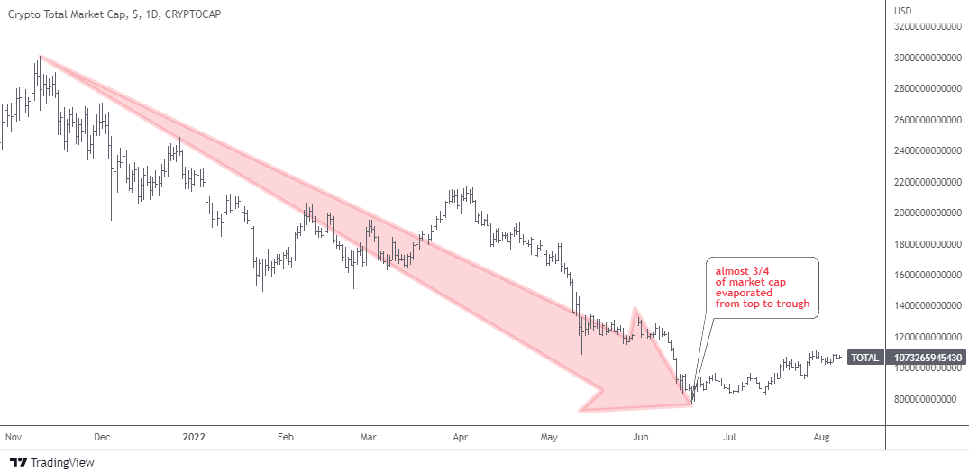
Earlier this month, I updated on the crypto market with a title, 'It Ain't Over Yet". I considered the recent strength in the main cryptocurrencies a "dead-cat bounce" within a classic sideways consolidation with a high probability of resuming collapse.

This time, I spotted new signals as the chart moves to the right building new bars over time. Let us start with the main coin in the weekly chart below.

Bitcoin Weekly Chart

Source: TradingView

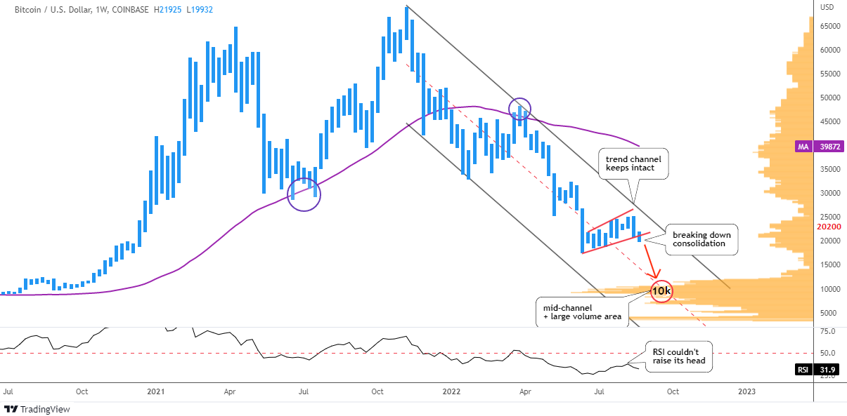
The price of Bitcoin moves within large bearish trend channel (black). The top of above-mentioned sideways consolidation within red trendlines did not even approach the resistance, it stays intact.

The RSI indicator could not raise its head to test the “waterline” of 50 level. This means that the market has considered this short-term strength as a "dead-cat bounce" as well.

The chart bar of last week has punctured below the red support. This is a harbinger of another drop. The main coin indeed is looking into the abyss as the strong support appears only after the price halves down. The largest area of the Volume Profile histogram (orange) is located between $9k and $10k. The mid-channel (red dashed) fortifies that support with its intersection.

Your biggest bet last time was the drop of the Bitcoin down to $12.2k, where the second leg down is equal to the first one. It almost coincides with the above-mentioned double support.
The next volume area is located at the $4k level and this option was your least favorite.

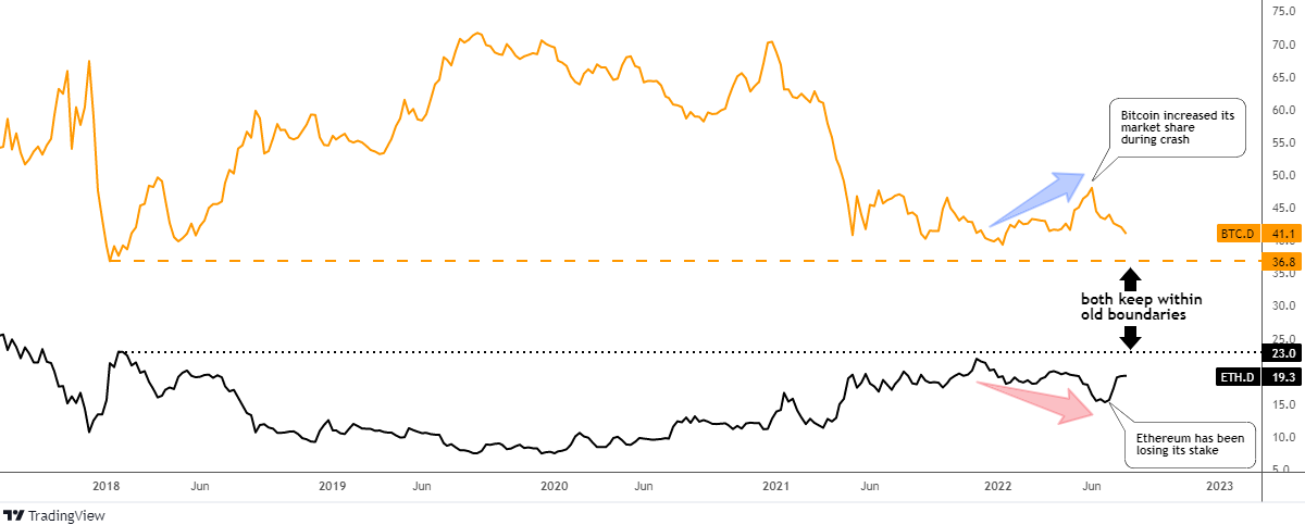
This time I added the simple moving average (purple) covering the preceding 52 weeks (1 year). It has been offering a strong support to the price starting from 2020. This year it has flipped to become a strong resistance after the price has dropped below it. The $40k level is the barrier to break to confirm the new bullish cycle.

A rather interesting situation has developed for the main coin. The price should either half down to find support or it should double up from this level to crack the bearish cycle. Continue reading "Bitcoin and Ethereum: No Safety Net"

The Excess Phase Peak Pattern

The Excess Phase Peak pattern is a very common transitional phase for the markets where psychology and economic trends shift over time. Global markets typically require periods of pause, reversion, or a reset/revaluation event to wash away excesses.

We’ve seen these types of setups happen near the DOT COM and 2007-08 market peaks. What happens is traders are slow to catch onto the shifting phases of the Excess Phase Peak and sometimes get trapped thinking, “this is the bottom – time to buy.”

The reality is that as long as the individual phases of the Excess Phase Peak continue to validate (or confirm), then we should continue to expect the next phase to execute as well. In other words, unless the Excess Phase Peak pattern is invalidated somehow, it is very likely to continue to execute, resulting in an ultimate bottom in price many months from now.

The 5-Phases Of The Excess Phase Peak Pattern

The Excess Phase Peak Pattern starts off in a very strong rally phase. This rally phase normally lasts well over 12 to 24 months and is usually driven by an extreme speculative phase in the markets.

Once a price peak is reached and the markets roll downward by more than 7~10%, that’s when we should start to apply the five unique phases of the Excess Phase Peak Pattern. If each subsequent phase validates after the peak, then the Excess Phase Peak Pattern is continuing. If any phase is invalidated, then the pattern has likely ended.

For example, if we start by completing Phase #1 & #2, then the market rallies to a new all-time high – that would invalidate the Excess Phase Peak Pattern.

Here are the Phases of the Excess Phase Peak Pattern:

  1. The Excess Phase Rally Peak
  2. A breakdown from the Excess Phase Peak sets up a FLAG/Pennant recovery phase.
  3. Sets up the Intermediate support level – the last line of defense for price.
  4. Price retests #3 support & breaches the support level – starting a new downtrend.
  5. The final breakdown of the price is below the Phase 4 support level. This usually starts a broad market selling phase to an ultimate bottom.

Continue reading "The Excess Phase Peak Pattern"

Dollar Ran Out of Time, Not Ammo

More than three years ago in my post titled, “Don't Get Trapped By Recent Dollar Weakness”, I shared with you a monthly chart of the dollar index (DX) futures with a map of large two-leg complex sideways consolidation. It was an experiment to try guessing the time target for the second blue leg to the upside based on the time it took second red leg to emerge.

Below is the updated chart with the same drawings enriched with the new highlights.

DX Futures Monthly

Source: TradingView

The time target was set on November 2020 when 33 bars in the second blue leg up emerge. The price had established the new top of $104 in March 2020 within those 33 bars. However, the minimum target of $114.2 on the price scale had not been reached and now 54 monthly bars appear on the chart.

If we divide 54 by 33 we will have the ratio of 1.64, which means the time period extended over the 1.618 Fibonacci ratio. This is a crucial time mark and last month the dollar index futures were really close to hitting the price target as it topped $109.1.

The next extension of doubling the time period with 66 bars to emerge falls on August 2023. It is enough time space for reaching both preset targets of $114.2 and $121.3.

I added two indicators on this updated chart. The purple one is the Volume Profile. It clearly has shown the strong barrier at the $98 level with the large volume traded there. When the price broke above that resistance, the speed of growth accelerated. It is the resistance being the strong support now. We should watch it closely in case the price drops there during correction.

The Simple Moving Average for the past year period is the blue line on the chart. It had accurately shown the reversal to the upside last year. The moving average confirms the support area of the Volume Profile indicator around $99.6 making it a double barrier for bears.

Three years ago the majority of readers misread the direction of the price as they bet on the drop of the dollar. Continue reading "Dollar Ran Out of Time, Not Ammo"

Gold And Silver: Is It A Trap?

Back in June, I shared with you an alternative scenario for gold with a downside trigger on the trendline support.

I highlighted it with a purple color in the weekly gold futures chart below. This area is fortified with the red horizontal trendline based on the former valley of $1,678. Though, it’s a double support level.

Gold Futures Weekly

Source: TradingView

It is amazing how accurately the price bounced off that strong support. The metal took its chance to jump to the upside amid the falling yield of 10-year U.S. government bonds (10Y).

The easing inflation data limits the hawkish expectations on the Fed rate hikes. Though, the 10Y’s advance has been paused as the market took some gains amid uncertainty.

However, the real interest rate is still strongly negative at -6%. The labor market shows vitality according to statistics. This leaves the room for the Fed to keep tightening until something breaks down.

The 10Y bounced off recently from 2.6% to 2.85% and nobody knows if it’s a continuation or a consolidation.

The gold market has been trapped with the whole uncertainty as it has built a large sideways consolidation since August 2020. Continue reading "Gold And Silver: Is It A Trap?"

Crypto Update: It Ain't Over Yet

It was a close call this May with a doom-saying title “Crypto Apocalypse?” where I shared with you an annihilating model for Ethereum and a bearish chart of Bitcoin.

Let us see what happened in the crypto market since then in the chart below.

Crypto Total Market Cap

Source: TradingView

Total crypto market cap had skyrocketed to the maximum of just over $3 trillion last November. Since then, almost ¾ of the total market cap has evaporated on the crypto crash down to $762 billion this June. That hurts!

More than $2 trillion of wealth was destroyed during that collapse. Some people were calling it a “crypto-winter” of the market. All of us have probably noticed that less videos and posts with clickbait titles on “how to become a crypto-millionaire” or new rising stars in the crypto-market have been popping up on social media lately.

In the next market share chart, let's check the status quo of the market leaders.

BTC ETH Dominance

Source: TradingView

During the collapse of the market, the main coin (orange) has managed to increase its market share tremendously from 40% up to 48% on the peak in June. How could that happen as it was bleeding alongside the whole market? The speed of the drop is the main reason. Continue reading "Crypto Update: It Ain't Over Yet"