Familiar Pattern in the AMD Chart

The Fed’s tightening puts hard pressure on the broad stock market and chip makers are not the exception. The strong labor market statistics and ongoing inflation pressure supports the hawkish mode.

If one thinks that the sell-off might be over, there is a chart below that I spotted a disastrous model for a well-known chip maker Advanced Micro Devices, Inc. (NASDAQ:AMD).

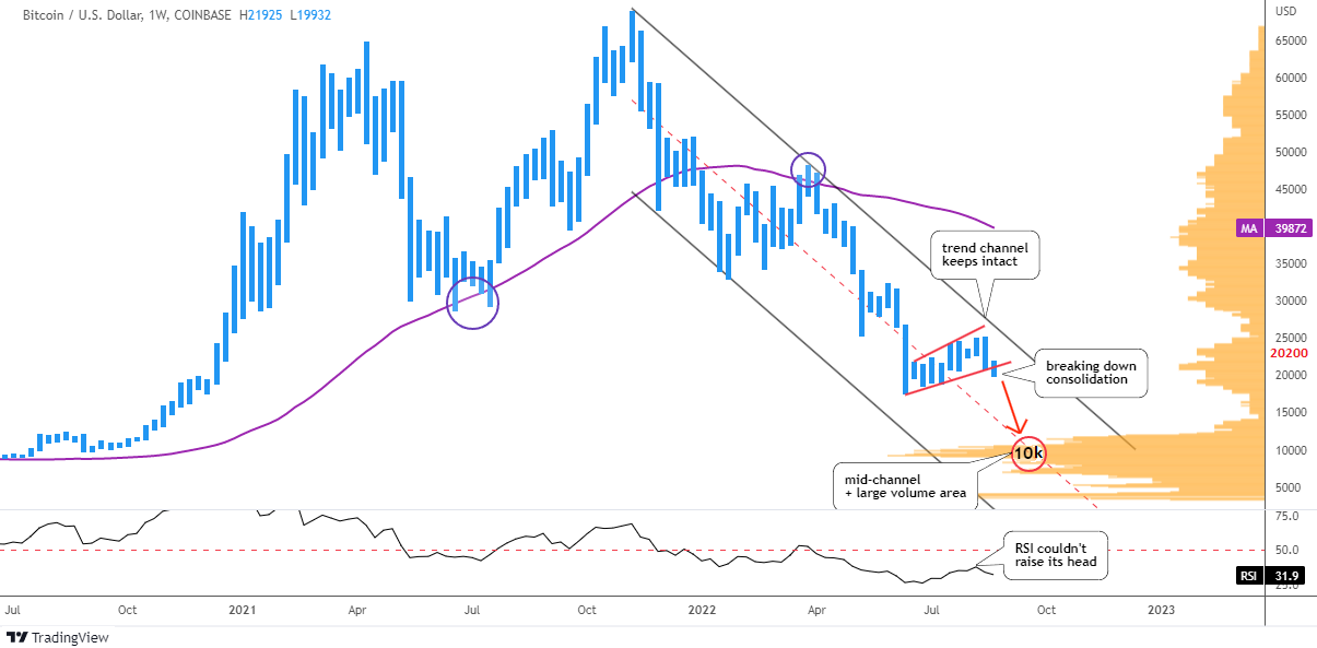
You definitely know this chart pattern I spotted for you. It is a Head & Shoulders reversal model. Last time this notorious chart pattern appeared in my posts was in May on the chart of Ethereum cryptocurrency. I updated it for you below to illustrate the historical sample.

ETH Weekly Updated

Source: TradingView

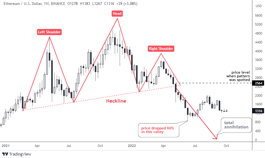
As soon as the price crossed below the Neckline beneath $2,400, Ethereum collapsed as it had lost a tremendous 66% down in the valley of $884 in June from the post level of $2,564.

This is how this model has played out before and that is what we could expect in the next chart of AMD below.

AMD Weekly

Source: TradingView

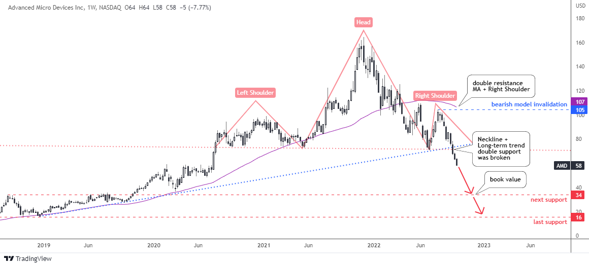
The Head & Shoulders pattern (pink) here is more balanced compared to up-sloped model in the Ethereum chart. The Neckline touch points are located almost exactly at the same level of $72, hence it is a flat line. The Head is quite tall above the wide Left Shoulder and the narrow Right Shoulder. The top of a latter offers a strong resistance and the invalidation point. Continue reading "Familiar Pattern in the AMD Chart"

Bitcoin and Ethereum: No Safety Net

Earlier this month, I updated on the crypto market with a title, 'It Ain't Over Yet". I considered the recent strength in the main cryptocurrencies a "dead-cat bounce" within a classic sideways consolidation with a high probability of resuming collapse.

This time, I spotted new signals as the chart moves to the right building new bars over time. Let us start with the main coin in the weekly chart below.

Bitcoin Weekly Chart

Source: TradingView

The price of Bitcoin moves within large bearish trend channel (black). The top of above-mentioned sideways consolidation within red trendlines did not even approach the resistance, it stays intact.

The RSI indicator could not raise its head to test the “waterline” of 50 level. This means that the market has considered this short-term strength as a "dead-cat bounce" as well.

The chart bar of last week has punctured below the red support. This is a harbinger of another drop. The main coin indeed is looking into the abyss as the strong support appears only after the price halves down. The largest area of the Volume Profile histogram (orange) is located between $9k and $10k. The mid-channel (red dashed) fortifies that support with its intersection.

Your biggest bet last time was the drop of the Bitcoin down to $12.2k, where the second leg down is equal to the first one. It almost coincides with the above-mentioned double support.
The next volume area is located at the $4k level and this option was your least favorite.

This time I added the simple moving average (purple) covering the preceding 52 weeks (1 year). It has been offering a strong support to the price starting from 2020. This year it has flipped to become a strong resistance after the price has dropped below it. The $40k level is the barrier to break to confirm the new bullish cycle.

A rather interesting situation has developed for the main coin. The price should either half down to find support or it should double up from this level to crack the bearish cycle. Continue reading "Bitcoin and Ethereum: No Safety Net"

Crypto Update: It Ain't Over Yet

It was a close call this May with a doom-saying title “Crypto Apocalypse?” where I shared with you an annihilating model for Ethereum and a bearish chart of Bitcoin.

Let us see what happened in the crypto market since then in the chart below.

Crypto Total Market Cap

Source: TradingView

Total crypto market cap had skyrocketed to the maximum of just over $3 trillion last November. Since then, almost ¾ of the total market cap has evaporated on the crypto crash down to $762 billion this June. That hurts!

More than $2 trillion of wealth was destroyed during that collapse. Some people were calling it a “crypto-winter” of the market. All of us have probably noticed that less videos and posts with clickbait titles on “how to become a crypto-millionaire” or new rising stars in the crypto-market have been popping up on social media lately.

In the next market share chart, let's check the status quo of the market leaders.

BTC ETH Dominance

Source: TradingView

During the collapse of the market, the main coin (orange) has managed to increase its market share tremendously from 40% up to 48% on the peak in June. How could that happen as it was bleeding alongside the whole market? The speed of the drop is the main reason. Continue reading "Crypto Update: It Ain't Over Yet"

Crypto: Failed Rally Builds Ambiguous Pattern

Before starting the crypto update, I would like to check an assumption circulating in the media regarding a strong correlation of Bitcoin with the Nasdaq 100 index in the chart below.

Crypto

It is safe to say that over the past two years, most of the time, Bitcoin was in a positive correlation with the Nasdaq 100 index. However, the current positive relationship is cooling down as we saw an almost absolute correlation at the beginning of February at 0.91, and these days it slipped down to 0.34.

Miscorrelation periods usually appear due to the higher volatility of Bitcoin and longer periods of price inertia in the stock index. In other words, these two instruments have different speeds. Continue reading "Crypto: Failed Rally Builds Ambiguous Pattern"

The Truth Behind The Bitcoin Sell-Off

Let's get right to it, if you invest long enough, you're going to have to deal with markets behaving in knee-jerk ways, and the recent selloff is Bitcoin (BTC) fits the bill to a T.

The fact is Bitcoin, along with the entire crypto asset class, got pummeled because the Fed signaled that they're in the mood to raise interest rates sooner rather than later. This outlook, which came from the Fed's minutes of the December meeting, wasn't what the markets expected. And we all know that when the markets don't get what they expect, they take their toys, go home, and sell pretty much everything in sight.

So, what juicy secret did the minutes reveal? As with most Fed announcements, precise forecasts are hard to glean. But the gist was that the Fed would raise rates sooner rather than later.

But if you think that it was just crypto that took it on the chin, think again. This more hawkish view on interest rates also hammered stocks, especially tech stocks.

All told, since the beginning of 2022, Bitcoin has dropped 14%, the NASDAQ 7%, and the S&P 4%. So, basically, once the Fed's minutes hit the street, there was nowhere to hide.

What’s So Bad About Higher Interest Rates?

So, why don't markets like higher rates? Continue reading "The Truth Behind The Bitcoin Sell-Off"