Very Long-Term Silver

Just for fun because I am a chart guy who all too often bores you (and me) to death with ratio and indicator charts and all too seldom makes charts just for the fun of it anymore…

So this long-term silver chart is just for the fun of it. What do we have here?

  • A very long-term Cup & Handle; and boy what a handle. It killed the true believers years ago. I like that the 2011 (bubble) right side high is higher than the 1980 (bubble) left side high (monthly closing basis).
  • A price that has held a very long-term support level at 14, coinciding with a 79% Fib retrace (if you believe Fibs are relevant).
  • Vertical cycle lines spaced around 8 years apart that have marked the two bubble highs, a minor high in the late 80s that led to a years-long trough, a whole lot of nothing in the mid-90s and the start of a massive bull market in 2003. The current line would appear to be a marker to a low.
  • Yes, that thing from 2006 to today looks like an ugly Head & Shoulders pattern, so let’s give it its due as well. If I am wrong about an inflationary near future – and the Gold/Silver ratio still stands in defiance of an inflation trade on this day – you’d want to at least be aware of the bear’s potential.
  • Another thing I don’t care for is the decade long trough that sprung the 2003 bull market vs. the much shorter flat period leading to today. Silver has certainly not had that level of desolation to its investment landscape since the most recent bubble popped in 2011.

So okay, there are at least two caution points if you want to take the long-term chart seriously.

That said, nothing’s changed. I am bullish on silver at this time and prepared to get more bullish if/when it takes over for gold. But obviously, that very important support around 14 that silver twice tested in the last year and three times tested in the last 5 needs to hold. Continue reading "Very Long-Term Silver"

Gold Update: Pitfall Or Pit Stop?

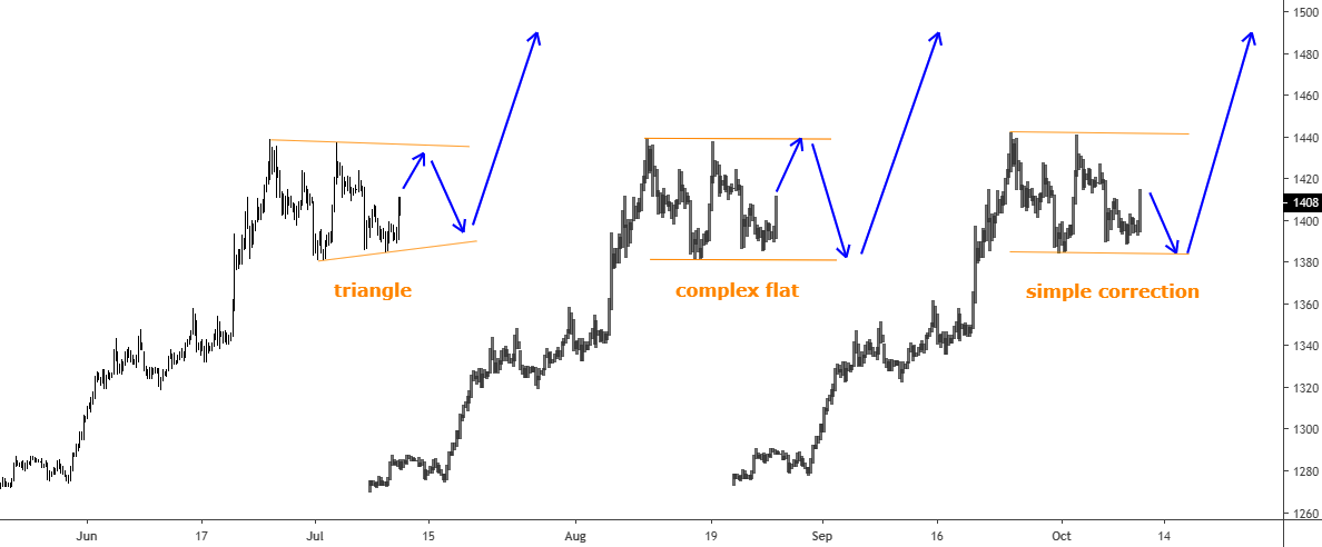
The mighty metal has almost hit the Bull Flag’s target, which was set two months ago. Gold was got close as it reached $1439 on June 25th and only had $6 left to reach that level. Usually, when the impulse of the price gets exhausted without breaking the important level or after it briefly penetrates the latter, then the price quickly retraces in the opposite direction. And that’s what we got with the gold price as the impulse initially looked strong enough to catapult the metal to the $1500 area, but suddenly it failed. Therefore, the price dropped back below $1400 to $1382. Then the buyers actively bought this drop up again to the former top, but they stopped just $1 below it and capitulated there as the price plummeted to $1386 back below $1400. These seesaw moves make traders nervous as it is dangerously volatile with more than $50 setbacks.

The question is if it is a pitfall and we shouldn’t expect any further strength of gold, or it’s just a pit stop to make a pause to accumulate a momentum for another push higher? Let’s look into the chart below to try to figure it out.

I dipped into the 4-hour time frame to show you what happens there.

Gold
Chart courtesy of tradingview.com

First of all, I would like to point out that I believe that we are just in a correction before another push higher, so I choose the pit stop option for the gold. Therefore, my chart will be based on this idea. Continue reading "Gold Update: Pitfall Or Pit Stop?"

Promises, Promises

Pity poor Jerome Powell. He just can’t seem to stay out of his own way.

For the past several weeks the Federal Reserve chair has been promising – ok, maybe not promising, but strongly “indicating” – that it’s only a matter of time that the Fed will cut interest rates. He’s certainly been grooming the financial markets for such a move, and the markets have duly responded, as the major U.S. equity indexes all jumped more than 7% last month while bond yields plunged.

Now comes last Friday’s jobs report that came in much stronger than most people expected and far stronger than the previous month’s totals. The Labor Department said the economy added 224,000 new jobs in June, well above not only the consensus Street forecast of 165,000 but also the most bullish individual estimate of 205,000. It was also far stronger than May’s total of 72,000, which was actually revised downward by 3,000 from the original figure.

Following May’s underwhelming report, most people seemed to believe that the jobs boom had finally played itself out, and it would be all downhill from here, with a recession looming in the not-too-distant future. And then what do you know, the June report comes out and takes everyone by surprise, not least of all Jay Powell himself. Continue reading "Promises, Promises"

How Well Has Your Portfolio Done Year-to-Date

The first six months of 2019 have been odd, but there is never a better time than now to look at where your money is and how it has performed as we pass over the half-way point of the year.

The year started with the markets rallying back after a disastrous end of 2018, then the trade wars heated up, the economy has begun showing signs of weakness, the Federal Reserve is holding off on interest rate increases and even considering rate cuts, but the markets continue to set new record highs.

If you have been heavily invested in certain sectors you have had a losing 2019, maybe a mediocre year or a great year. On July 1st, the SPDR S&P 500 ETF Trust (SPY) was up 17.42% year-to-date. All of the major indexes and their corresponding Exchange Traded Funds have performed well during the first half of the year. The SPDR Dow Jones Industrial Average ETF Trust (DIA) is up 15% year-to-date, while the Fidelity NASDAQ Composite Tracking Stock (ONEQ) is up 19.92% year-to-date. Even the broader indexes and their ETF’s such as the iShares Russell 1000 ETF (IWB) or the Vanguard Russell 3000 ETF (VTHR) are up 17.53% and 17.47% as of the morning of July 1st.

While the indexes all performed better than average years, if you were more industry-focused then as I said before, it depended on what industry you wherein during the first half of the year on whether or not you kept up with the market. The worst performing ETF during the first half of the year, outside of leveraged or any specialty products focusing on futures, was the Breakwave Dry Bulk Shipping ETF (BDRY) which has lost 29.22% since the start of 2019. The best performing ETF following the same guidelines was the Invesco Solar ETF (TAN), which is up 47.22% in 2019. Continue reading "How Well Has Your Portfolio Done Year-to-Date"

Pendulum Swing #8: Gasoline Vs. Natural Gas

We have passed the middle of the year, so it’s time to announce the result of the 7th Pendulum swing pushed this January. The multiple winner Palladium and the earlier loser Lumber were put on the starting point at the beginning of this year.

Let’s see below which one you favored.

Gasoline Natural Gas

Most of you had bet that the metal would beat the forest product. And it appeared to be the right choice! This option was against the Pendulum effect as the lumber was thought to be the winner. I understand the majority’s decision as palladium was on the news as it hit the all-time high levels to become more precious than the gold amid insatiable demand.

The lumber futures chart implied the upcoming weakness after a retest of the broken support. The price has accurately followed that forecast making a pullback to the broken trendline support and then continued down.

Please look at the chart below, all in all, the invincible metal has scored 29% and hit the top of the chart again in the second place. The lumber futures are also in green as it gained 13%, but it was not enough to beat the palladium. The latter kept resistant to the Pendulum effect this time. Continue reading "Pendulum Swing #8: Gasoline Vs. Natural Gas"