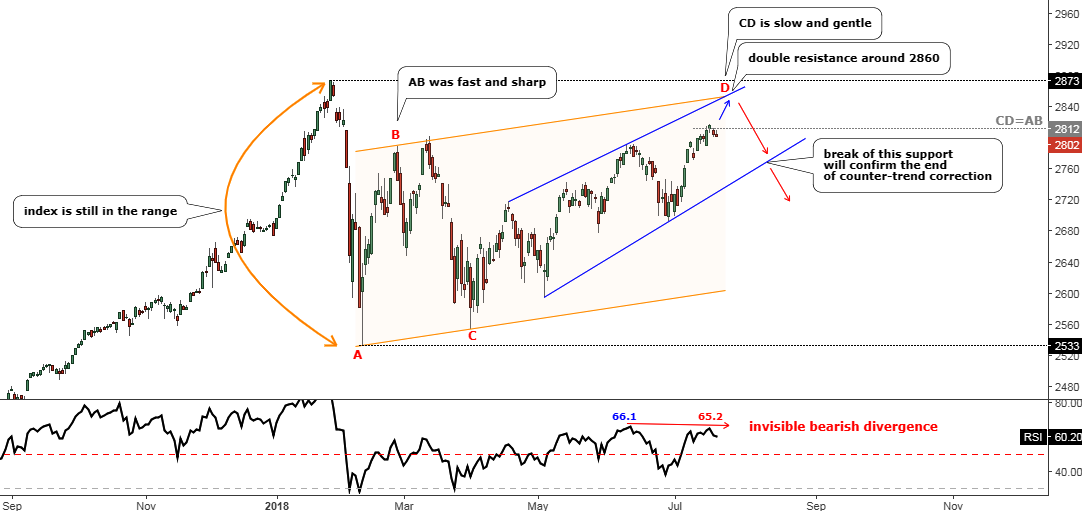
Last month I shared with you my concern about the possible reversal of the index in spite of the solid gain booked earlier. The chart of the S&P 500 spoke for itself, showing a weakness in the structure of the move up. The angle of the uptrend was too gentle to sustain. And the finishing punch came from the RSI indicator, which had an invisible Bearish Divergence on its chart.
We never know what the future will bring us, although this time the geometry of the double resistance worked just perfect as I assumed another spike to that area of $2860 before a reversal in my earlier post. Bingo! The index peaked right in that area at the $2863 and then collapsed. This is further proof of the magic power of the trends.
Chart: S&P 500 Daily: Watch Support After The Failure At The Resistance
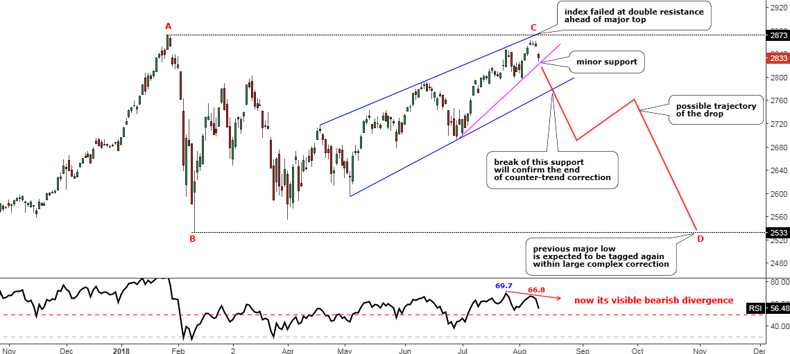
Chart courtesy of tradingview.com
This is an updated chart above, which reflects the market changes and shows the outlook of the possible upcoming behavior of the S&P 500. Continue reading "S&P 500: Exhausted?"