Dear readers, I am very grateful to get all your feedback and suggestions that you kindly share with me all the time! Rasesh Shukla, one of our regular readers asked about the Emerging market currencies and particularly about Indian rupee in a comment this month. And I am pleased to share my thoughts with all of you in this post.
Chart 1. 5-Year Dynamics of Top FX vs. EM FX
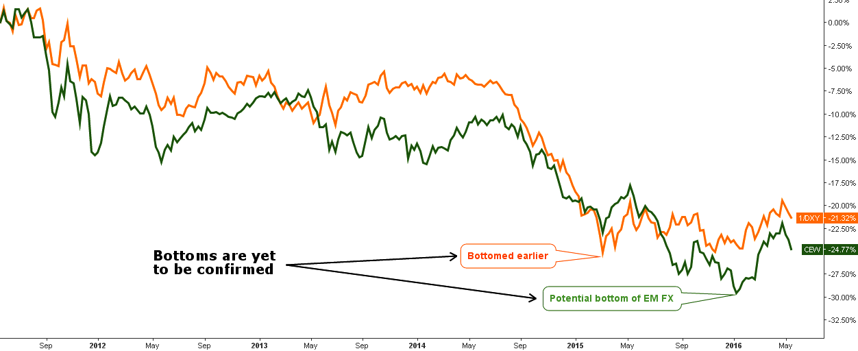
Chart courtesy of tradingview.com
I want to start with the comparison chart of the top currencies presented by inverse dollar index, consisting of 6 currencies: Euro, Japanese Yen, British Pound, Canadian Dollar, Swedish Krona and Swiss Franc (orange line) versus the emerging market currencies presented by WisdomTree Emerging Currency Strategy Fund (CEW, green line). The former is quite representative, it tracks the value of the following 15 currencies: Mexican Peso, Brazilian Real, Chilean Peso, Colombian Peso, South African Rand, Polish Zloty, Russian Ruble, Turkish New Lira, Chinese Yuan, South Korean Won, Indonesian Rupiah, Indian Rupee, Malaysian Ringgit, Philippine Peso and Thai Baht. Continue reading "The Dollar Takes 'EM Down" →