Copper On Big Time Frame Charts: $0.6 or $6?

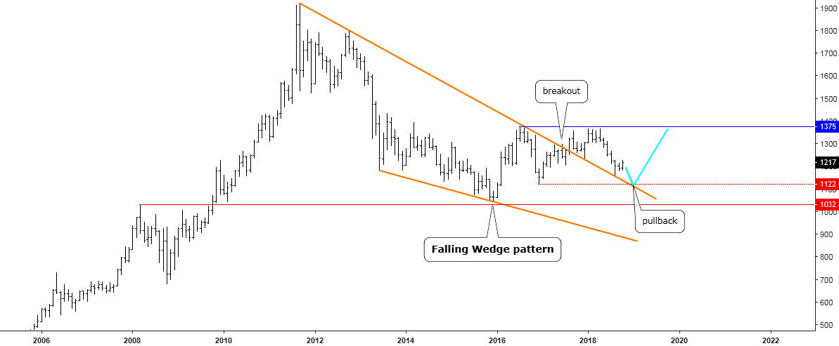
There is an age-old question asking: How do you determine if a trader is biased? Show him a chart and ask where he thinks the market would go and then show him the same, but reversed chart and if the answer is the same, then this trader is indeed biased. We call such a trader a Perma-Bull or a Perma-Bear. The market sentiment is often split even as there are a lot of biased traders and market is then trapped within a range as there is no dominant opinion among the participants.

Every day I see how the trading community spreads opposite signals in any instrument creating an overwhelming sea of information where it’s hard for novice traders to focus and make a trading decision. Different levels of experience and fantasy generate the diversity of chart patterns and models. People change time frames and squeeze or expand charts; all of this affects the perception and therefore, the final decision.

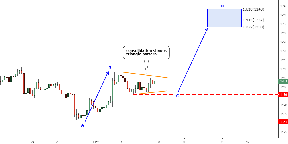
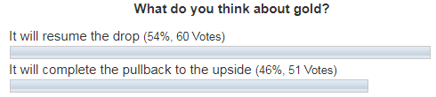
Let’s perform an educational experiment with two patterns that I found on different time frames for the same instrument, copper. I will add two separate charts with those patterns followed by explanations. I am eager to see what you think about the outlook for this instrument after reading and voting on the pole at the end of the article. Continue reading "Copper On Big Time Frame Charts: $0.6 or $6?"

Gold & Silver: Fly or Die

The precious metals are busy finishing the anticipated pullback to the former support, which is almost within our grasp on the short-term charts. So, let it go and in the meantime we can look into the bigger charts with higher time frames to update the outlook beyond the short-term horizon.

Chart 1. Gold Monthly: 1122/1375

Gold Shines
Chart courtesy of tradingview.com

The monthly gold chart above answers some critical questions. The first one, why gold reversed ahead of $1000? The answer is the red horizontal line, which was set at the 2008 top and acted as strong support and breakdown of it would unleash severe volatility into the market as the next level of serious technical support is located in the $700 area (2006 top/2008 bottom). Continue reading "Gold & Silver: Fly or Die"

Bearish Pattern Warns Of Dollar Weakness

A unique setup has occurred in the Invesco DB US Dollar Index (UUP) that resembles an Engulfing Bearish type of pattern (even though it is not technically an Engulfing Bearish pattern). Technically, an Engulfing Bearish pattern should consist of a green candle followed by a larger red candle whereas the red candle’s body (the open to close range) completely engulfs the previous candle’s body. In the instance, we are highlighting in this article, a unique variation of what we’ll call a “Completely Filled Engulfing Bearish” pattern is setting up.

This is when two red candles set up in an Engulfing Bearish type of formation – omitting the requirement that the first candle is green. Japanese Candlesticks help us to identify the psychology of the market price in relation to our other specialized tools. We believe this formation is important because both of the red candlesticks that make up this pattern opened much higher than the previous bar’s close and dramatically sold off into the close of each session. We believe this type of rotation clearly illustrated that price is reaching resistance near $25.50 and pushing lower because of this strong resistance. We also believe this resistance/pattern will set up a downside price move in the US Dollar very soon.

bearish pattern

Below, we have highlighted the traditional formation of an Engulfing Bearish Candlestick pattern. The example chart, to the right of this definition, shows another variation of the Engulfing Bearish pattern setting up after three minor sideways candles. The interpretation of this Bearish Reversal pattern is subjective in terms of understanding the psychological representation of the Engulfing Bearish pattern. This pattern represents a total reversal of power within the price bar where the buyers were in control at the open (resulting in a higher opening price) and lost control through the trading session to allow the sellers to drive the price much lower into the close of the trading session. Thus, the Engulfing Bearish pattern represents a “key pivot point” in price that may prompt a larger downside move in the near future. Continue reading "Bearish Pattern Warns Of Dollar Weakness"

Gold & Silver: Get Ready For A Final Shot

Chart 1. Gold 4-Hour

LLLL
Chart courtesy of tradingview.com

Gold has already booked more than $20 from the low established on the 28th of September at the $1181. Now, there is no doubt that the pullback I mentioned in the middle of September has been in progress.

After hitting the $1209 area, gold halted its move to the upside and started a consolidation. I marked that move as the AB segment (up blue arrow). I always mention the tricky nature of corrective structures as it may vary on the fly. The shape of consolidation could be as a counter-trend zigzag, could fit into a rectangle or form a triangle. The latter has been shaped in our chart above as the combination of lower peaks and higher troughs. I highlighted it with the converging trendlines (orange). Continue reading "Gold & Silver: Get Ready For A Final Shot"

Gold Bounced as Silver Broke Downtrend

Both triggers were pulled in the precious metals since my last post about gold and silver. I hope it is interesting for you to see how you voted about the metals price action in that article.

Let’s start with the gold votes below.

Gold Bounced

Most of you (54%) thought that gold would resume the drop. It was a slight edge over the other option where you chose the completion of the pullback. Let’s check in the chart below to see what actually happened with the gold price since then.

Chart 1. Gold Daily: Second Leg Of A Pullback

Gold Bounced
Chart courtesy of tradingview.com

The price of gold has finished the consolidation highlighted with the thin red down arrows in the earlier chart between the B and the C points of the blue AB/CD segments. The simple measurement pointed at the $1180 level, where I said the CD segment should start. Indeed, the gold has hit the $1181 low within the BC part and then bounced up towards the end of the last week to close at the $1191. This is the magic of simple math, which occurs in the charts again and again. Continue reading "Gold Bounced as Silver Broke Downtrend"