All of the top commodities have rebounded amid the dollar's weakness recently, but copper didn't follow the pack to make gains. I think we should take a chance as this misbehavior will not last for long.
Chart 1. Copper-Oil Correlation: Huge Divergence!
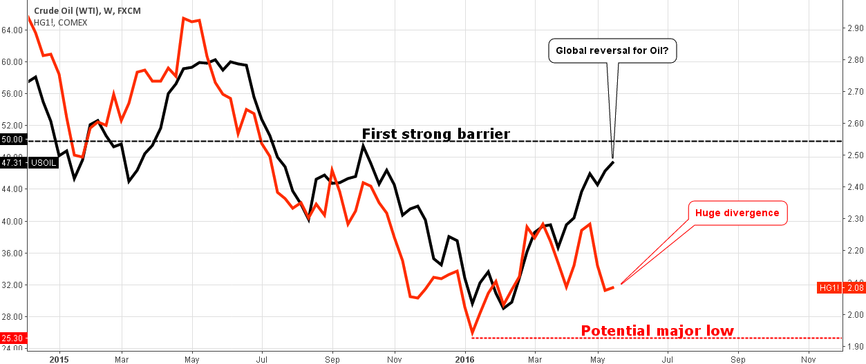
Chart courtesy of tradingview.com
The crude oil is very strong these days, although last time we have been witnessing its comparative weakness to copper. It looks like the Double Bottom reversal pattern is still making the game for oil with the first strong barrier at the $50 level.
This time, copper overreacted to the short-lived drop of crude hitting the $2.06 area, and this gap that we can see on the chart above kept at the following strong rebound. And then another weird thing happened – crude oil had a minor pullback and continued its upward move while copper overreacted again down to the previous low area at $2.06, this time with even larger divergence. Now look at the left part of the chart, the current gap reminds me the one-year-old situation – oil had stalled at the end of May 2015 while copper overcame it with a new high and then it dropped sharply to run down crude. Therefore, there is a high probability of copper catching up soon with the current oil price corresponding to $2.40-2.50 copper price levels.
Let's look at the copper chart below to find it out. Continue reading "Copper Bites The Dust Behind Strong Oil"